5 Best Widget Types for Data Visualization

Data visualization organizes and represents data in a graphical format. Its goal is to make data easy to understand. Data visualization allows business leaders to evaluate product performance, understand business activities, track customer satisfaction and product sales, and monitor project progress. To visualize key performance indicators (KPIs), you must know which part of a data set you need, how it needs to be transformed, and which types of visualization widgets are suitable to your data set and understandable for your target audience. Let’s see the five best widget types for showcasing key performance indicators and metrics using Bold BI®.
Heatmap
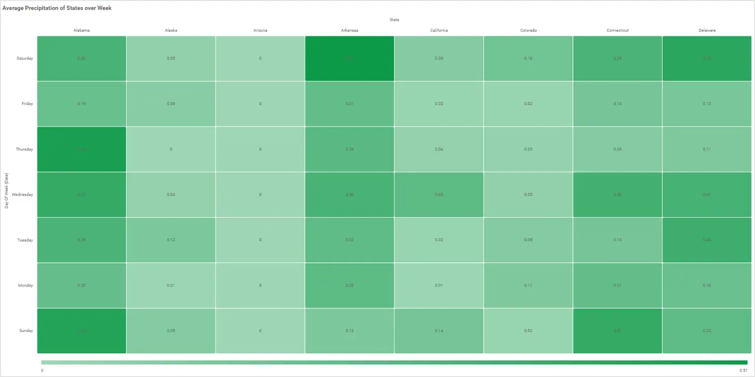
A heatmap represents tabular data values as gradient colors and displays the relationship between two items you choose as an x axis and y axis. Heatmaps are ideal to show multiple rows of two-column values. They can be used to highlight low to high and weak to good rating information by using different colors with different gradients. In the heatmap shown in the following Bold BI dashboard, we are visualizing the daily average precipitation of 8 states. Here you can easily see which states have extreme rain because of the color gradients.
The following table lists the metrics best visualized through heatmaps in certain domains.
| Domain | Metrics |
| Meteorology | Average temperature/precipitation recorded in a state or city over a time period. |
| Education | Marks scored by students across subjects in an examination. |
| Government | State-wise allocation of school improvement grants by category. |
| Information technology | Support ticket severity vs. status.Expense allocation for projects by department. |
| Telecommunications | Bandwidth utilization by subscribers in a week. |
| Energy | Energy consumption by sector on monthly basis. |
| Insurance | Annual premium equivalent (APE) performance by year and policy type. |
Pivot table
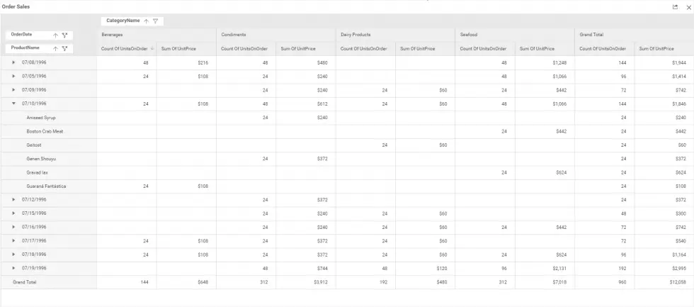
A pivot table is best used to quickly summarize a large amount of data. It allows you to display summarized data in a cross-tabular format and create multidimensional views. Further, it provides an option to filter and group data for analysis to satisfy the needs of business users. It’s good to use in marketing and financial domains for revenue and expense calculations. In the following example, product order details are summarized in a pivot grid of a Bold BI dashboard, and It provides an overview of the quantity sold, the sale amount by ordered date, and the product category.
The following table lists the KPIs and metrics that are best visualized through pivot tables in the corresponding domains.
| Domain | KPIs and Metrics |
| Manufacturing | Daily production overview.Product sales for the year. |
| Education | Top 10 students by grade and gender. |
Indicators
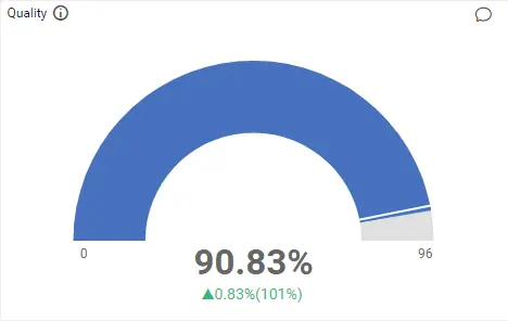
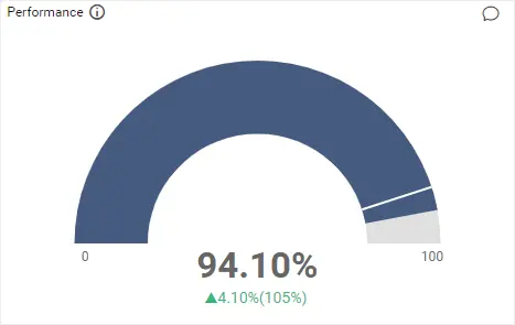
Indicators can be used to measure numeric KPIs and show their progress. The radial gauge and card are two such indicators available in Bold BI. These indicators show the same type of information but with different visuals. Gauges are preferable when measuring processing efficiency in the context of defined threshold levels. Card is preferable to showcase the current state and identify trends with comparative value assessment.
Gauge
In the following examples, the quality and overall performance of production are visualized through the radial gauge widget of a Bold BI dashboard.
A gauge widget is suitable for visualizing KPIs and metrics in the corresponding domains listed in the following table.
| Domain | KPIs and Metrics |
| Manufacturing | Production quality, availability, and performance. |
| Information technology | Customer satisfaction rating. |
| Education | Overall pass percentage. |
| Finance | Days sales outstanding (DSO), days payable outstanding (DPO), and days sales inventory (DSI) for a company’s outstanding accounts receivable and payable. |
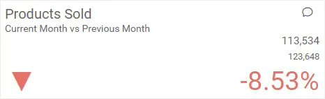
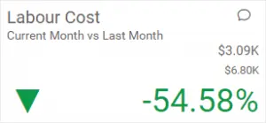
Card
A card is best used to show a single number or comparison values. In the following card in a Bold BI dashboard, we are visualizing the products sold and labor cost comparatively between the current month and the previous month. Here you can easily learn about production sales and expenses.
A card widget suits visualizing KPIs and metrics in the corresponding domains listed in the following table.
| Domain | KPIs and Metrics |
| Manufacturing | Manufacturing costs, labor costs, rework quantity, and comparing any of these with a previous time period. |
| Insurance | Policy claim details like total policy, assured amount, annual premium, and comparing any of these with a previous time period. |
| Education | Count of students, staff, and overall attendance. |
| Marketing | Visitor count and dormancy rate. |
| Information technology | Total customer requests, average resolution time, project investment and billed amount, and project completion time vs. estimate. |
| Energy | Energy consumption and production cost, and comparing these with a previous time period. |
| Healthcare | Patients’ vital signs (heart rate, temperature, and blood pressure). |
| Finance | Total accounts receivable and payable, equity ratio, and deposit equity of company. |
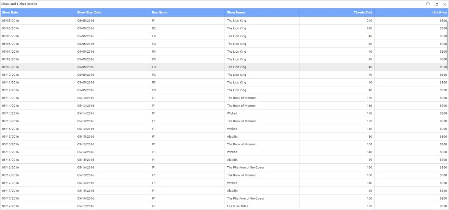
Grid
A grid is an efficient display component for tabular data. It is very useful for generating complex grid-based reports with rich formatting. In addition, It can load millions of rows very quickly and allows you to showcase ranked relationships through the vertical arrangement of items, ordered from top to bottom. Also, It provides paging, sorting, filtering, searching, and grouping. It’s used in a variety of industries and departments such as finance, banking, software, and more. In the following example, ticket sales information is displayed in the Grid widget of a Bold BI dashboard to give you a detailed view of show date, start date, show name, tickets sold, and ticket price.
The grid widget is appropriate for visualizing domain related metrics listed in the following table.
| Domain | KPIs and Metrics |
| Healthcare | Patient, physician, and specialization details. |
| Education | Student and staff details. |
| Government | Top 10 schools based on improvement grant amount. |
| Insurance | Overview of policy detail with claim date, policy type, and claim amount. |
| Telecommunications | Recharge, ticket, and activity details of subscribers. |
Charts
Charts represent tabular data in a graphical format. They are split into different categories based on how they present data.
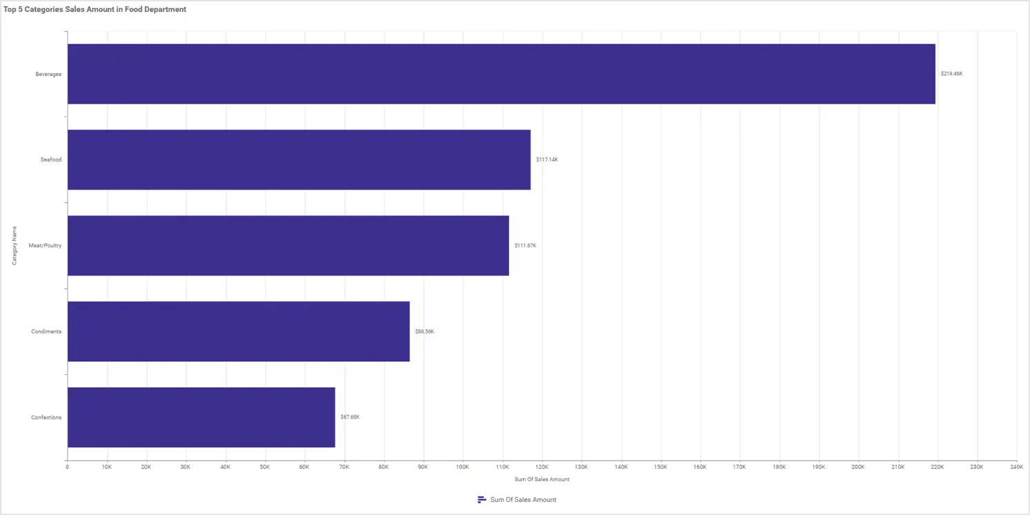
Bar and column charts
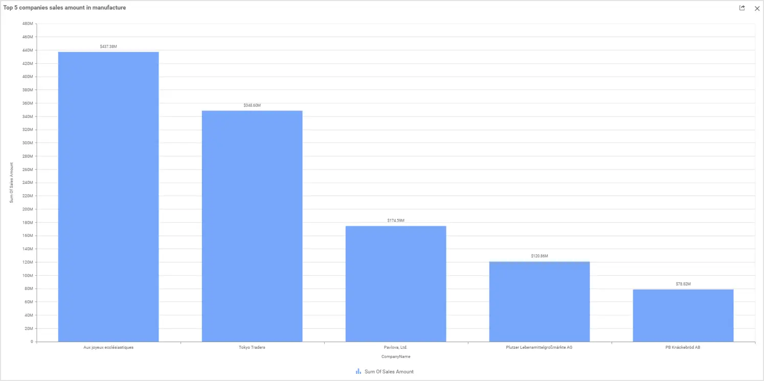
Bar and column charts are used to compare values for a set of unordered items across categories. You can compare the values through horizontal bars or vertical bars ordered vertically or horizontally. The following charts in a Bold BI dashboard showcase the top five categories sold in a food department through horizontal bars and the top five manufacturing companies through vertical bars.
Bar and column charts are suitable for visualizing certain domain related metrics listed in the following table.
| Domain | Metrics |
| Education | Number of students who passed, failed, or did not attend their exams in each subject. |
| Insurance | Performance of annual premium equivalent (APE) in sales based on channel.Cost per claim and days required for settlement. |
| Energy | Energy consumption per month.Production quantity of different types of energy sources (renewable, fossil fuel, and nuclear) for different economic sectors (industrial, commercial, traffic, and residential). |
| Finance | Total accounts receivable and payable aging by due date. |
| Information technology | Total number of requests resolved based on category, like web meeting, phone conversation, and unsupported usage. |
Stacked bar and stacked column charts
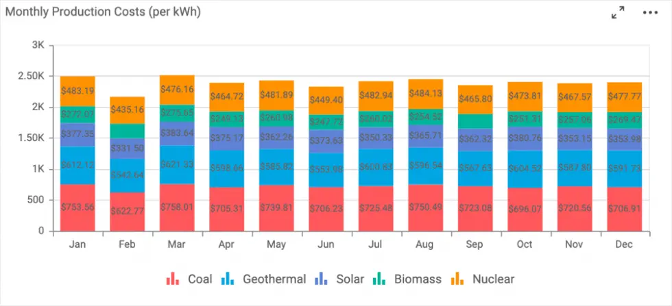
Stacked bar and stacked column charts are used to compare multiple measures through bars stacked one after the other horizontally or vertically. In the following example of a stacked column chart of a Bold BI dashboard, you can see the monthly production costs per kWh in a power plant by department.
Stacked bar and stacked column charts are most importantly useful for visualizing metrics in the corresponding domains listed in the following table.
| Domains | Metrics |
| Energy | Monthly production cost of each source like nuclear, biomass, solar, and coal. |
| Information technology | Support request status for each department. Monthly expenses of each department (administration, development, maintenance, support) |
| Insurance | Claim amount of each policy by year or month. |
| Telecommunications | Network utilization by subscriber by month. |
Pie and doughnut charts
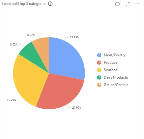
Pie and doughnut charts showcase the proportionality of each item to the total in the form of pie slices or donut slices. The following pie chart in a Bold BI dashboard showcases the least sold top five categories of food products.
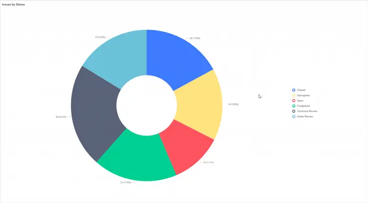
Similarly, the doughnut chart in the following Bold BI dashboard showcases an overview of project statuses such as in progress, open, closed, and under review, which are essential for monitoring by IT operations managers.
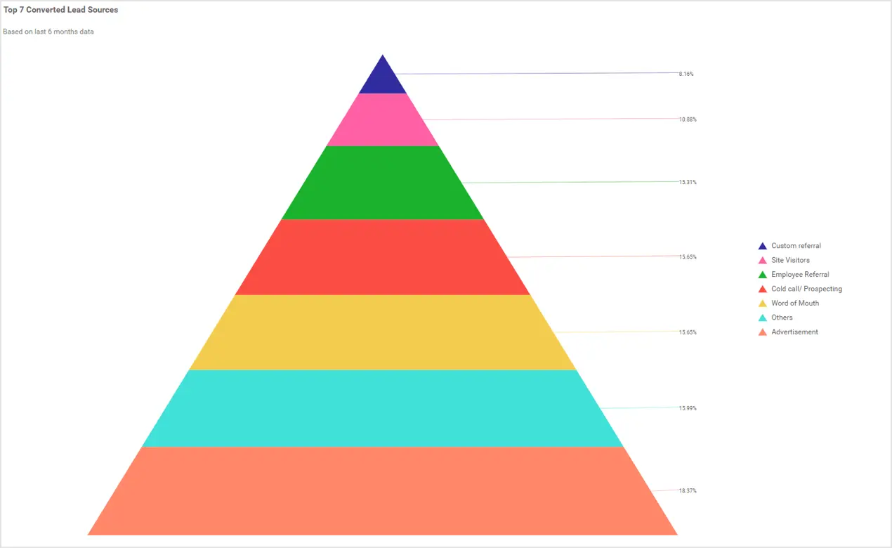
Pyramid chart
A pyramid chart allows you to make proportional comparisons between related groups of data showcased in a progressively increasing manner from top to bottom in terms of quantity or size. In the following example, the top seven converted lead sources for a product are showcased in a pyramid chart.
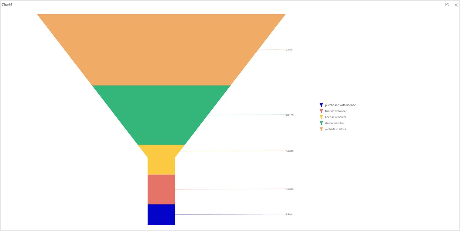
Funnel chart
A funnel chart shows values across different stages with different colors in a progressively decreasing manner from top to bottom. In the following example, the funnel chart showcases the visitor-to-customer conversion on a website.
These proportion charts are applicable to visualizing certain metrics of the corresponding domains listed in the following table.
| Domains | Metrics |
| Education | Library book availability, exam results statistics, and school improvement grants by category. |
| Energy | Average energy consumption numbers for different economic sectors (industrial, commercial, traffic, and residential). |
| Insurance | Insured amount based on policy claim type (disability, accident, travel, home, life, health, and investments). |
| Healthcare | Patient satisfaction ratings, like excellent, good, average, and bad. |
| Marketing | Top five revenue sources by website traffic type (campaign, direct, display, organic, paid, referral, and social). Percentage of customer acquisition. |
| Sales | Sales pipeline. |
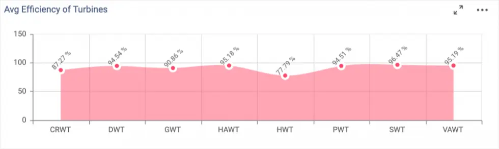
Area chart
An area chart is best used to compare values for a set of unordered items across categories by visualizing them with filled curves. In the following illustration of an area chart in a Bold BI dashboard, the average efficiency of types of turbine is showcased.
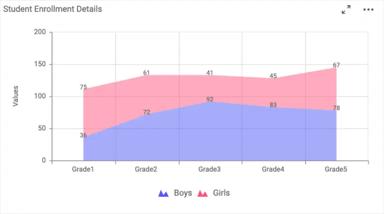
Stacked area chart
A stacked area chart allows you to compare multiple measures through filled curves stacked one atop another. In the following example, it is easy to compare the overall number of students enrolled by grade.
Area and stacked area charts are good for visualizing certain metrics related to the corresponding domains listed in the following table.
| Domain | Metrics |
| Education | Student enrollment statistics by grade for each gender. |
| Marketing | CTR rating based on website traffic sources (campaign, direct, display, organic, paid, referral, and social). |
| Telecommunications | Network delay time, throughput time, roundtrip time, jitter, setup time, and bit rate. |
| Manufacturing | Uptime and downtime of production for each unit. |
| Government | Domestic motor vehicle accidents per month. |
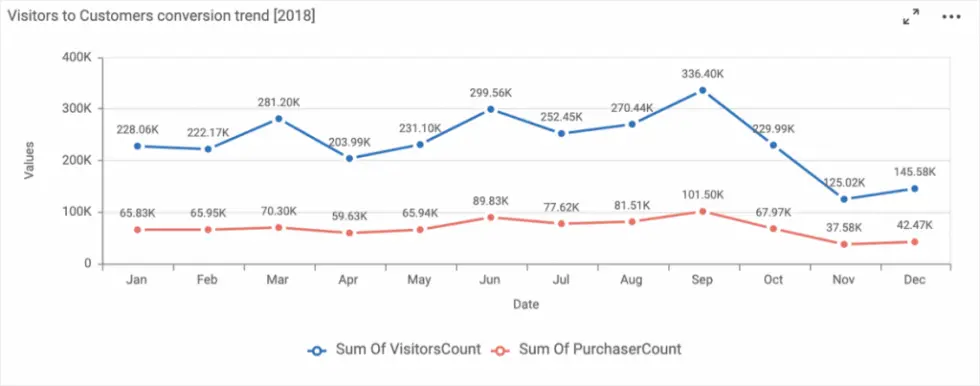
Line and spline charts
Line and spline charts are good for analyzing trends over a period of time with data points connected using straight lines or splines. In the following example, users can analyze a monthly breakdown of the number of website visitors versus purchasers. Also, This information could help the company ensure that employee and marketing resources are used efficiently.
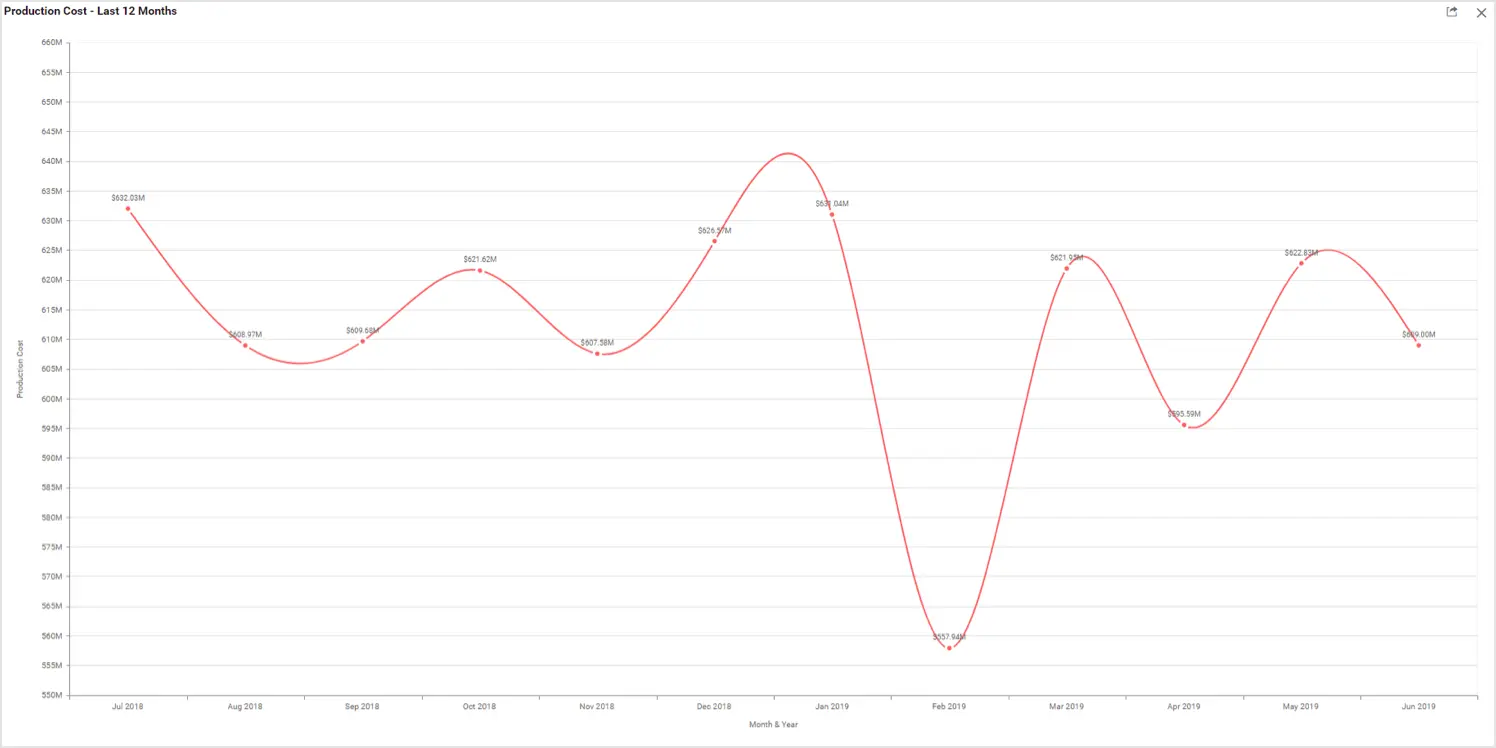
The following spline chart showcases the production costs for the previous 12 months. You can easily track the expenses of your production month to month.
Line and spline charts are an appropriate fit for visualizing metrics related to the domains listed in the following table.
| Domain | Metrics |
| Healthcare | Average patient stay duration by department and average patient wait time by department. Patient sleep rate like sleep hours and deep sleep hours per day. |
| Information Technology | Investment and revenue amount distribution by month. |
| Insurance | Customer feedback for each policy by year or month. |
| Manufacturing | Production cost and downtime by month. |
| Marketing | Lead conversation rate, bouncing average, new visitors average, dormancy rate, and session rate by month. |
| Telecommunications | Network delay time, throughput time, roundtrip time, and bit rate for a time period. |
Conclusion
We hope this article helps you choose the right widget to visualize your data. If you have any questions on this blog, please feel free to post them in the following comment section. Get started with Bold BI® by signing up for a free trial and create more interactive business intelligence dashboards. You can also contact us by submitting your questions through the Bold BI website or, if you already have an account, you can log in to submit your support question.