


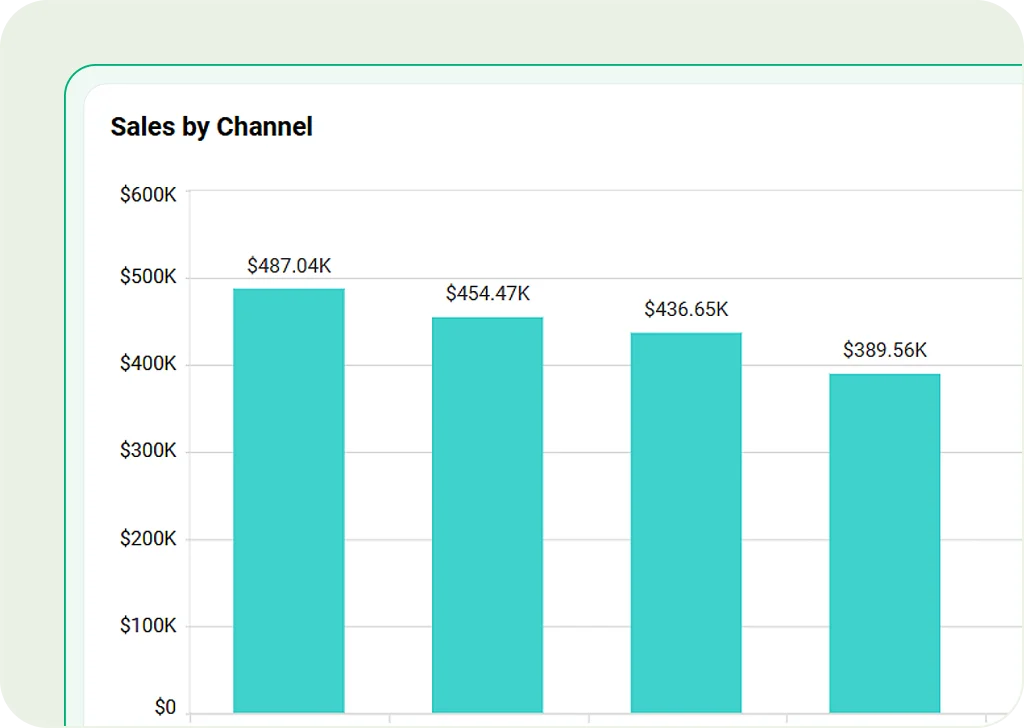
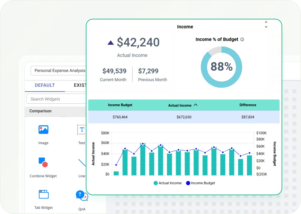
Column Chart
Use vertical bars to compare values across categories. Great for showing performance, revenue trends, or survey results.
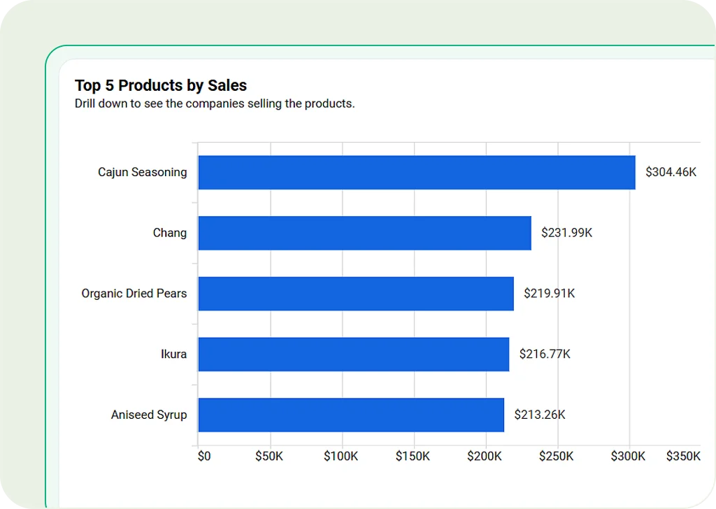
Bar Chart
Use horizontal bars to easily compare different categories. Best for ranking data or competitive analysis.
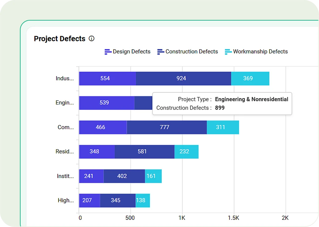
Stacked Bar Chart
Show data groups stacked in one bar. Useful for segment analysis, sales breakdowns, or comparing parts of a whole.
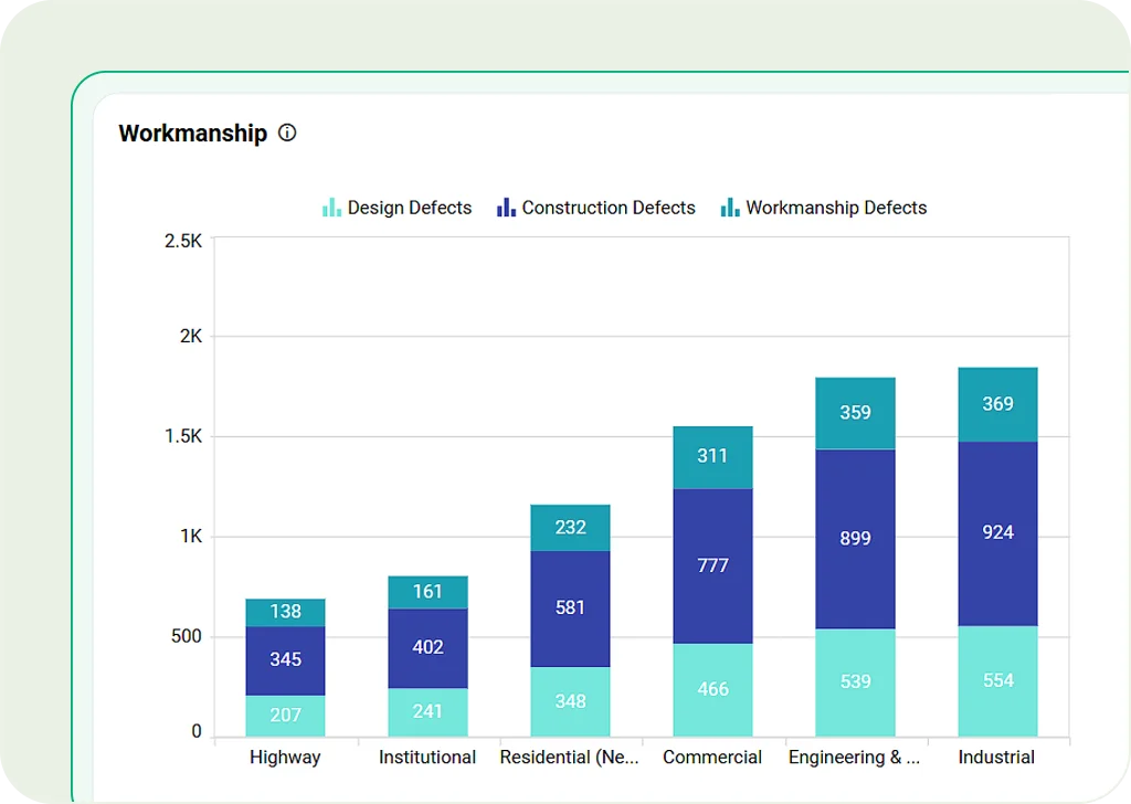
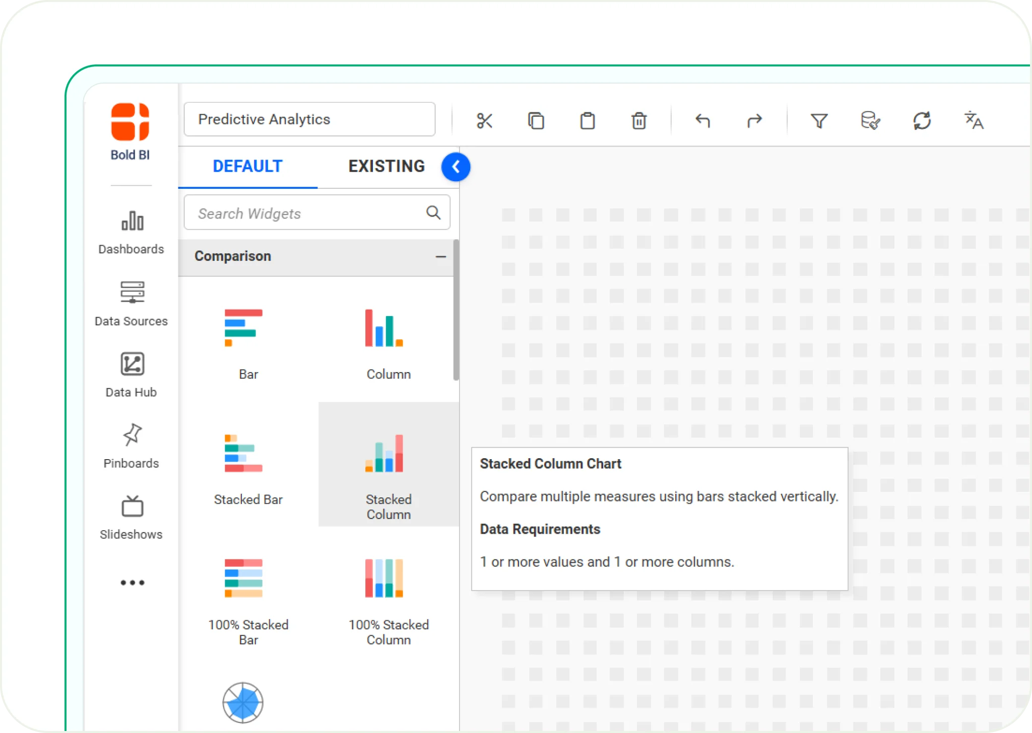
Stacked Column Chart
Like stacked bars, but arranged vertically for better clarity. Good for tracking grouped data changes over time.
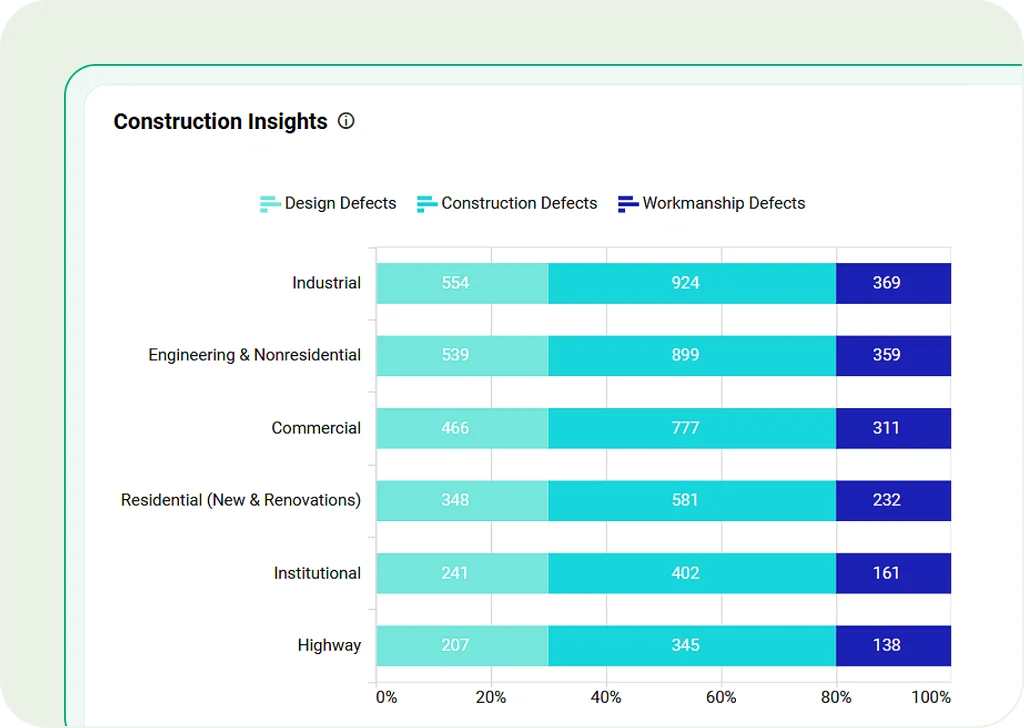
100% Stacked Bar Chart
Each bar shows parts of a whole (100%). Best for comparing proportions, like customer segments or demographics.
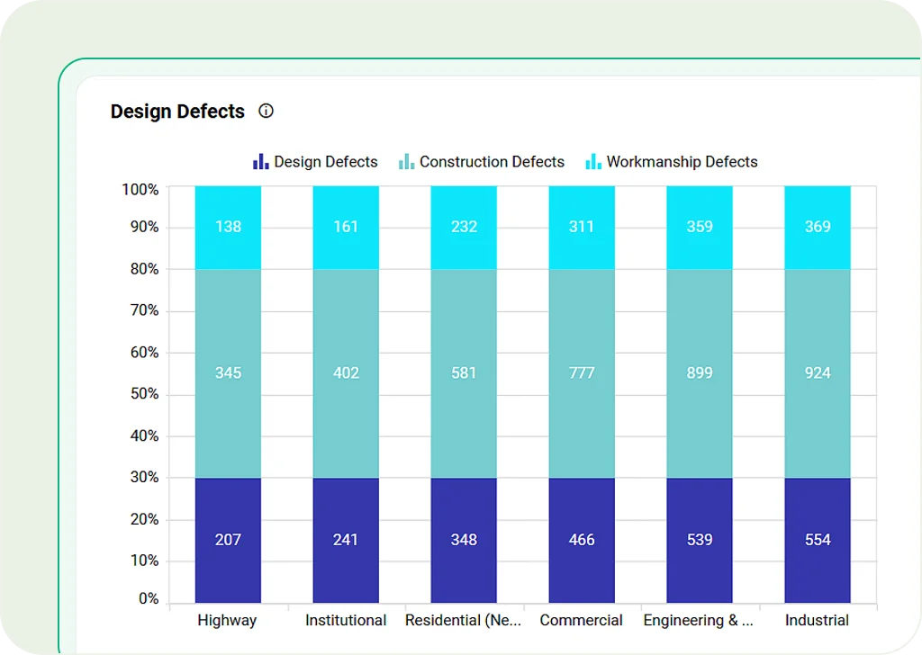
100% Stacked Column Chart
Vertical version of the 100% stacked bar chart. Helps clearly show how data is split into percentages.
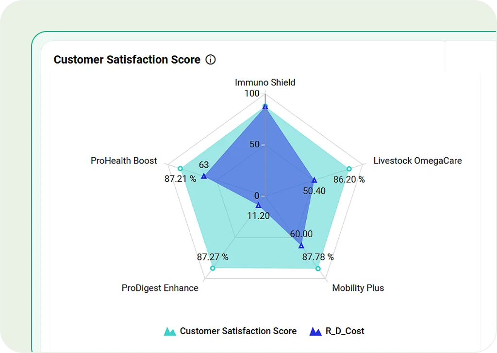
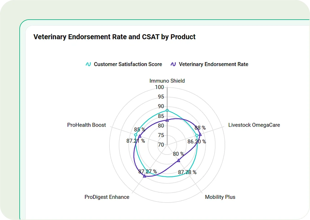
Radar Chart
Use a circular layout to visually compare performance across various categories.
Polar Chart
Show complex data in a circle. Great for comparing things like skills or risk levels.
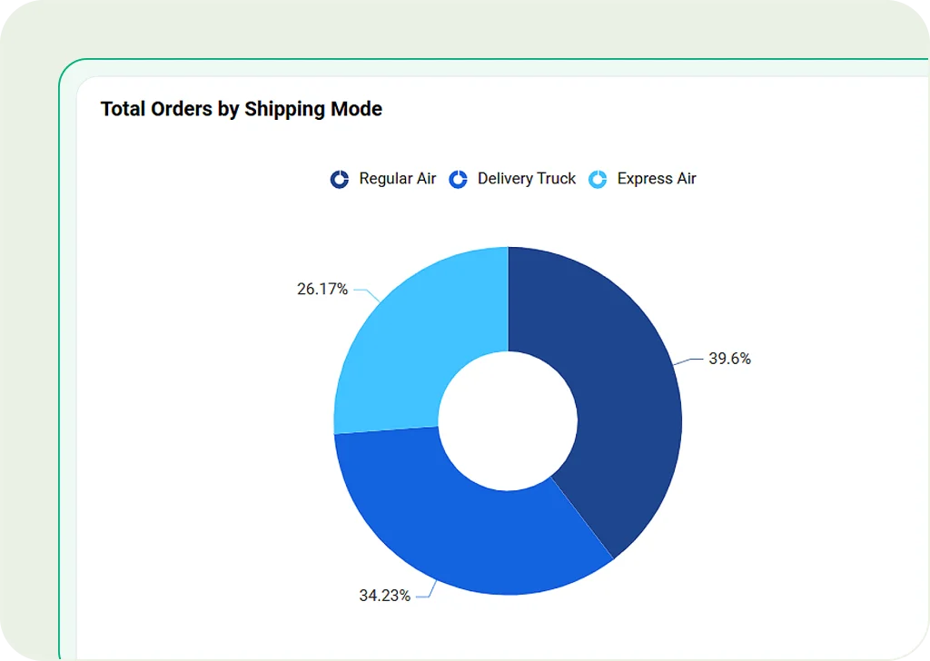
Doughnut Chart
A variation of pie charts with a hollow center, making it easier to compare multiple datasets.
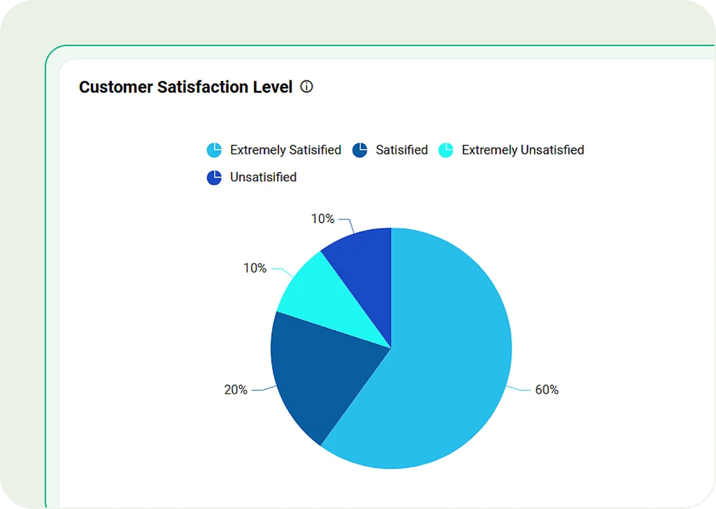
Pie Chart
Show parts of a whole clearly in a circle. Best for market share, budget splits, or customer groups.
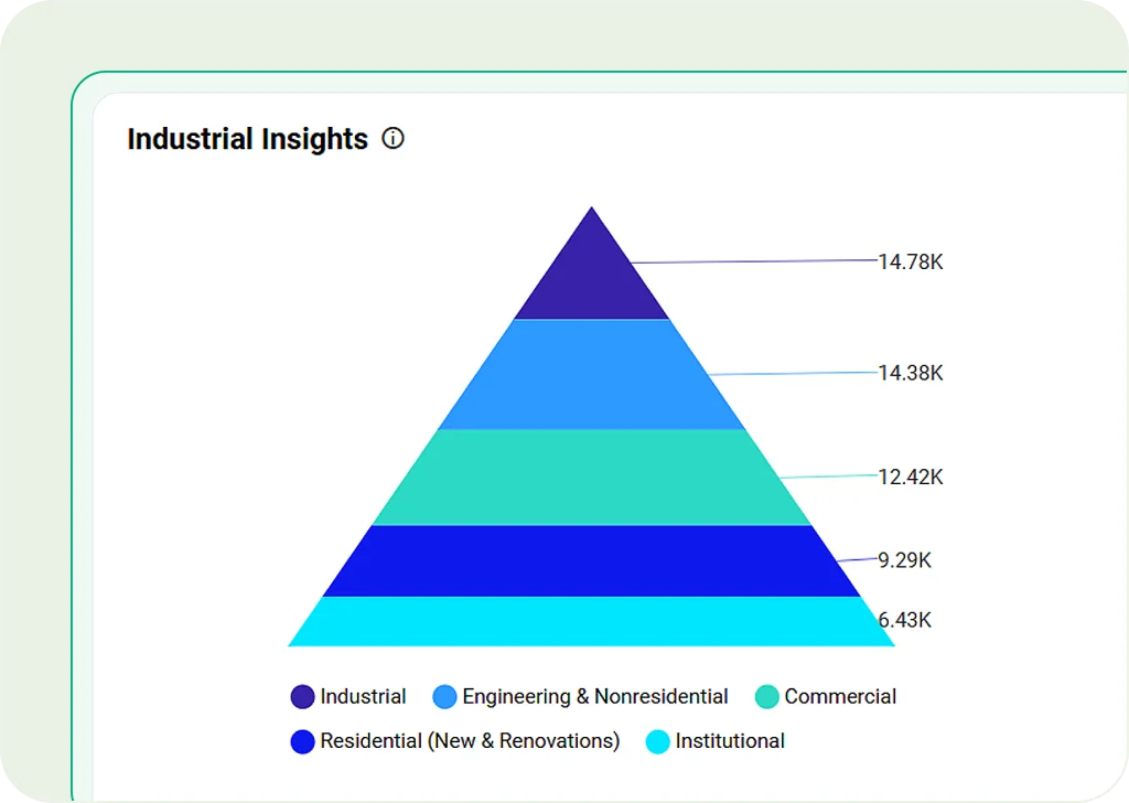
Pyramid Chart
Display data in a pyramid shape. Ideal for showing hierarchies, demand, or marketing funnels.
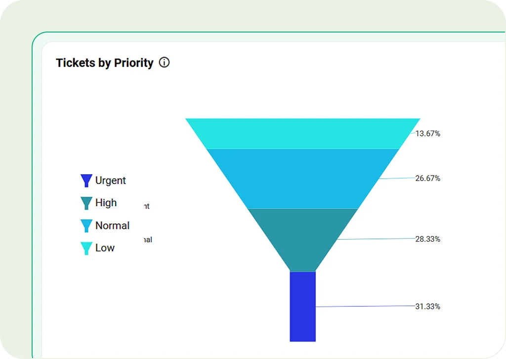
Funnel Chart
Track values through steps in a process. Useful for sales conversions or lead tracking.
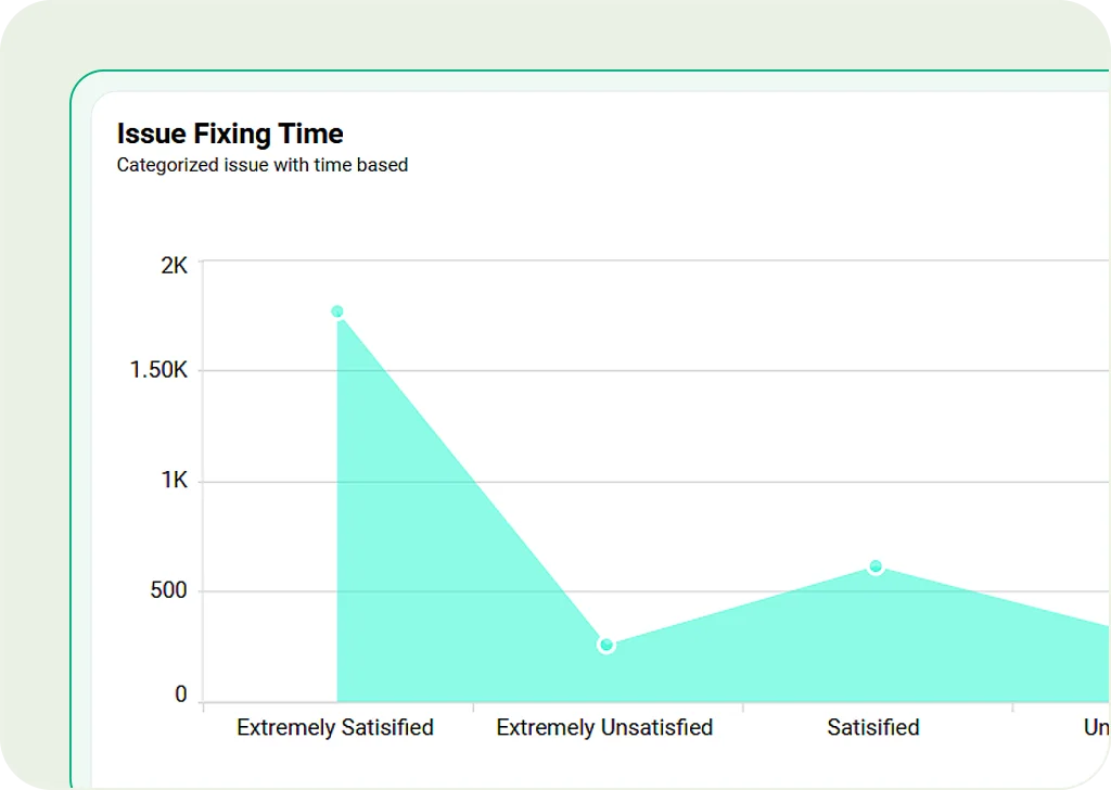
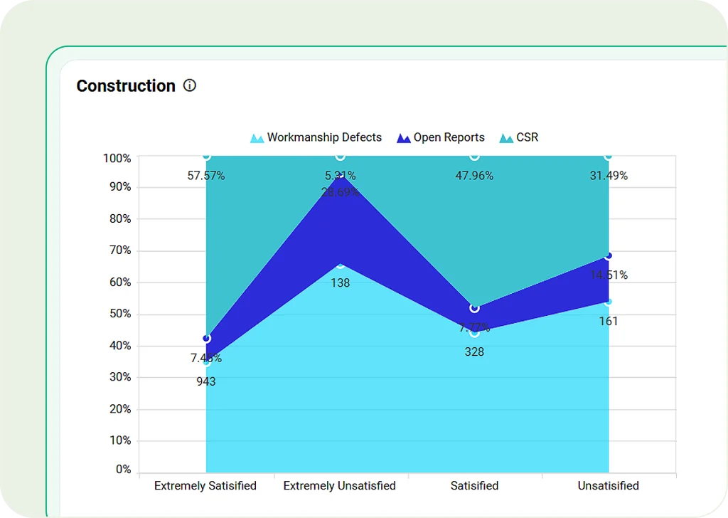
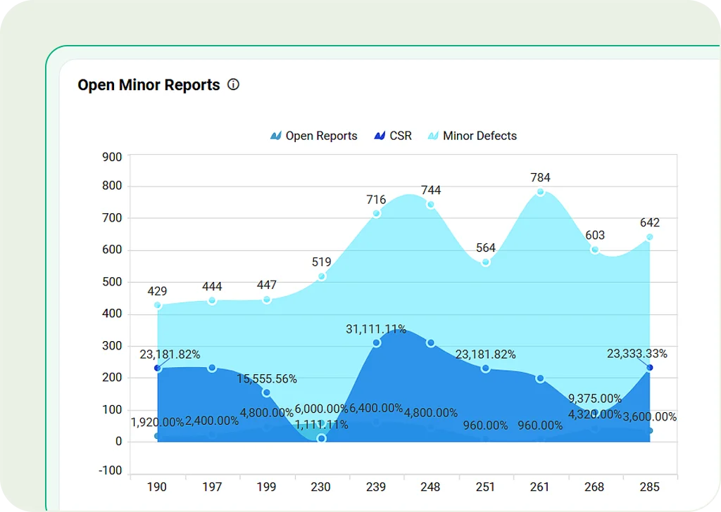
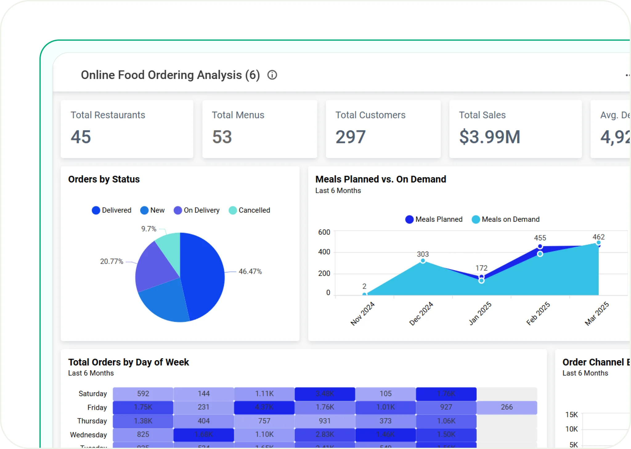
Area Chart
Fill the space under a line to show trends over time. Great for revenue growth, stock performance, or website traffic.
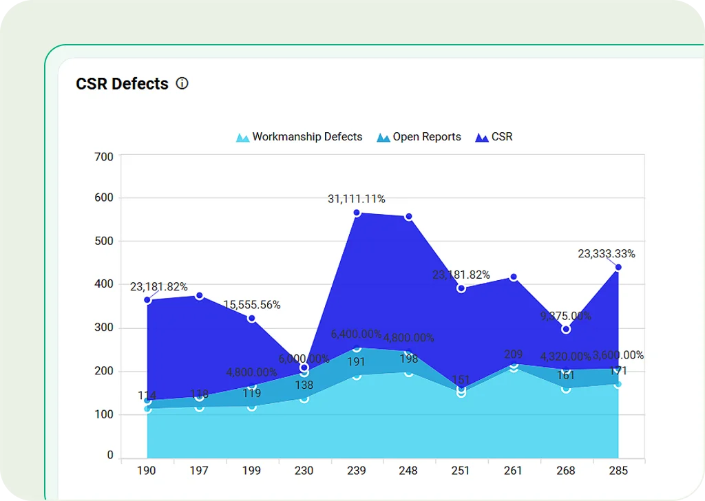
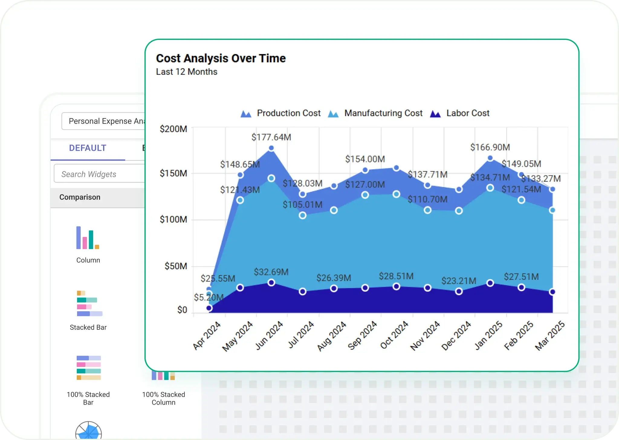
Stacked Area Chart
Stack layers together to show multiple data groups over time. Best for tracking total values like regional sales.
100% Stacked Area Chart
Similar to stacked area charts, but it shows proportions as percentages. Great for market studies and financial forecasts."
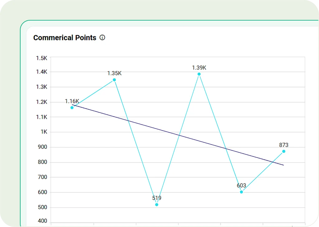
Line Chart
Connect points with a line to show trends. Perfect for tracking growth, temperature changes, or stock prices.
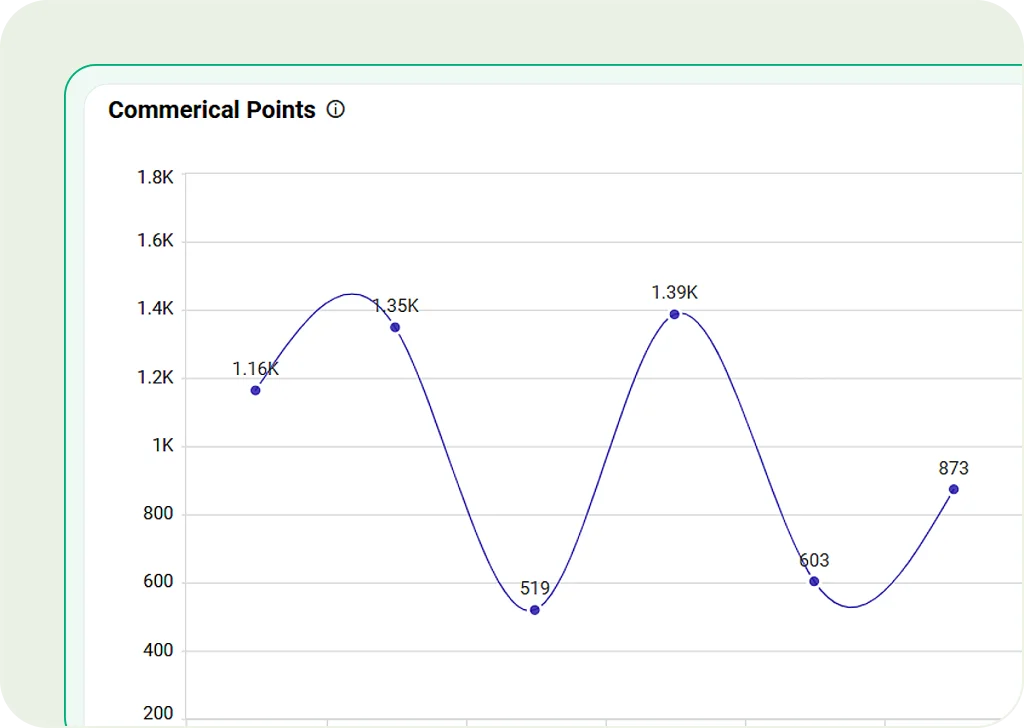
Spline Chart
A smoother version of a line chart. Great for showing continuous data like revenue or engagement.
Spline Area Chart
Mix spline and area charts. Highlights trends with smooth curves and filled areas.
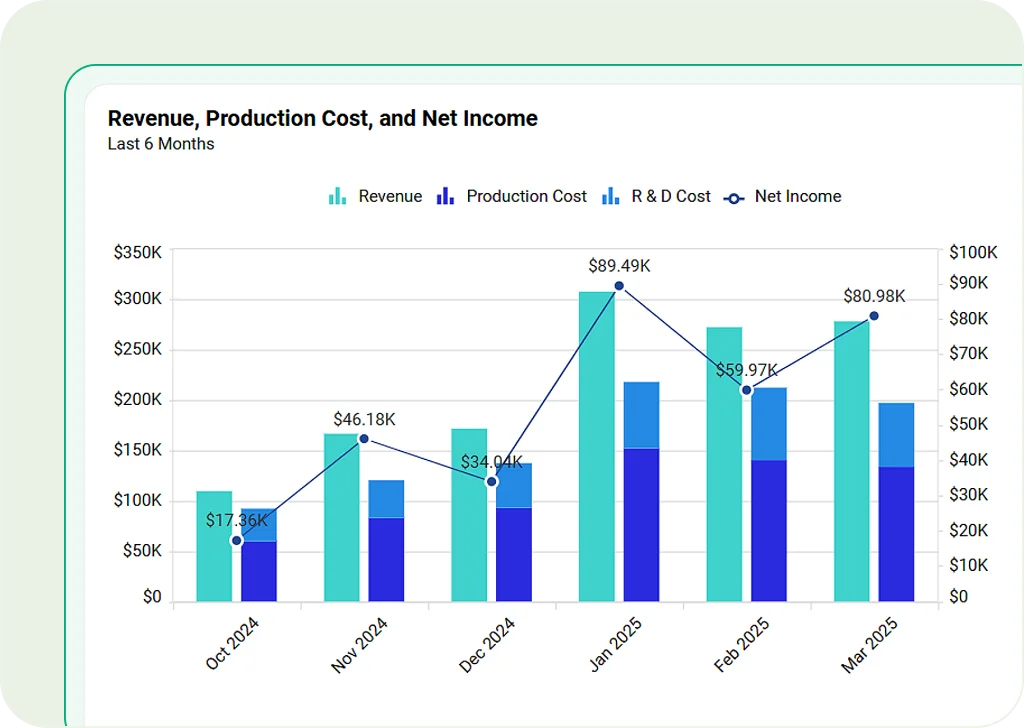
Combination Chart
Display multiple types of charts within a single visualization to compare different data trends simultaneously.
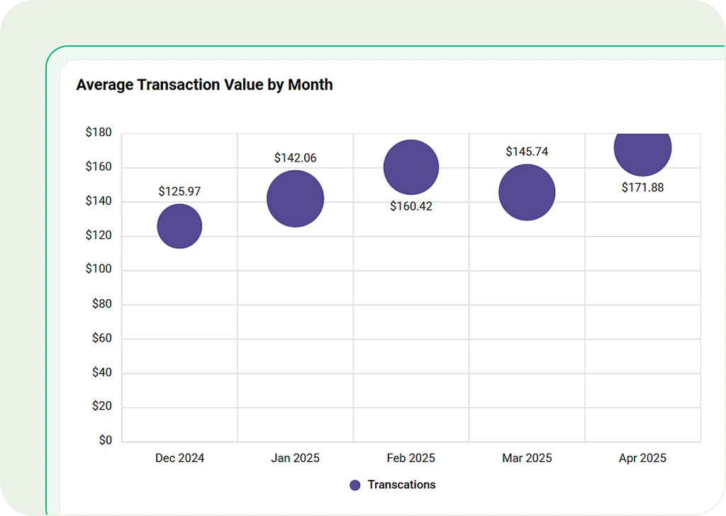
Scatter Chart
Plot points to show relationships between two numbers. Useful for finding patterns, risks, or doing research.
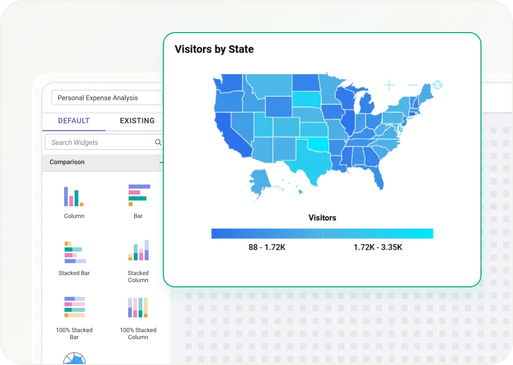
Map
Show geographic data using color-coded values. Great for regional sales, population density, or event locations.
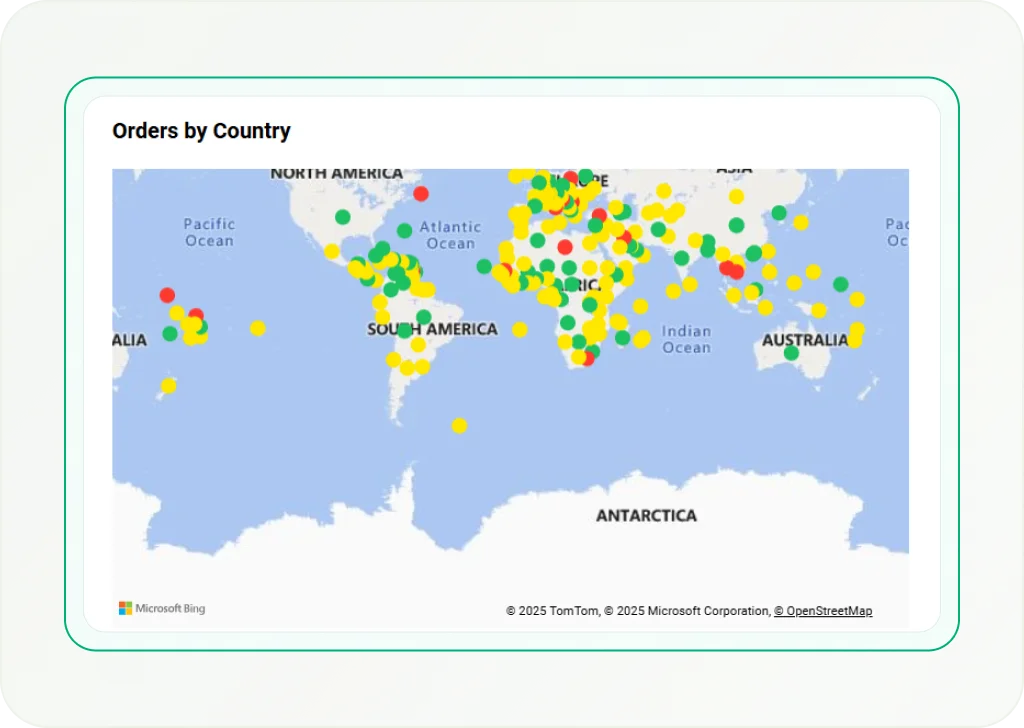
Bing Maps
Use high-quality Bing-powered maps to show data points by latitude and longitude. Helpful for getting accurate location insights.
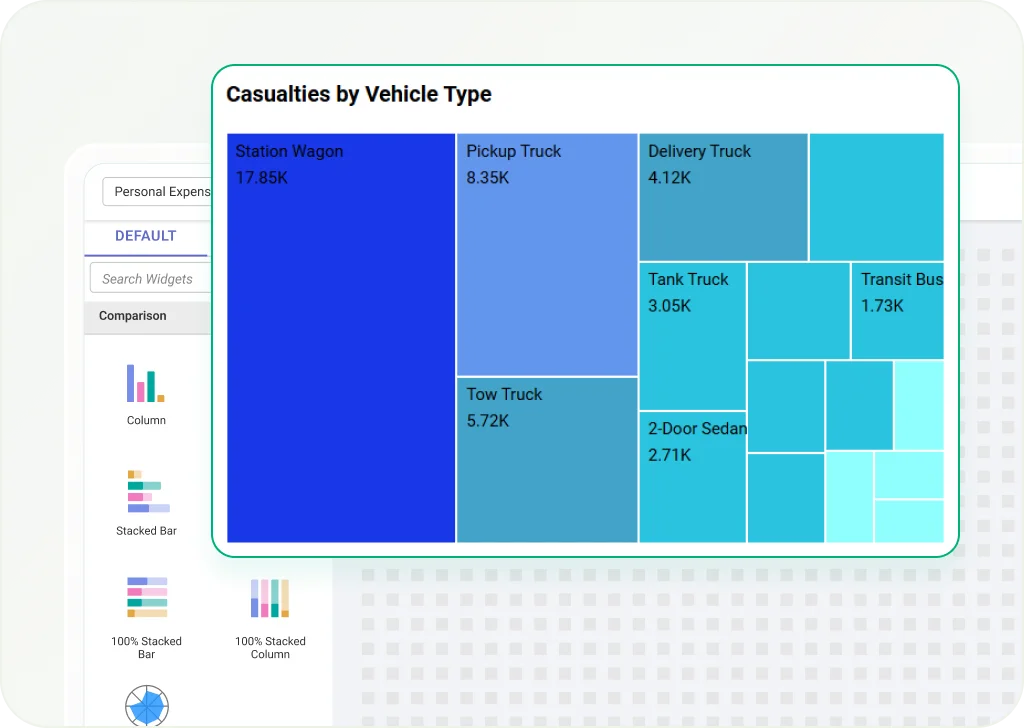
Tree Map
Show hierarchical data with nested rectangles. Ideal for financial reports, product performance, or market breakdowns.
Heat Map
Use colors to show data intensity and patterns. Best for spotting trends in customer behavior, sales, or system activity.
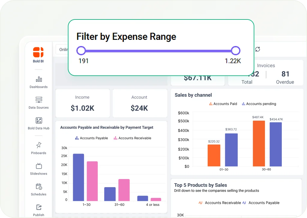
Range Slider
Let users filter data by selecting value ranges. Ideal for date or number filters in dashboards.
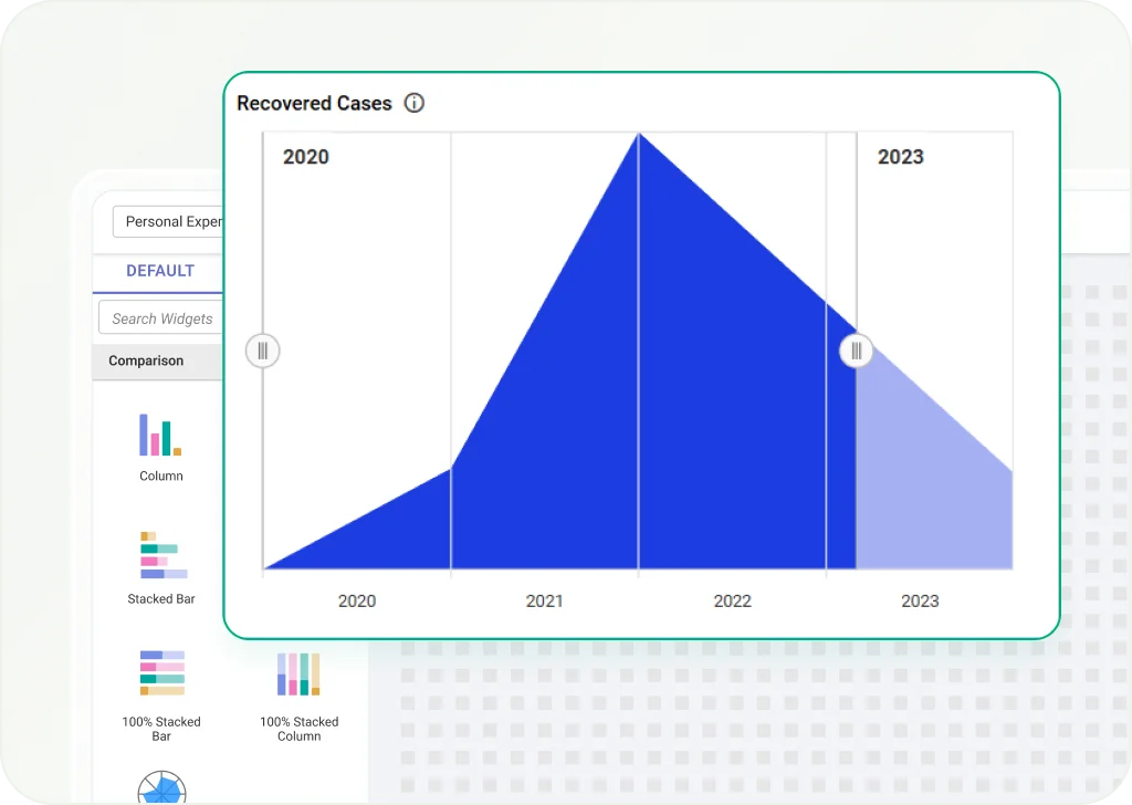
Range Navigator
Shows a small preview of data trends and lets users pick a smaller range for closer analysis.
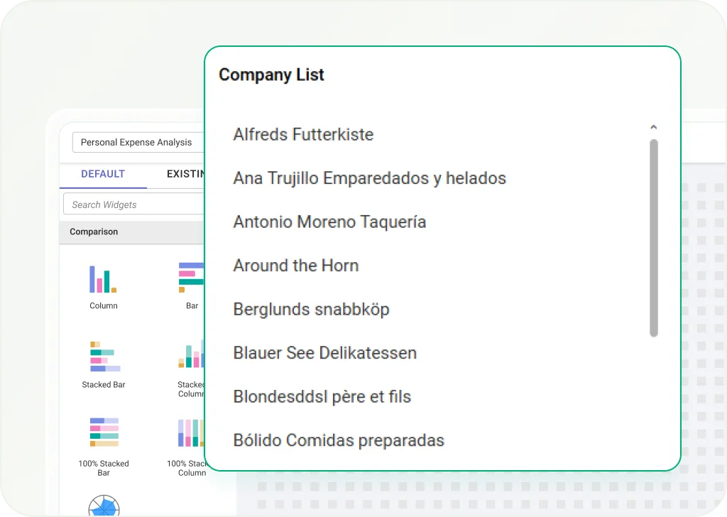
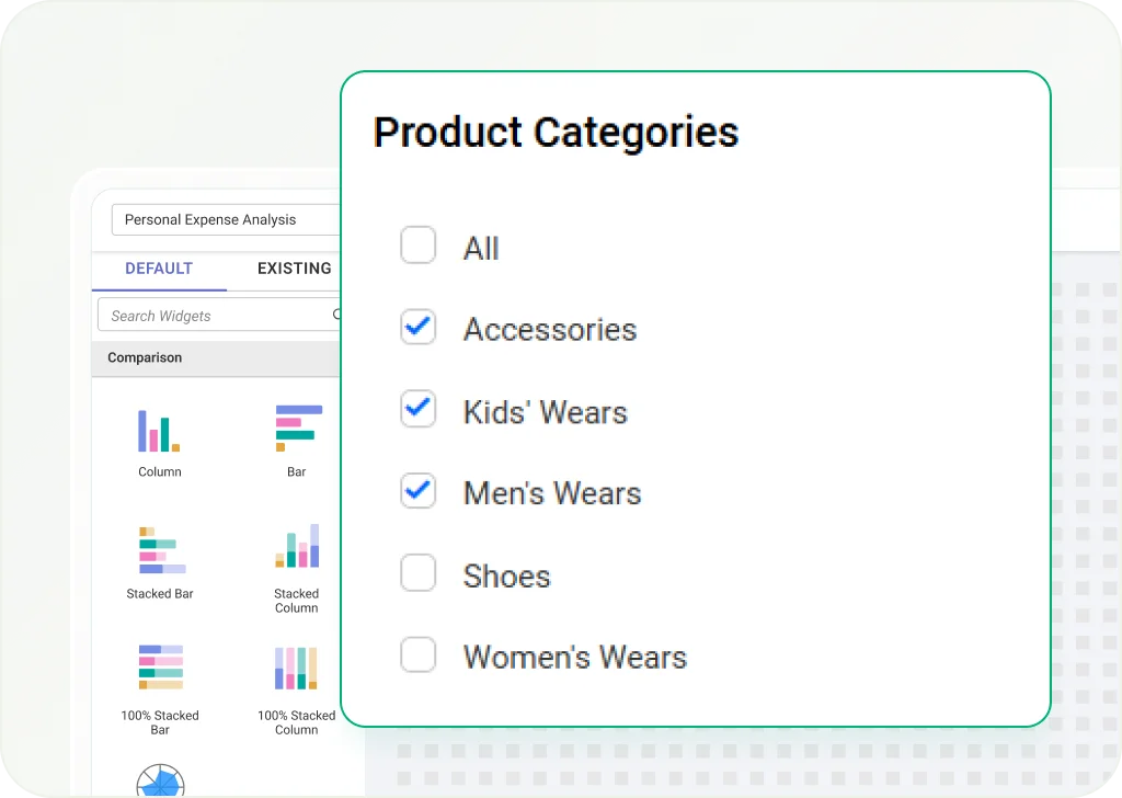
List Box
Displays a list of items users can choose from to filter data. Best for selecting categories, products, or regions.
Combo Box
A dropdown list that lets users pick from several filter options. Helps make dashboards more flexible.
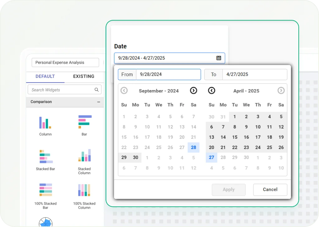
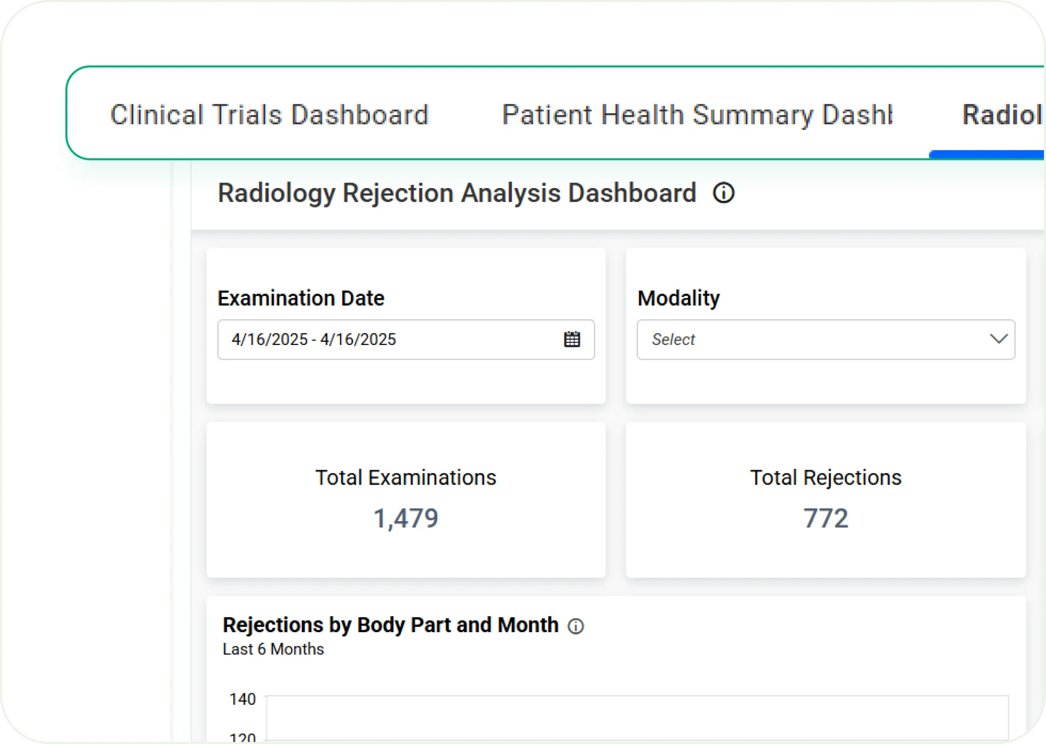
Date Picker
Allows users to select specific dates or date ranges to filter time-based data in dashboards.
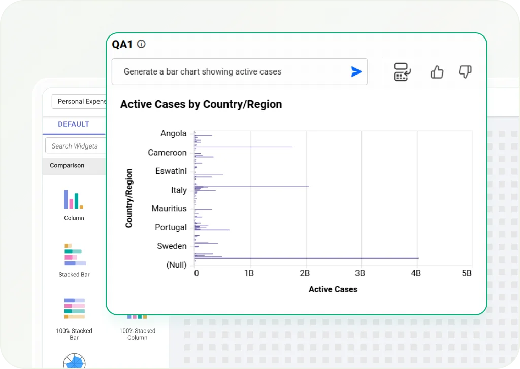
Q&A
Uses AI to answer natural language questions and give quick insights from your data.
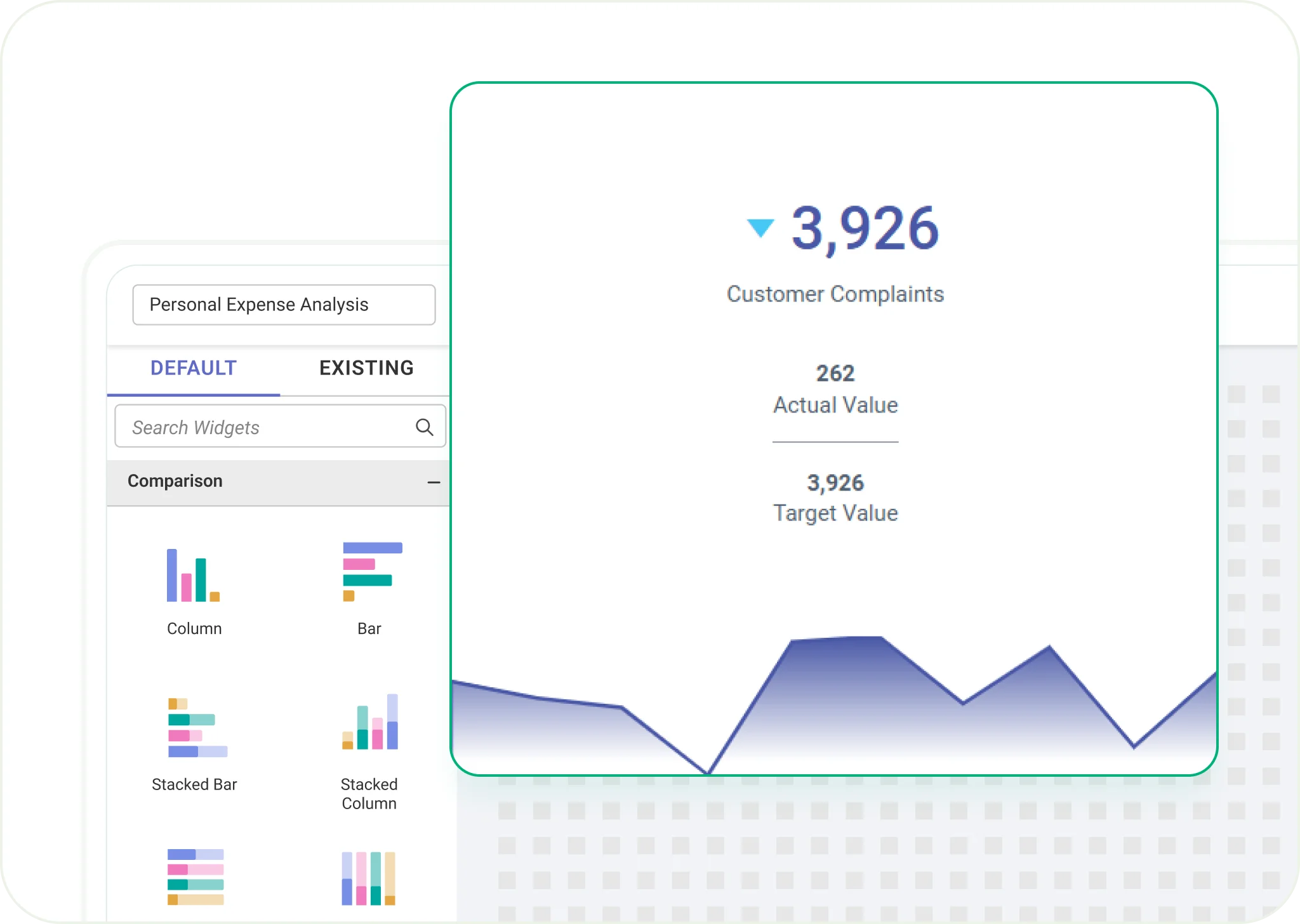
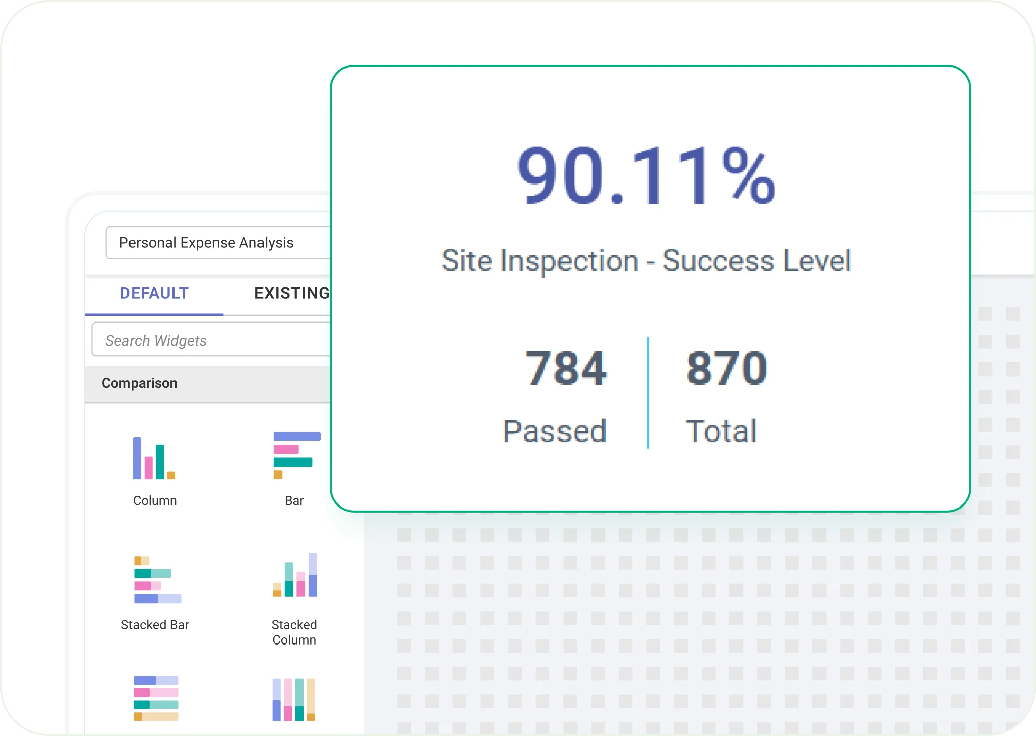
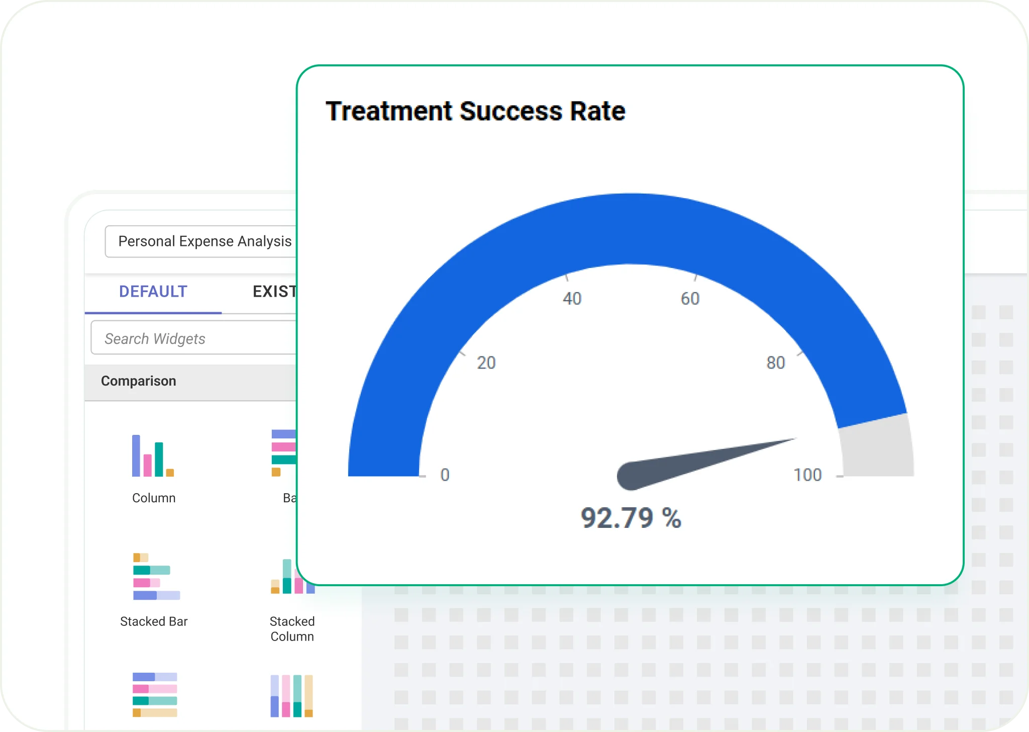
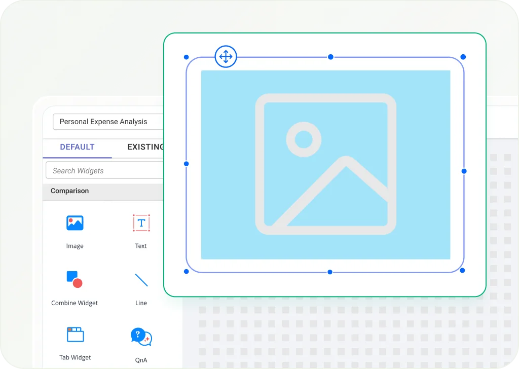
Image Widget
Add static or dynamic images to dashboards for better context and branding.
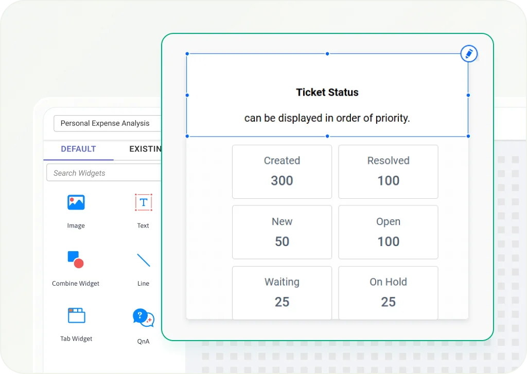
Text Widget
Use rich text for labels, descriptions, or custom messages inside dashboards.
Combine Widget
Group several widgets into one container to keep the layout organized.
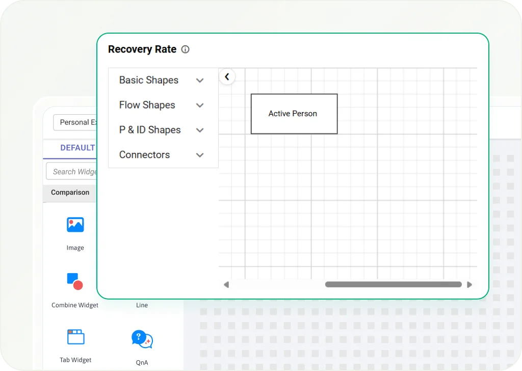
Custom Widgets
Integrate Syncfusion controls or JavaScript components for a tailored analytics experience.
UI Interactivity
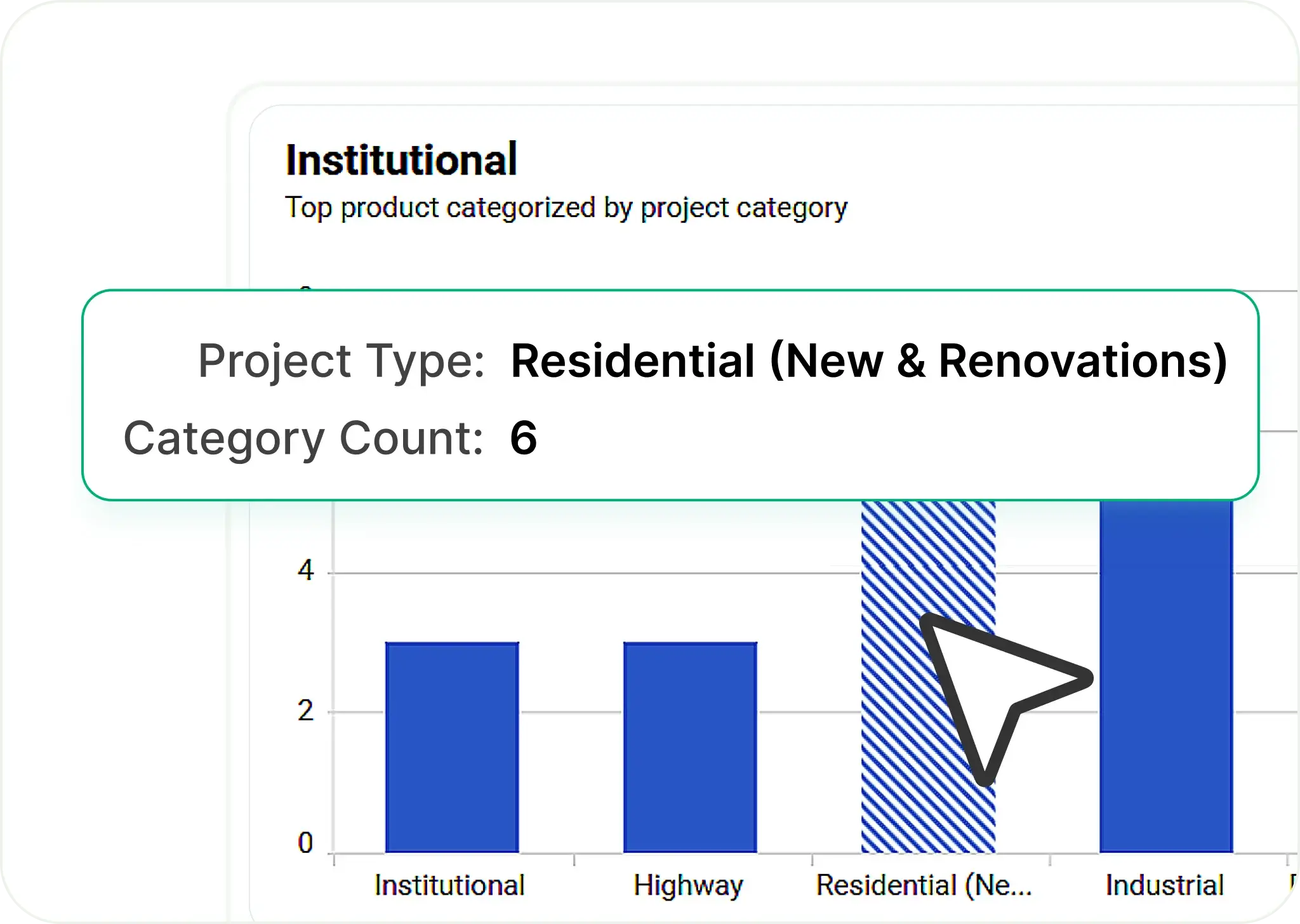
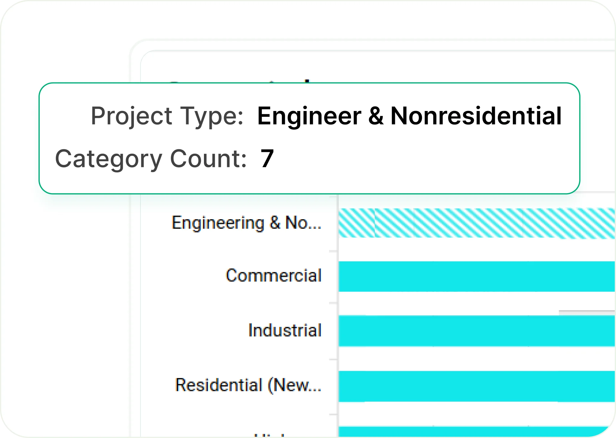
Drill-Down
Drill-Up
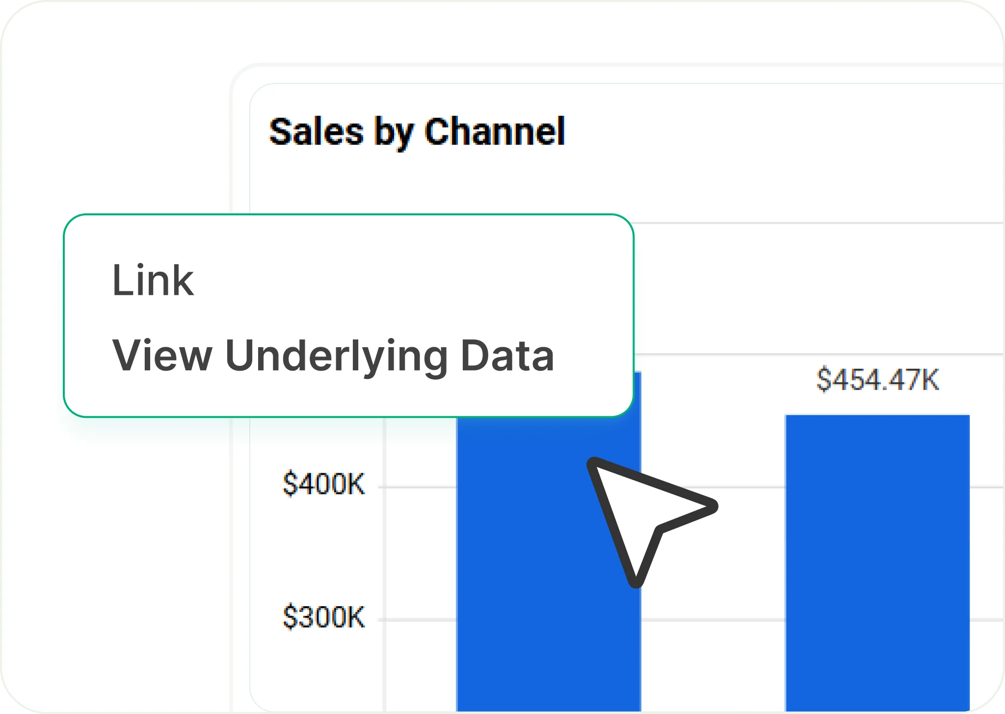
Linked Analytics & Reports

Custom Visualizations