Visualizing Sales Success with Bar Graphs

Visualizing sales performance with large datasets can be daunting, but bar graphs can greatly simplify this task. They effectively present and compare data, making it easier to detect trends and make informed decisions. By understanding and applying bar graph principles, businesses can uncover key sales metrics and enhance sales strategies for success.
Bar graphs
A bar graph is a visualization tool that uses horizontal bars to represent and compare quantities or frequencies of different categories. The bar length corresponds to the value it signifies. The following image shows a bar graph.
How bar graph visualization promotes sales performance
Understanding your metrics leads to changes that improve performance.
Data comparison: They compare sales data across several items, locations, times, or periods, assisting in identifying top performers and potential development areas.
Trend identification: Bar graphs make it easy to visualize sales trends, like seasonal swings or growth patterns, which allows for proactive decision-making and plan modifications.
Goal tracking: Bar graphs make it easy to evaluate progress and inspire sales teams to meet goals since they clearly depict sales goals and targets.
Sales team motivation: Bar graphs may enhance morale and promote healthy competition among salespeople by showing individual and team successes.
Categorical representation: Bar graphs enable clear and easy comparison of discrete categories or groups within a business dataset, easing interpretations.
Benefits of using bar graph visualization in business
Effective communication
Bar graphs are a great way to analyze complex datasets and communicate results to stakeholders and team members in an easy-to-understand visual format.
Increased efficiency
Using bar graphs can help businesses identify areas of inefficiency and waste, leading to improved processes and increased productivity.
Better resource allocation
By visualizing data in bar graphs, businesses can identify areas of their operations that are underperforming and allocate resources accordingly, improving overall efficiency and profitability.
Competitive advantage
Businesses can gain a competitive advantage by leveraging bar graphs to analyze and visualize data that highlight opportunities and trends before competitors.
Bar graph visualization for sales performance success
The following are examples of key sales performance metrics that can be depicted with bar graphs.
Top 5 countries by sales
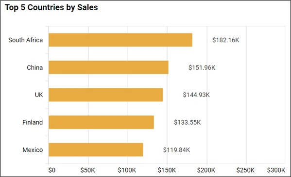
This metric provides a clear visual comparison of sales performance to help identify key markets and growth prospects. This visual aids strategic planning and resource allocation.
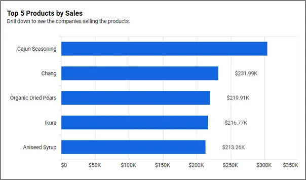
Top 5 products by sales

This metric helps a business optimize its marketing strategies, manage inventory efficiently, and devise growth strategies. This leads to enhanced business performance.
Top 5 opportunities by win probability
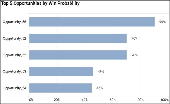
This metric represents possible deals with the highest likelihood of success, enabling targeted sales efforts and higher conversion rates. This data-driven strategy optimizes the allocation of resources and acquisition revenue.
Monthly sales performance: units ordered

This metric provides a quantifiable measure of monthly sales volume, enabling managers to track performance, manage inventory, and plan future sales strategies.
Sales by month
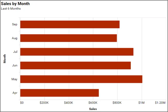
This metric shows a monthly revenue overview for sales trend analysis.
Business intelligence (BI) boosts sales by offering key insights for data-driven decisions. Syncfusion’s Bold BI® provides customizable bar chart visuals in sales dashboards for efficient tracking and communication of metrics.
How BI helps in sales performance growth
With bar charts as an important component, BI dashboards can enhance sales performance through:
- Customer analysis: BI provides customer insights, allowing sales teams to tailor strategies and boost sales.
- Inventory management: BI assists businesses in inventory management and demand forecasting by visualizing inventory levels and sales data.
- Real-time updates: BI dashboards offer real-time data updates, enabling sales teams to make prompt decisions in response to market changes.
- Customer feedback analysis: BI uses customer feedback data to identify where improvements are needed, track satisfaction, and tailor marketing campaigns.
- Cost analysis: BI can incorporate sales-related cost data, with bar graphs and other charts visualizing the cost-sales relationship, aiding businesses in optimizing their cost-to-revenue ratio.
In conclusion, using bar graphs for sales analysis allows businesses to turn complex BI data into useful insights for strategic planning. This visualization technique simplifies data comparison and highlights trends and patterns.
If you have any questions or need assistance, don’t hesitate to reach out through the Bold BI website; simply log in to submit your inquiries if you already have an account. If you’re not yet a customer, get started with Bold BI now by signing up for a free trial!