
Harnessing the Power of Stax Bill Data Through Visualization

Introduction
Searching for a way to streamline subscription billing and revenue management? Stax Bill (formerly Fusebill) integration is a solution chosen by many companies. Stax Bill seamlessly integrates its subscription billing platform into your existing systems, offering complete control over billing operations and revenue optimization. Now, you can easily integrate your Stax Bill data with Bold BI® to track key metrics such as subscriptions and invoices, enabling you to gain insights into your organization’s strengths and weaknesses. This blog will guide you on how to integrate Stax Bill data with Bold BI and showcase it in a dashboard.
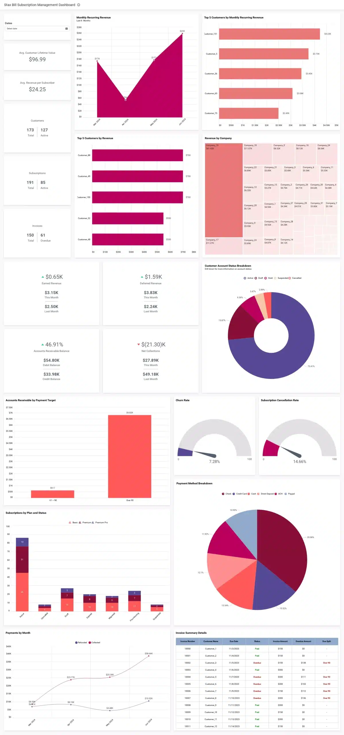
To follow along with this blog, you’ll need to have a Stax Bill account with your company or client details.
How to extract data from Stax Bill
Stax Bill provides REST APIs for users to analyze and retrieve data stored in their Stax Bill accounts. Utilize the following table to link to Stax Bill data and establish a data source using suitable APIs.
| Endpoints | Used for |
| GET https://secure.fusebill.com/v1/aractivities | Getting the complete list of accounts receivable accounting transactions within a specified date range. |
| GET https://secure.fusebill.com/v1/customers | Getting the list of customers. |
| GET https://secure.fusebill.com/v1/NetEarned | Getting the values for the net earned revenue summary list. |
| GET https://secure.fusebill.com/v1/invoiceSummaries | Getting the list of summarized invoices. |
| GET https://secure.fusebill.com/v1/PaymentActivities/GetByAccountID | Getting the list of payment activities across a Stax Bill account. |
| GET https://secure.fusebill.com/v1/subscriptions/getAll | Getting the list of all subscriptions. |
Connecting Stax Bill data to Bold BI
The Bold BI dashboard designer lets you connect Stax Bill web services through a REST API. To configure the Stax Bill data source:
- Click the data source button on the dashboard home page to navigate to the data source creation page.
- In the data source pane, click CREATE NEW to begin a new data source connection.
- Choose the Stax Bill connection from the list of data connectors in the connection panel under Finance.
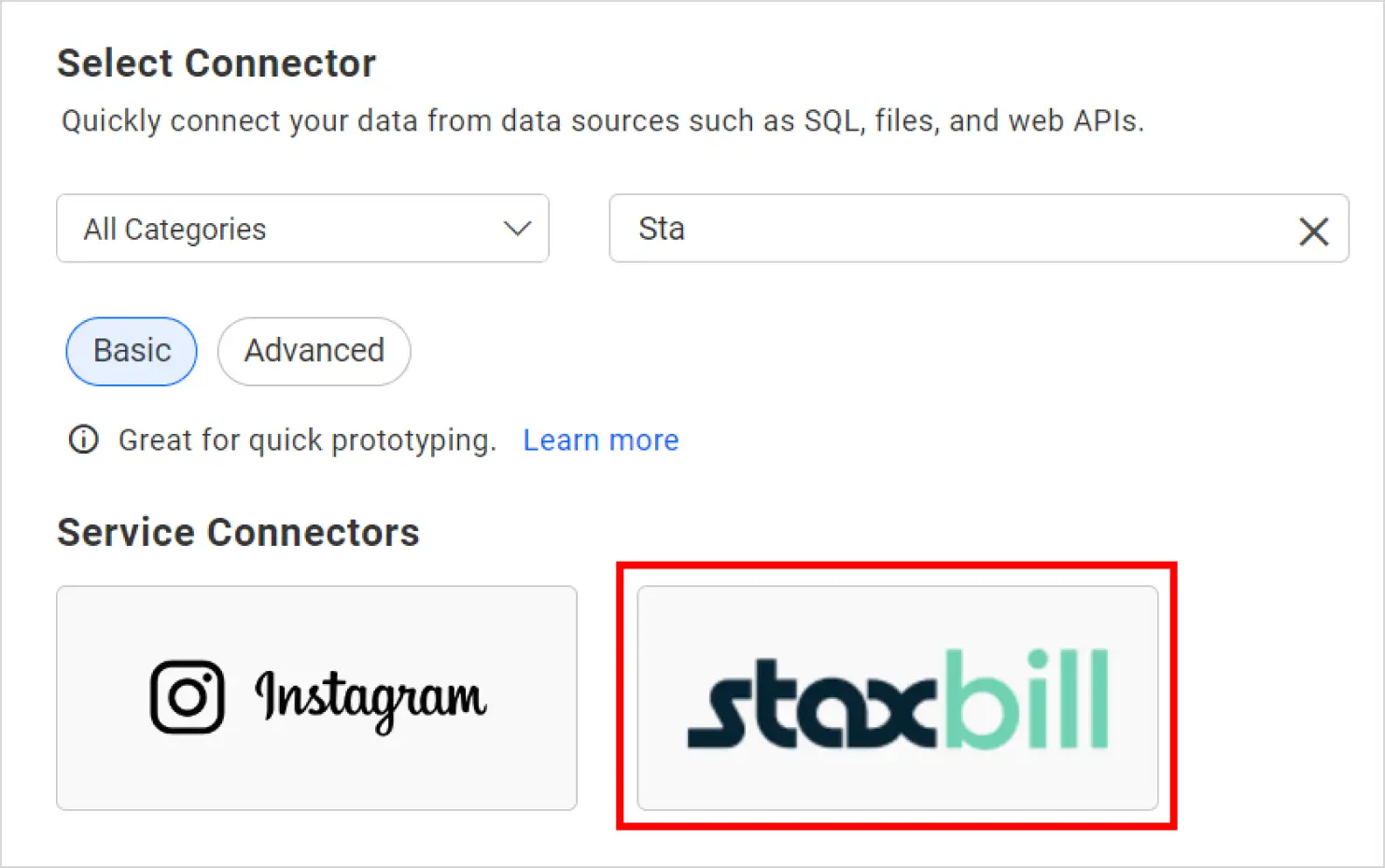
Data source connecting panel - The Stax Bill data connection window will be displayed in the panel. Enter a valid name for the Stax Bill data source and provide a description (optional).
- Enter a valid Stax Bill REST API endpoint in the URL text box and leave the default value, GET, for the for the REST API in the Method section. Refer to this Stax Bill for more details.
- Add an authentication key and value under the headers. Set Authorization as the value of the key and Bearer <APIKey> as the value of the header. Learn more about Stax Bill.
- Set the time interval for the refresh settings so that the dashboard can automatically refresh itself with the latest data updates.
- Let the data format be JSON since all REST API endpoints return results in JSON format. Choose None under Authentication Type.
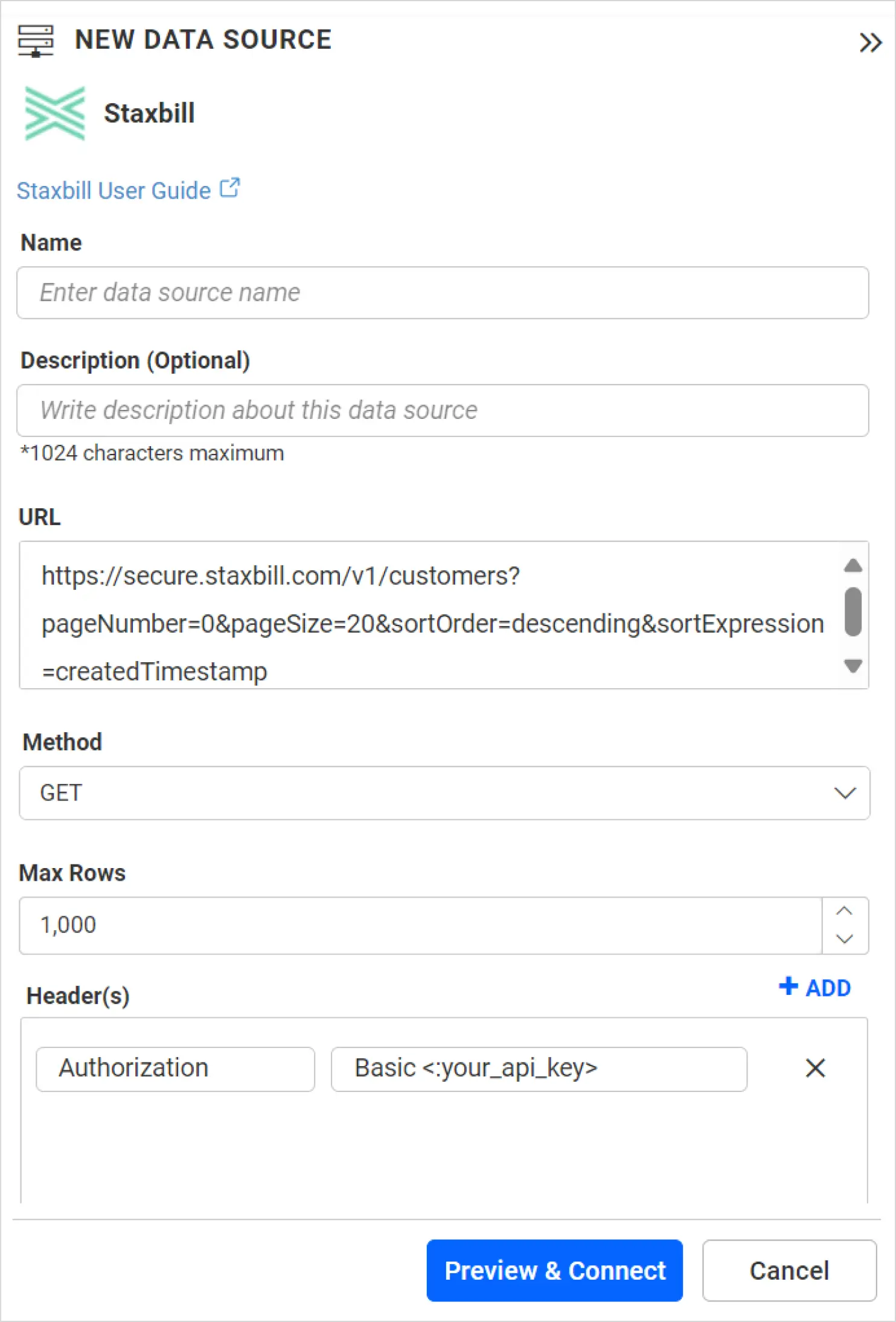
Stax Bill connection window - Once the creation process is completed, click Preview & Connect. A window will open listing the data results, as shown in the following image.
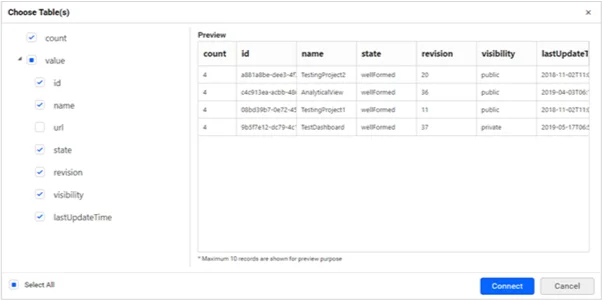
Raw data window - Select desired columns and then click Connect. Drag and drop the table and save the data source. Finally, the created data sources will be added to the DATA SOURCES panel.
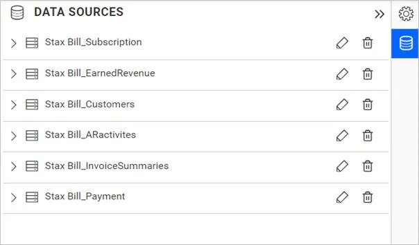
Data source listing panel
After creating the data source, proceed to add the necessary widgets to your dashboard. Connect the data to these widgets to visualize the metrics effectively.
How to create a dashboard with Stax Bill data configuration
With Bold BI, you can easily use Stax Bill integration to create a more interactive dashboard. New to Bold BI? Watch this tutorial video for step-by-step guidance on creating a dashboard from scratch.
Let’s recreate Bold BI’s Stax Bill Subscription Management Dashboard using Stax Bill integration data. This financial dashboard can be built from scratch by simply dragging widgets into the dashboard designer. With this dashboard, you can gain a comprehensive view of your company’s subscription-based business operations by tracking your subscription details, revenue, AR numbers, and more.
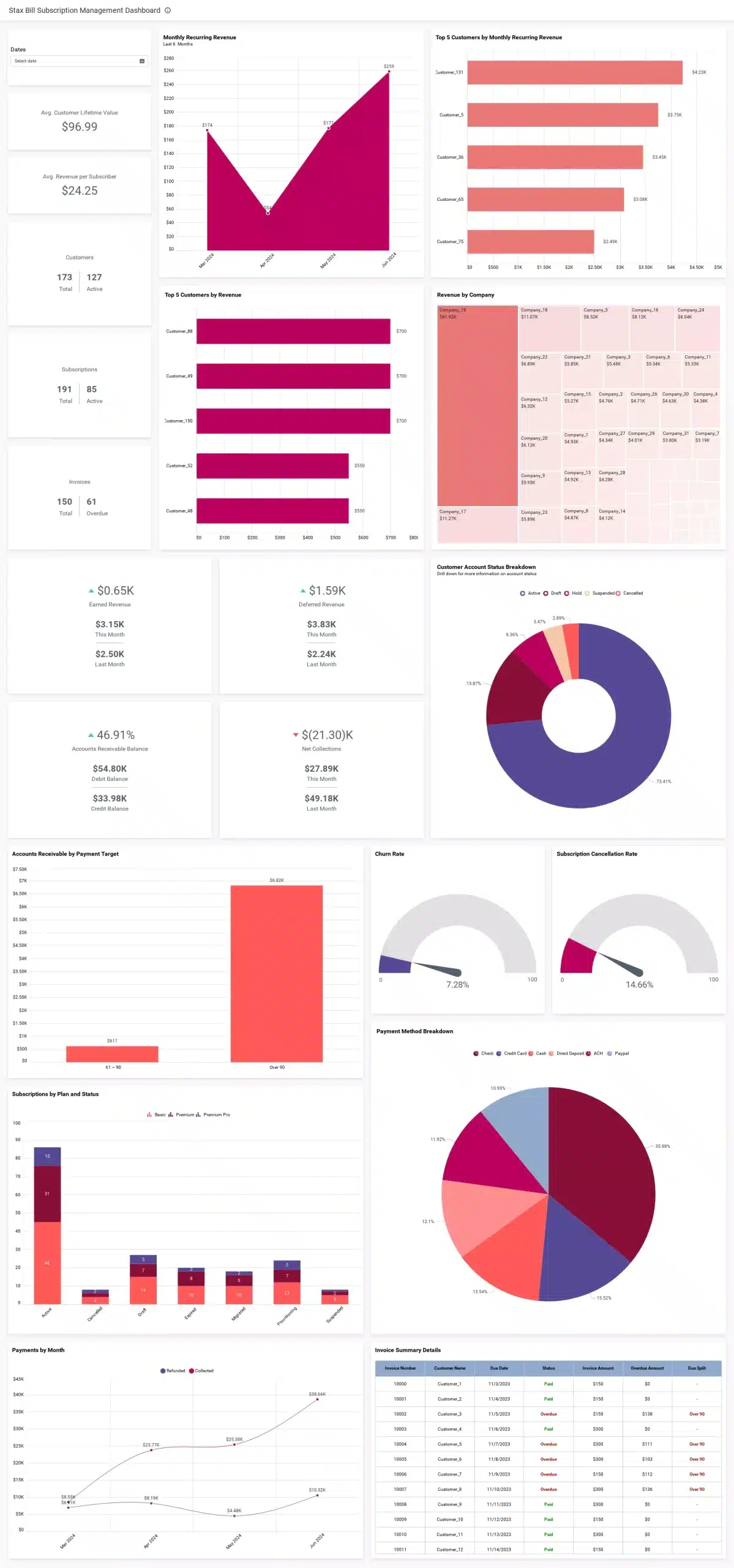
This subscription management dashboard helps you monitor these real-time finance metrics:
- Monthly recurring revenue: Total monthly revenue generated by recurring subscriptions, which provides a measure of predictable revenue for the business.
- Top 5 customers by monthly recurring revenue: The five customers who contribute the highest amount of revenue through their recurring monthly subscriptions.
- Top 5 customers by revenue: The five customers who generate the highest overall revenue, considering all sources of income, including recurring and nonrecurring transactions.
- Revenue by company: Total revenue generated by each individual company, indicating the financial performance of different entities or divisions within the business.
- Customer account status breakdown: A breakdown of customer accounts based on their status (active, inactive, suspended, or canceled).
- Accounts receivable by payment target: The amount of money owed to the company by customers, categorized based on their payment deadlines, allowing for effective management of outstanding payments.
- Churn rate: The rate at which customers cancel or stop using a product or service over a specific time period, highlighting customer retention.
- Subscription by plan and status: The distribution of customers across different subscription plans and their respective statuses, helping understand the popularity and performance of different subscription options.
- Payment by month: The total amount of payments received from customers each month, allowing for analysis of revenue trends and seasonality.
- Invoice summary details: Comprehensive information about individual invoices, including the customer’s name, invoice amount, due date, and payment status, aiding in tracking and managing financial transactions.
- Subscription cancellation rate: The percentage of customers who discontinue their recurring services within a specific timeframe, revealing the attrition rate of subscribers.
- Payment method breakdown: The distribution of payment methods utilized by customers, such as credit cards, bank transfers, or digital wallets, offering insights into the preferred modes of payment among the customer base.
The dashboard also allows you to track and monitor simple numbers, like subscriptions, invoices, average customer lifetime value, and average revenue per subscriber in card widgets.
We can customize the metrics displayed in a Fuesbill dashboard. However, before configuring the data to a widget, it is necessary to join tables and create expressions that enable the desired metrics.
Joining with shared tables
To join data sources with shared tables:
- Choose the data sources whose tables need to be joined. In this example, the Stax Bill-Payment and Stax Bill-Subscription data sources need to be selected. Then, expand them.
- Edit the Stax Bill-Payment data source. Drag the customers table from Stax Bill-Subscription data source, which will be available in shared table list, to the designer.
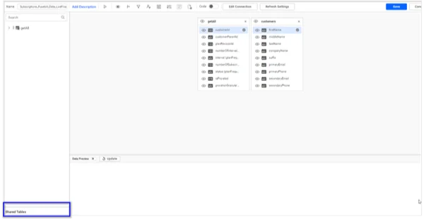
Shared Table - The Query Joiner window will open. Set an Inner join for the customerId column from the GetByAccountID table and Id (customer references) column from the customers table, as shown in the following screenshot.

Query Joiner window - Likewise, set an Inner join for the customerId column from the getAll table in the Stax Bill-Subscription data source and the id column from the customers table in the Stax Bill-Subscription data source, shown in the following image.
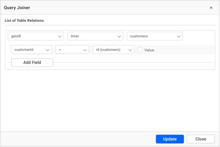
Query Joiner window
Now, we can create expression columns to visualize metrics.
How to configure widgets in a Stax Bill dashboard
Certain metrics require the use of calculated fields known as expression columns. To create an expression column for the specified metrics in the widget configuration, refer to the functions provided in the next table.
| Expression | Function |
| Active Customers | IF([status]=’Active’,1,0) |
| Current Month | MONTH(TODAY()) |
| Current Month Customers | IF(MONTH([createdTimestamp])=[Current Month],1,0) |
| Current Year | YEAR(TODAY()) |
| Customer Start of Period | IF((MONTH([createdTimestamp])<[Current Month]) and (YEAR([createdTimestamp])<=[Current Year]),1,0) |
| Cancelled Customer | IF(([status]=’Cancelled’) OR ([status]=’Suspended’),1,0) |
| New Customers | IF([status]=’Draft’,1,0) |
| Churn Rate | (SUM([Cancelled Customer])/(SUM([Active Customers])+SUM([New Customers])))*100 |
| LastMonth Earned Revenue | IF([range]=’Last Month’,[netRevenue],0) |
| CurrentMonth Earned Revenue | IF([range]=’This Month’,[netRevenue],0) |
| Overdue Amount | IF([invoiceStatus]=’Overdue’,[outstandingBalance],0) |
| Due Split | IF(DAYDIFF(TODAY(),[dueDate])>=’0′,’0 or less’,IF(DAYDIFF([dueDate],TODAY()) < 31,’1 ~ 30′,IF(DAYDIFF([dueDate],TODAY()) < 61,’31 ~ 60′,IF(DAYDIFF([dueDate],TODAY()) < 91,’61 ~ 90′,’Over 90′)))) |
| OverDue | IF([invoiceStatus]=’Overdue’,1,0) |
| Overdue Due Split | IF([invoiceStatus]=’Overdue’,[Due Split],’-‘) |
| Refund Amount | IF([transactionType]=’Refund’,[amount],0) |
| Collect Amount | IF([transactionType]=’Collect’,[amount],0) |
| Current Month | MONTH(TODAY()) |
| Previous Month | MONTH(TODAY())-1 |
| CurrentMonth Amount | IF(MONTH([createdTimestamp])=[Current Month],[amount],0) |
| PreviousMonth Amount | IF(MONTH([createdTimestamp])=[Previous Month],[amount],0) |
| CurrentMonth Deferred Revenue | IF(MONTH([createdTimestamp])=[Current Month],[unallocatedAmount (transaction)],0) |
| PreviousMonth Deferred Revenue | IF(MONTH([createdTimestamp])=[Previous Month],[unallocatedAmount (transaction)],0) |
| Active Subscription | IF([status]=’Active’,[customerId],0) |
| Churn Subscribers | IF(([status]=’Cancelled’) OR ([status]=’Expired’),1,0) |
| Total Subscribers | IF([status]!=”,1,0) |
| Expired Customers | IF([status]=’Expired’,[customerId],0) |
| Current Month | MONTH(TODAY()) |
| Current Month Customers | IF(MONTH([createdTimestamp])=[Current Month],1,0) |
| New Subscription | IF([status]=’Draft’,1,0) |
| Active Subscription Count | COUNTD([Active Subscription]) |
| Average Revenue per Subscriber | SUM([monthlyRecurringRevenue (subscriptionProducts)])/[Active Subscription Count] |
| For Renewal | IF([status (customers)]=’Active’,1,0) |
Follow these steps to visualize the previous metrics:
- Add the required widgets to the blank dashboard that you created in the beginning.
- Configure the widgets in the dashboard with their corresponding data sources as shown in the following table.
| Metric/KPI | Configuration |
| Date | Type: Date picker
Value: Created time stamp |
| Monthly recurring revenue | Type: Area Chart
Value: Monthly Recurring Revenue Column: Converted Date |
| Top 5 customers by monthly recurring revenue | Type: Bar chart
Value: Monthly recurring revenue |
| Average customer lifetime value | Type: Number card
Value: Average length of subscribers |
| Average revenue per subscriber | Type: Number card
Value: Average revenue per subscriber |
| Customers | Type: KPI card widget
Value: First name |
| Subscriptions | Type: KPI card widget
Value: Subscription Id |
| Invoices | Type: KPI card widget
Value: Id |
| Top 5 customers by revenue | Type: Bar chart
Value: Amount |
| Revenue by company | Type: Tree map
Value: Amount |
| Earned revenue | Type: KPI card widget
Value: Current month earned revenue |
| Deferred revenue | Type: KPI card widget
Value: Current month deferred revenue |
| Customer account status breakdown | Type: Doughnut chart
Value: Customer reference |
| Accounts receivable balance | Type: KPI card widget
Value: AR debit |
| Net collections | Type: KPI card widget
Value: Current month amount |
| Accounts receivable by payment target | Type: Column chart
Value: Overdue amount |
| Churn rate | Type: Radial gauge
Value: Churn rate |
| Subscription cancellation rate | Type: Radial gauge
Value: SCR |
| Subscription by plan and status | Type: Stacked column chart
Value: Subscription Id |
| Payment method breakdown | Type: Pie chart
Value: Amount |
| Payments by month | Type: Spline chart
Value: Refund amount, collect amount Column: Converted Date |
| Invoice summary details | Type: Grid
Value: Invoice number, customer name, due date, invoice status, invoice amount |
Scheduling data refresh for a Stax Bill dashboard
You can set up data refresh schedules in a Stax Bill dashboard to ensure your data remains up to date. This can be achieved using the refresh settings feature, through which you can establish a timetable for transferring data from your cloud storage to an intermediate database location. To configure refresh settings in a Stax Bill dashboard, follow the steps provided in this link.
Conclusion
With this blog, I hope you have seen how you can analyze data within a Stax Bill dashboard to gain valuable insights for improving your decision-making, retaining customers, and increasing revenue.
Get started with Bold BI by signing up for a free trial and create more interactive business intelligence dashboards. You can also contact us by submitting your questions through the Bold BI website or, if you already have an account, you can log in to submit your support question.