10 Best Practices for Designing Powerful Dashboards

TL; DR: Dashboards often fail due to clutter, poor widget choices, and weak data models. This blog shares 10 best practices to improve clarity, layout, interactivity, and performance in Bold BI®. Learn how to choose the right charts, optimize data sources, personalize views by role, and use Bold Data Hub for scalable, insightful dashboards.
Introduction
Is your dashboard helping your team or holding them back? Too often, dashboards are packed with charts but lack clarity. Disorganized layouts, confusing visuals, and irrelevant data slow down understanding and make it harder to extract meaningful insights. But it doesn’t have to be that way. In this blog, you’ll explore 10 dashboard design best practices as shown below into focused, decision-driving tools.
Whether you’re starting fresh or refining an existing dashboard, these tips will help you design with purpose, boost usability, and make every metric count.
Common dashboard design challenges
Before we explore best practices, it’s important to understand why dashboards often fall short. Many users encounter common design flaws that prevent them from gaining meaningful insights or making timely decisions. Here are the top challenges:
- Overloaded dashboards: Users often cram too much data into one view, making it hard to focus on key metrics.
- Poor widget selection: Choosing the wrong chart type or failing to customize leads to confusion.
- Slow performance: Large datasets and inefficient queries slow down dashboards.
- Disconnected data sources: Inconsistent or poorly modeled data cause reporting errors.
- Limited interactivity: Dashboards without filters, drill-down options, or parameters feel static and unengaging.
Understanding these real frustrations is the first step in designing dashboards that work not just visually, but functionally. Now, let’s look at key practices that help solve these issues and create dashboards that are clear, purposeful, and user-friendly.
10 best practices for designing dashboards you should consider
Define your dashboard’s purpose and audience
Effective dashboards begin with a clear understanding of the business questions they’re meant to answer. To design a purposeful dashboard:
- Define your objectives: Determine what you are trying to achieve.
- Identify the right KPIs: Choose metrics that reflect your goals.
- Align every component: Ensure each visual supports your objectives.
- Tailor to your audience: Consider who will use the dashboard and what decisions they need to make.
- Centralize your data: Use a Bold Data Hub to connect and unify all relevant data sources for consistency and reliability.
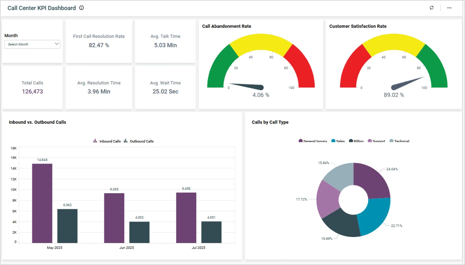
A good example to look at is the call center KPI dashboard.
If your goal is to improve customer satisfaction and agent efficiency, focus on metrics like:
- Call abandonment rate.
- Customer satisfaction rate.
- Call volume by type.
- Inbound vs. outbound calls.
Each visual should:
- Provide direct insight into these KPIs.
- Help managers spot performance gaps.
- Monitor service levels.
- Support informed decision-making aligned with operational goals.
Once your purpose is clear, prepare your data.
Plan and optimize your data with Bold Data Hub
A dashboard is only as effective as the data it’s built on. Before diving into design, ensure your data sources are clean, connected, and optimized for performance.
Here’s how to do that:
- Centralize your data: Use a unified platform like Bold Data Hub to connect multiple data sources like databases, cloud apps, and spreadsheets into a single, reliable source of truth.
- Clean and validate: Remove duplicates, fix inconsistencies, and ensure data accuracy before visualization. Learn more in our documentation on data cleaning and standardization in Bold Data Hub and this blog post on mastering data standardization.
- Use aggregated data: For large datasets, aggregate your metrics before using the set as a data source to improve dashboard load times and responsiveness.
- Secure your data: Apply role-based access controls and encryption to protect sensitive information.
- Monitor refresh cycles: Set appropriate data refresh intervals based on the dashboard’s purpose—real-time for operational dashboards and periodic for strategic ones.
- Leverage Bold Data Hub features:
- Data blending: Combine data from different sources without complex ETL.
- Reusable models: Create consistent data models for use across multiple dashboards.
- Scalability: Handle large volumes of data efficiently.
In a Sales dashboard, for example, you can use Bold Data Hub to blend CRM, ERP, and marketing data into a unified view of lead conversions, revenue, and campaign ROI.
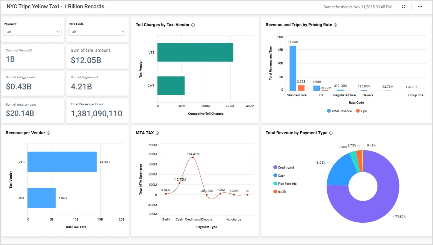
For large-scale data scenarios, Bold BI also supports dashboards with massive datasets—such as the NYC yellow taxi dashboard, which showcases one billion records—demonstrating its ability to handle high-volume analytics with speed and precision.
To explore more on data sources, see our blog, Introduction to Bold BI Data Sources!
Design a clear, logical dashboard layout
A dashboard should guide users through a narrative that reveals insights and drives action. Use layout and visual hierarchy to lead users from overview to detail. Highlight trends, comparisons, and anomalies that answer key business questions.
To guide users effectively:
- Position key KPIs in the top-left corner: This is where users naturally begin scanning.
- Group-related visuals together: Create intuitive sections to improve readability.
- Use Bold BI’s grid layout: Maintain consistent alignment and structure.
- Leverage white space: Create focus, reduce clutter, and enhance visual balance.
- Minimize scrolling: Aim for a one-screen view to keep insights immediately accessible.
Choose the right charts and widgets for clear insights
The right chart brings clarity. The wrong one adds noise. To ensure your visuals support decision-making, choose charts that not only display data clearly but also reinforce the insight you want to communicate.
Let’s explore common chart types you can use to design your dashboard:
explore common chart types you can use to design your dashboard:
- Time series chart: A time series chart is ideal for displaying data over a time period and helping you understand the outliers, trends, and range of data values. Here are a few examples:
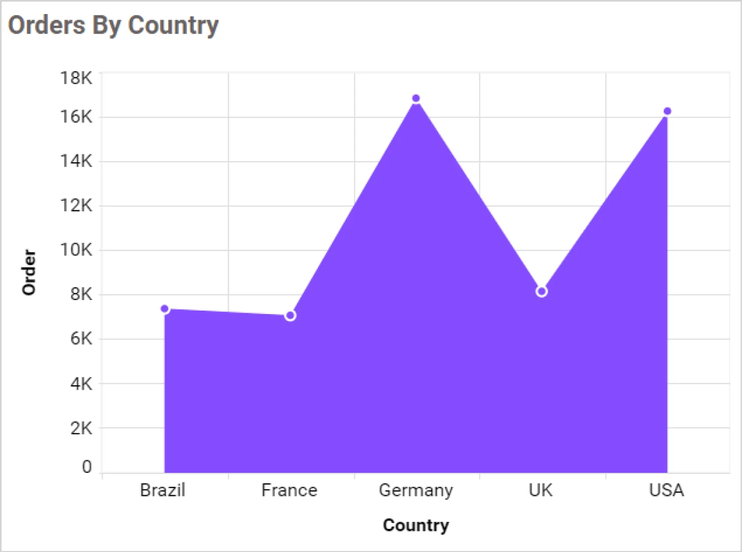
- An area chart in time series analysis highlights trends over time and emphasizes data magnitude with filled regions under the line.
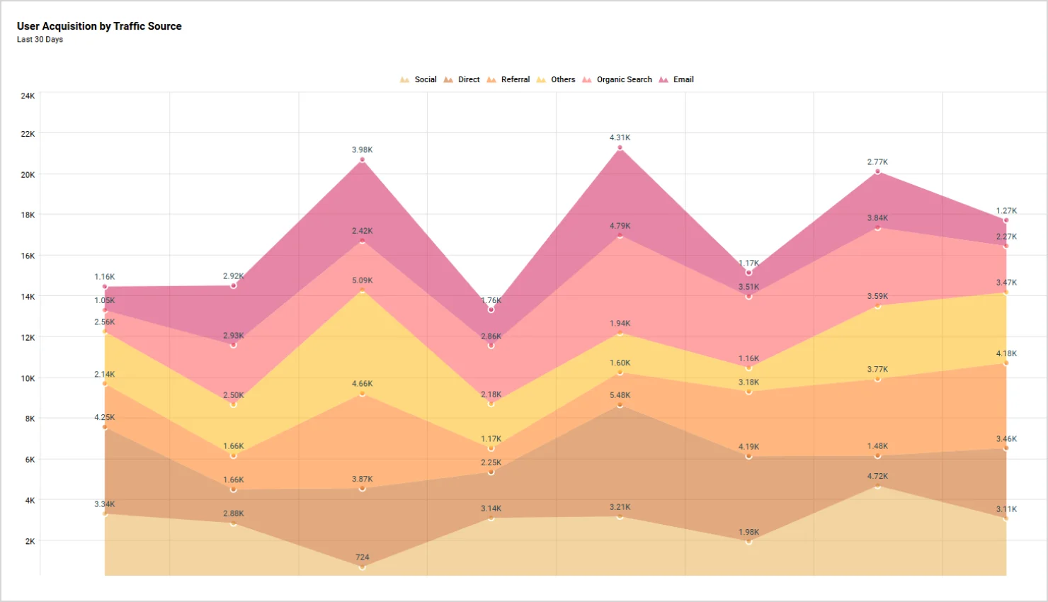
- Stacked area chart to show multiple data series stacked on top of each other, highlighting both individual and cumulative trends.
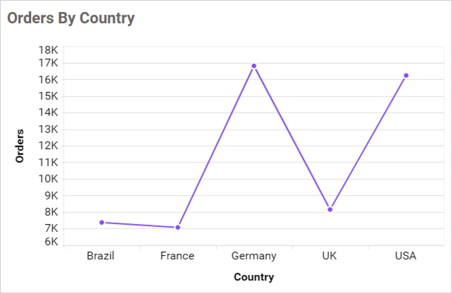
- A line chart connects data points with straight lines and clearly shows trends or changes over time.
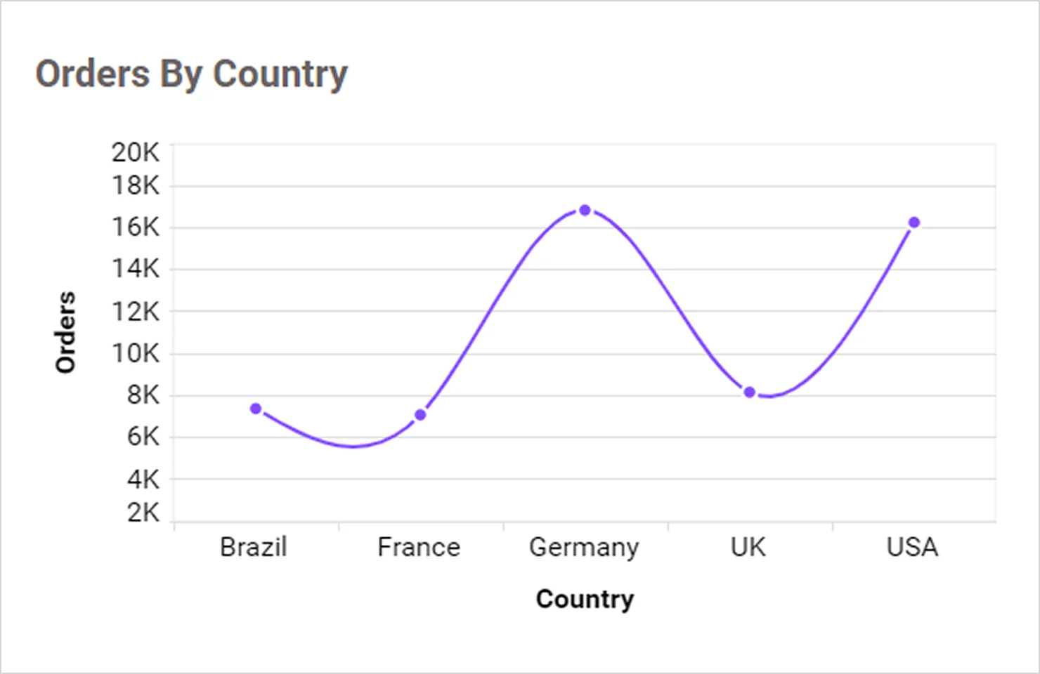
- A spline chart visualizes trends over time for a more fluid and visually appealing display, ideal for highlighting gradual changes in data.
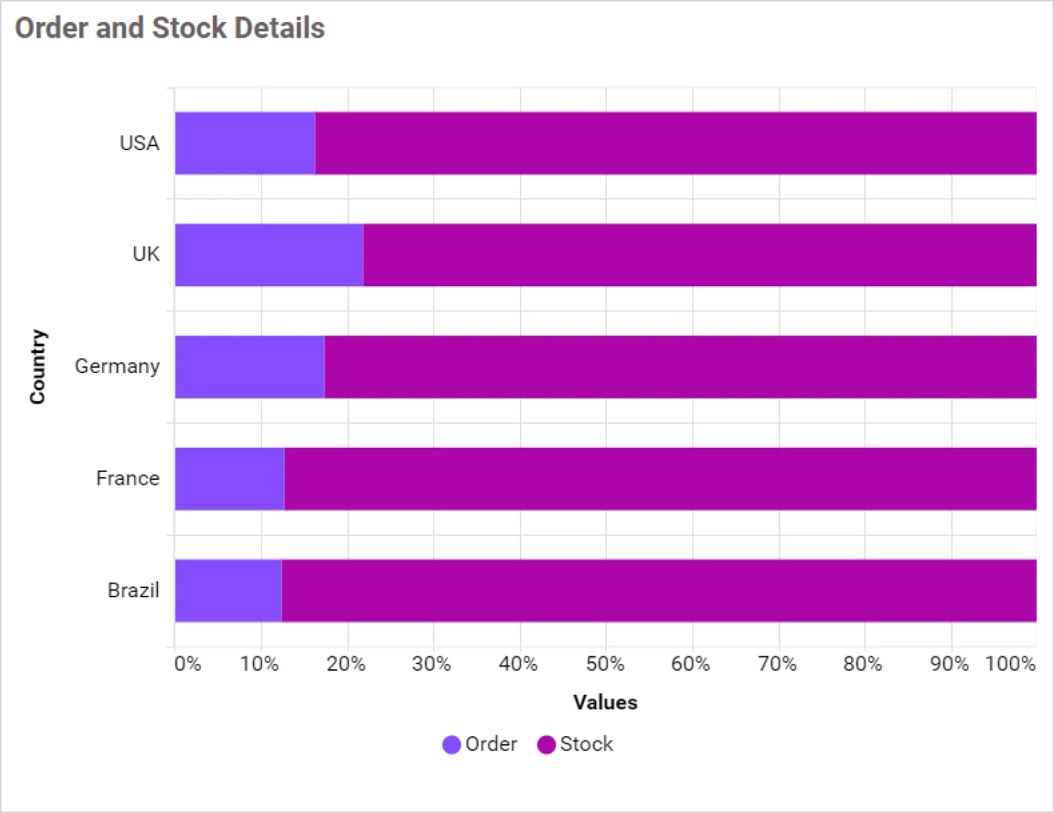
- Comparison charts: Comparison charts are designed to highlight differences between values, categories, or time periods. These charts help users quickly analyze performance, identify trends, and pinpoint top or underperforming segments. Here are a few examples in this category:
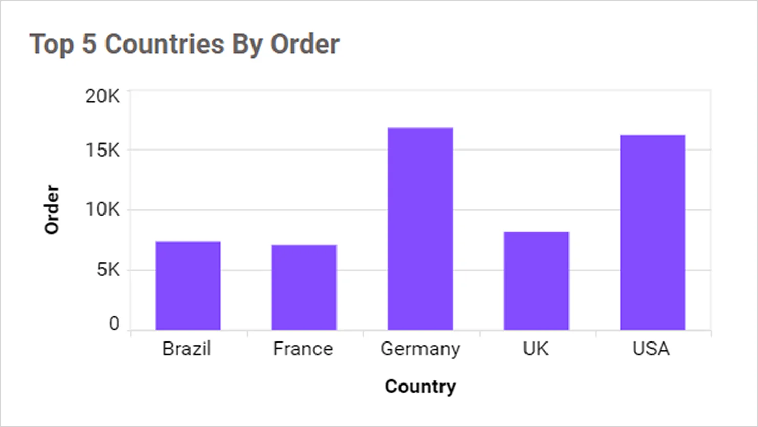
- A column chart compares values across categories, making it ideal for showing performance or trends.
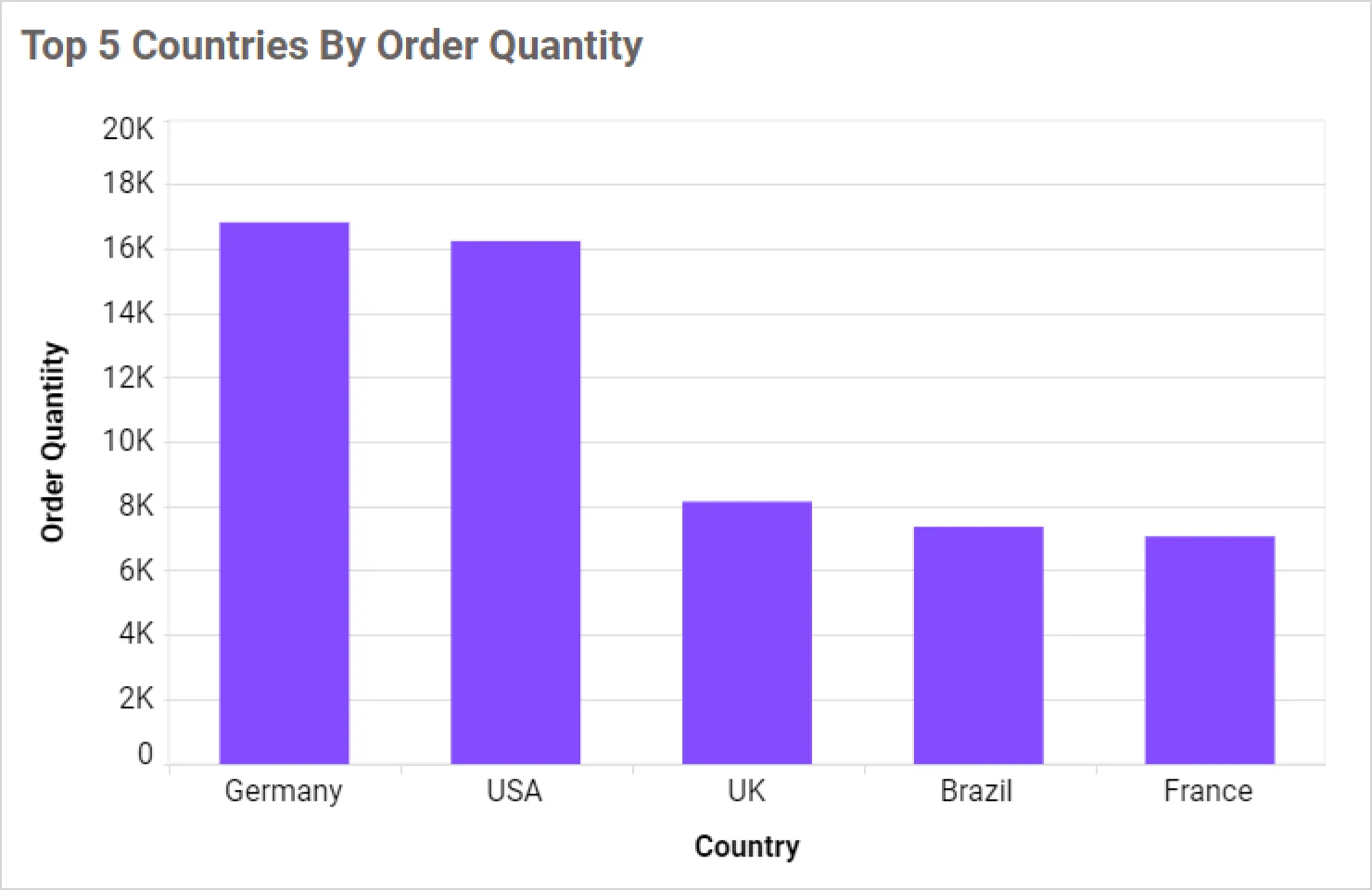
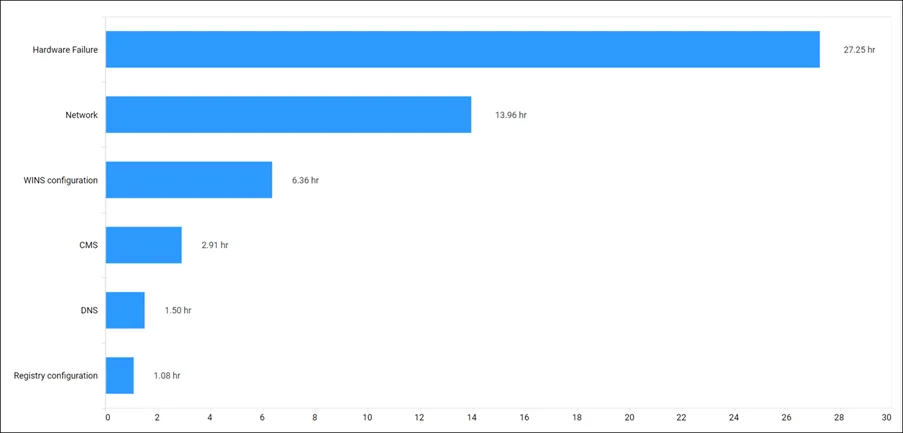
- A bar chart compares values across categories, best for ranking and competitive analysis using horizontal bars.
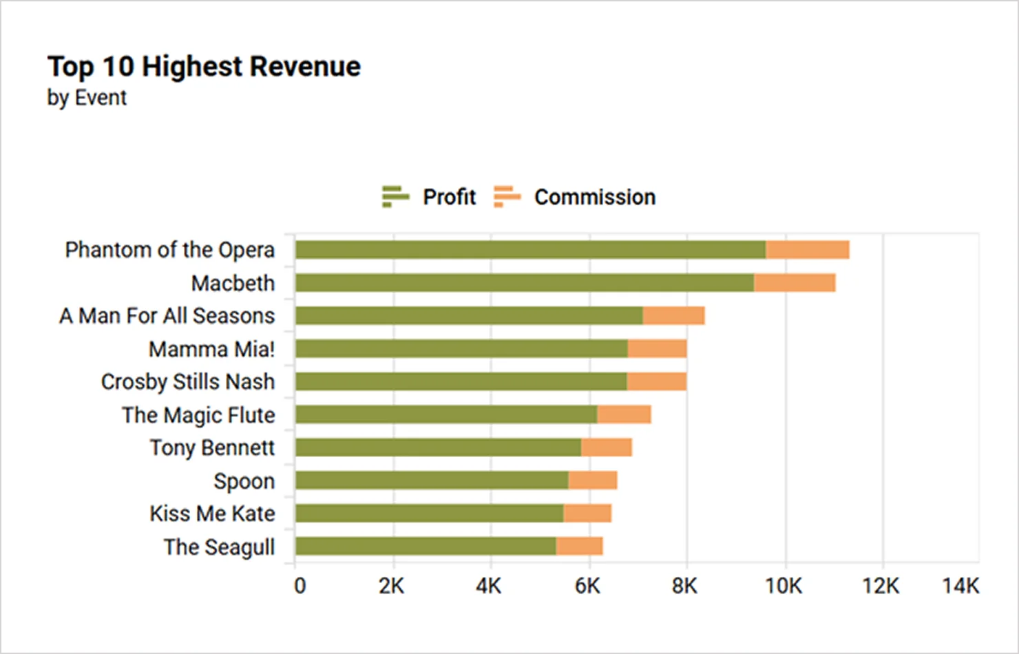
- A stacked column chart displays multiple data series stacked vertically in one column, showing cumulative totals and segment contributions.
- A stacked bar chart shows multiple data series stacked horizontally in one bar, which is useful for comparing parts to a whole across categories.
- A 100% stacked column chart represents each column up to 100% with segments showing proportional contributions of subcategories.
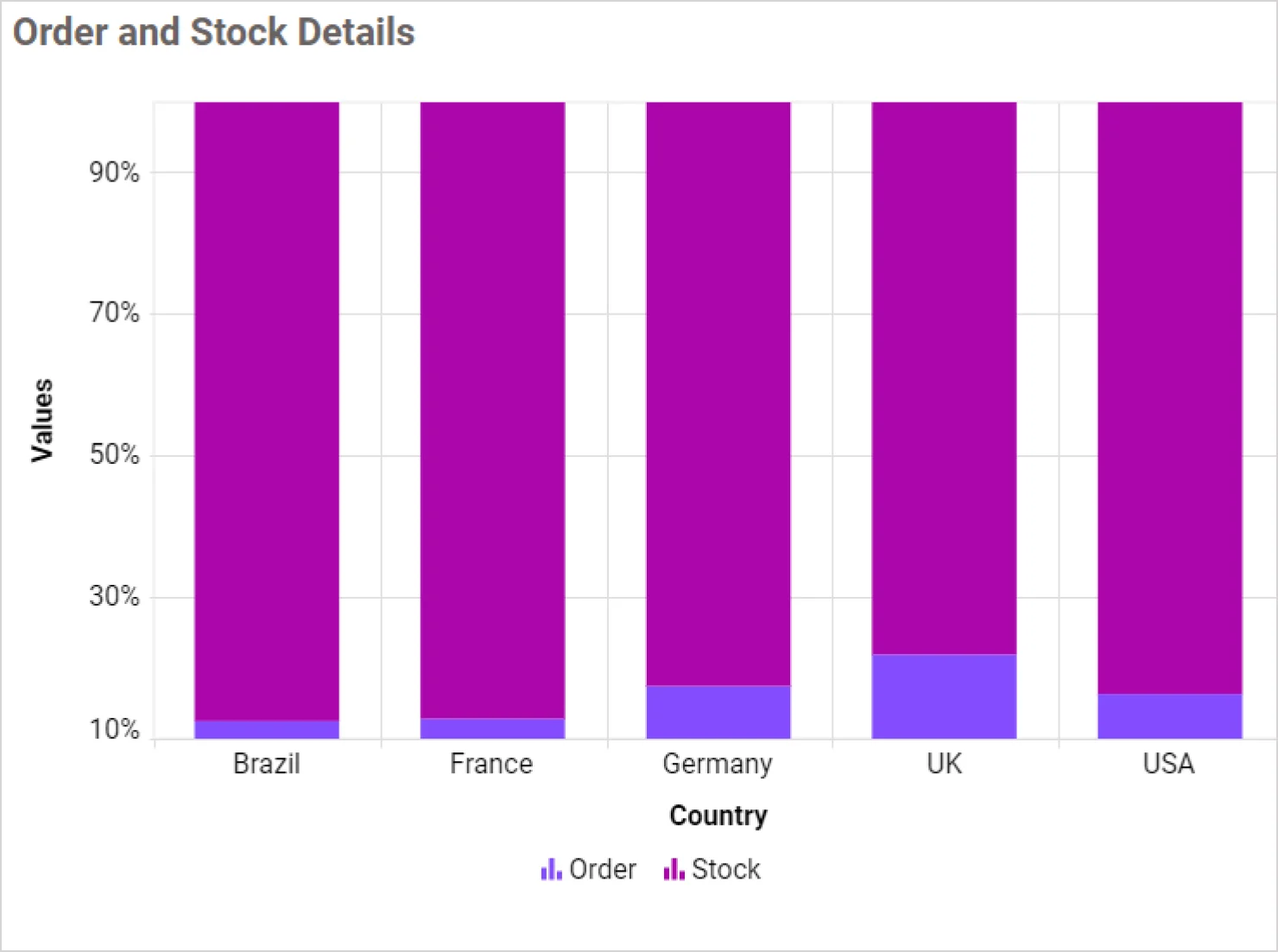
- A 100% stacked bar chart displays horizontal bars divided into segments that represent percentage contributions to the whole.
For more details on choosing the right visuals, explore these Bold BI blogs that offer practical guidance:
- Choosing Visuals for Embedded Dashboards – Tips & Tricks: Learn how to select the most effective chart types for embedded dashboards based on data representation needs like comparison, proportion, and distribution.
- Unlocking Data Insights with Appropriate Charts: Discover how to match your KPIs with the right chart types to improve clarity and decision-making.
- 5 Best Widget Types for Data Visualization: Explore top widget types like heatmaps, pivot tables, and KPI cards to visualize metrics effectively across industries.
Maintain consistent colors, fonts, and branding
Consistency in visual design helps users quickly understand and trust the data presented. A well-designed dashboard should use a unified visual language that enhances readability and reduces cognitive load.
Here’s how to do it effectively:
- Use a consistent color palette: Assign specific colors to categories or statuses like green for success or red for issues, and apply them uniformly across all widgets.
- Limit the number of colors: Stick to between four and six core colors to avoid visual clutter.
- Apply consistent typography: Use the same font family and size hierarchy for titles, labels, and values. For example, use bold for headings and regular for data labels.
- Use contrast wisely: Ensure text is readable against background colors, especially in KPI cards and charts.
- Align text and visuals: Maintain consistent alignment and spacing to create a clean, professional layout.
- Apply conditional formatting: Use dynamic color rules to highlight values based on thresholds like red for low performance or green for high performance. This helps users quickly identify trends, outliers, and areas needing attention.
To further improve clarity and user experience, include:
- Titles and subtitles: Clearly define the purpose and timeframe of each dashboard section or widget. This helps users quickly grasp what they’re viewing.
- Descriptions: Add brief explanations to provide context for metrics or visuals, especially when dealing with complex data.
- Tooltips: Use hover-based tooltips to offer definitions, data sources, or additional insights without cluttering the layout.
- Annotations: Highlight trends, anomalies, or key takeaways directly on charts to guide user attention and support decision-making.
These elements not only reinforce branding and professionalism but also make dashboards more intuitive, informative, and actionable.
Add interactivity to make dashboards engaging
Good dashboard design is also about user experience. Apply the following UI principles to make your dashboard intuitive and visually appealing:
- Consistency: Use uniform colors, fonts, and layouts.
- Hierarchy: Position key metrics in the top-left.
- Responsiveness: Design for multiple devices.
- Minimalism: Remove unnecessary elements.
To enhance usability and decision-making:
- Enable filtering: Users can view data by time, region, product, or other dimensions. To understand more about filters, check out our blog on Filtering a Dashboard with Dashboard Parameters!
- Add drill-down capabilities: These allow users to explore deeper layers of data from summary views. For guidance, see our existing blog on Drill-Down and Drill-Up in Dashboards: What You Need to Know!
- Incorporate forecasting and trending visuals: Help your users anticipate future outcomes based on historical data.
- Use tab-like navigation: Organize dashboards by topic or department, making it easier to switch between views without clutter.
These features make dashboards more dynamic, personalized, and actionable—especially for decision-makers who need quick, flexible insight.
Personalize dashboards by role with secure access controls
Enhance the user experience by:
- Allowing filtering and drill-down options.
- Ensuring responsiveness across devices.
- Keeping navigation intuitive.
- Minimizing unnecessary elements.
To further support enterprise needs and data governance, you can:
- Implement row-level security: Ensure users only see data relevant to them, like how a regional manager only sees their region’s data. Check out our blog, Enabling Row-Level Security with Embedded BI, to learn more about row-level security.
- Apply role-based access controls: Define what each user can view or interact with based on their role. For more details, see our blog, Permissions Management: What It Is & How to Use It.
- Support multitenancy: Securely isolate data between different clients or departments within the same dashboard environment. Explore more by reading our blog, Harnessing Multitenancy: Empowering Insights with Embedded BI!
This ensures relevance, improves engagement, and maintains data privacy and compliance across user groups.
Keep dashboard design simple and focused
Avoid clutter by:
- Limiting dashboards to 8 to 10 widgets.
- Avoiding repeating metrics in multiple visuals.
- Keeping text labels short and meaningful.
- Not mixing too many chart types. Consistency builds comprehension.
Test your dashboard for usability and clarity
Before deployment:
- Conduct user testing.
- Validate that insights are easy to find.
- Ensure layout supports intuitive navigation.
Continuously refine and improve your dashboards
Dashboards are not static. They should evolve with your business needs. Regularly review and update your dashboards to:
- Reflect new goals or KPIs.
- Improve performance and usability.
- Incorporate user feedback.
- Remove outdated metrics.
Encourage a culture of continuous improvement to keep dashboards relevant and effective.
Well-chosen visuals make your data intuitive and actionable, helping users focus on insights rather than interpretation.
Real-world examples of effective dashboards in Bold BI
The following examples show how Bold BI can be leveraged to create impactful, real-time dashboards for various business needs.
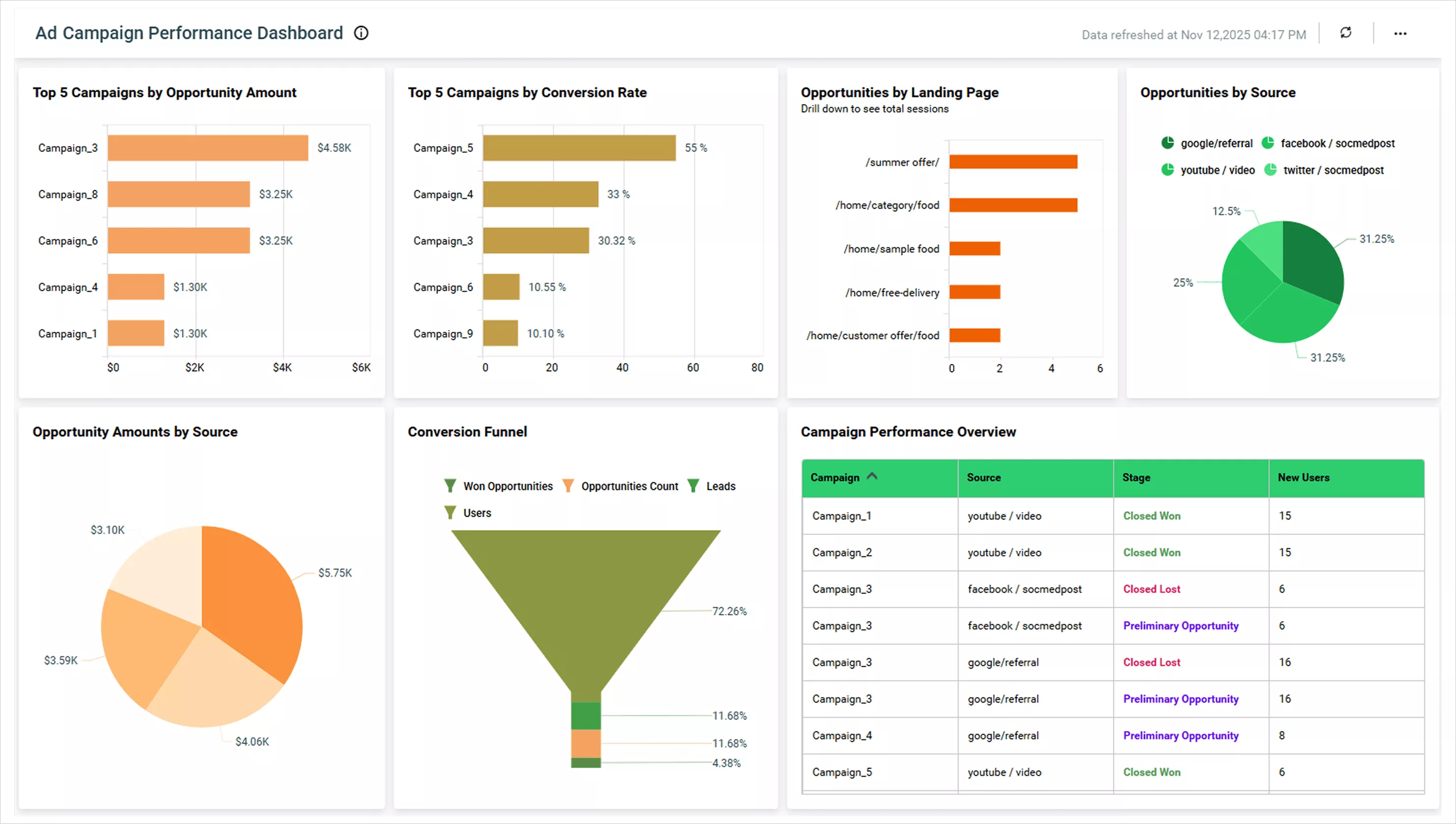
Ad campaign performance dashboard
Bold BI’s ad campaign performance dashboard is a top-notch marketing tool that highlights key metrics like opportunities by source, landing page, and campaign performance overview. These KPIs are positioned at the top, making it easy for marketing teams to gauge campaign performance at a glance. It uses clean bar and pie charts for quick visual interpretation and consistent spacing and colors for easy navigation. Interactive filters allow users to drill into specific platforms like Facebook or Google Ads, while real-time data updates provide the latest campaign insights for fast decision-making.
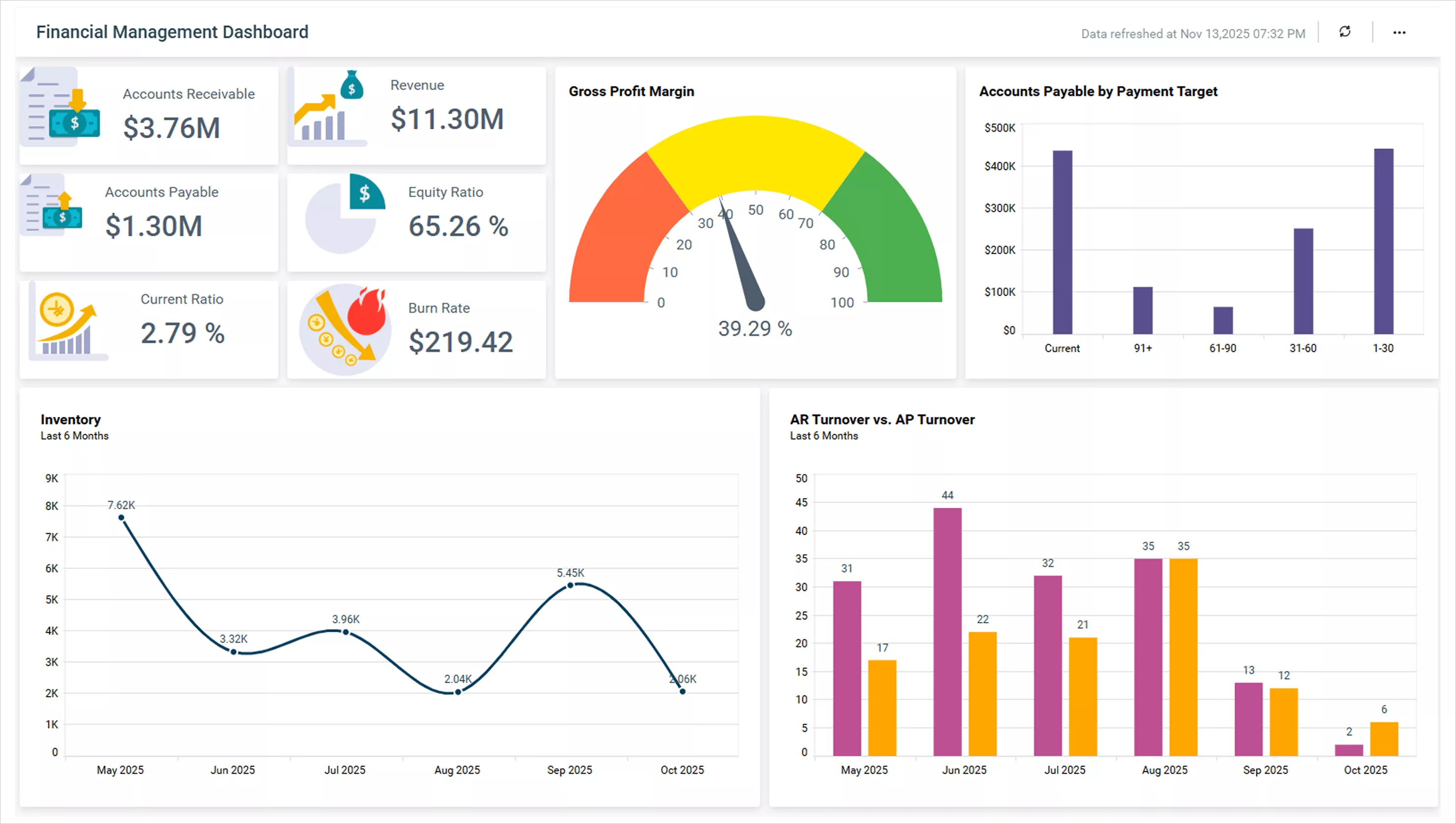
Financial overview dashboard
The financial management dashboard by Bold BI is designed to support financial executives with clarity and insight. It highlights high-impact financial metrics such as gross profit, net profit, and revenue versus expenses at the very top, ensuring visibility of what matters most. Charts like gauges, bar graphs, and line trends are cleanly formatted and visually aligned for fast scanning. A spacious layout and readable typography enhance user comfort, while dynamic filters by department or fiscal quarter allow deeper exploration. Integration with real-time accounting data ensures financial reporting stays current and trustworthy.
These are just a few examples of well-designed dashboards in Bold BI. Explore more live examples on the Bold BI dashboard examples page to see how different industries, departments, and data analysts bring their data to life.
Final thoughts
Designing dashboards in Bold BI® is not just about visual appeal—it’s about delivering clarity, speed, and actionable insights. By applying purpose-driven design, choosing the right widgets, structuring dashboards for usability, optimizing data sources, and leveraging the Bold Data Hub, you can overcome common user challenges like clutter, slow performance, and disconnected data. These best practices help ensure your dashboards are intuitive and scalable. Empower your users to explore data confidently and act faster.
Ready to work with Bold Data Hub, dashboards, widgets, or data sources in Bold BI? Sign up for a free trial today, and start building smarter dashboards and turn your data into actionable insights.