
Setting up TV Dashboards as Slideshows on Large Screens

TV dashboards are meant to display key metrics on a large screen for a target audience in the workplace. They inform team members about milestones, keep targets in focus, and motivate folks to reach their goals through continuous monitoring. TV dashboards provide an overview of the business through separate dashboards, each showcasing relevant key metrics arranged one after the other, rotating as a slideshow to communicate what’s going on and how work is progressing. This blog post will answer the following questions regarding TV dashboards:
- How should TV dashboards be organized?
- How do I set up dashboards as a slideshow for display on a TV?
Organizing TV dashboards
Before building a TV dashboard, ask yourself:
- Who is the target audience?
- What should they know?
- What are the key metrics that should be showcased?
- How should different dashboards be categorized?
Let’s look at some examples of TV dashboards in different industries to get an idea of how to choose the right dashboards.
TV dashboards for IT operations
For IT operations including customer service, finance, and product management, TV dashboards are very useful. They provide the operations team leader a quick view of customer service performance, project expenses, and timelines for process improvements. After making any procedural or team changes, the team leader can then monitor their effects and plan the next move. To learn about important IT operations metrics and KPIs.
In an IT operations scenario, you may categorize dashboards by department, say, support and development. For example, consider a support ticket management dashboard to track the following KPIs to measure customer service performance:
- Total support tickets received.
- Average resolution time per ticket.
- Ticket status by issue type.
- Server availability and downtime.
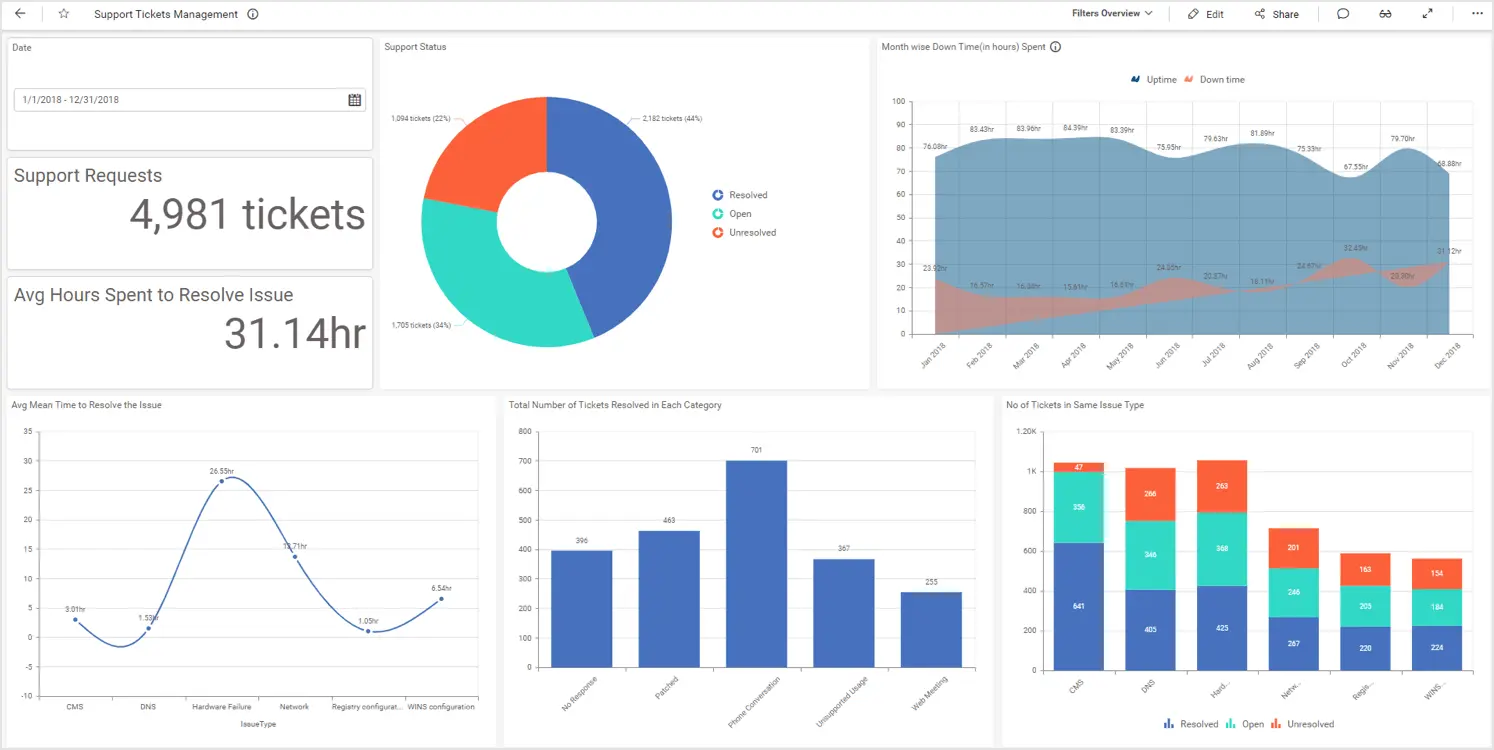
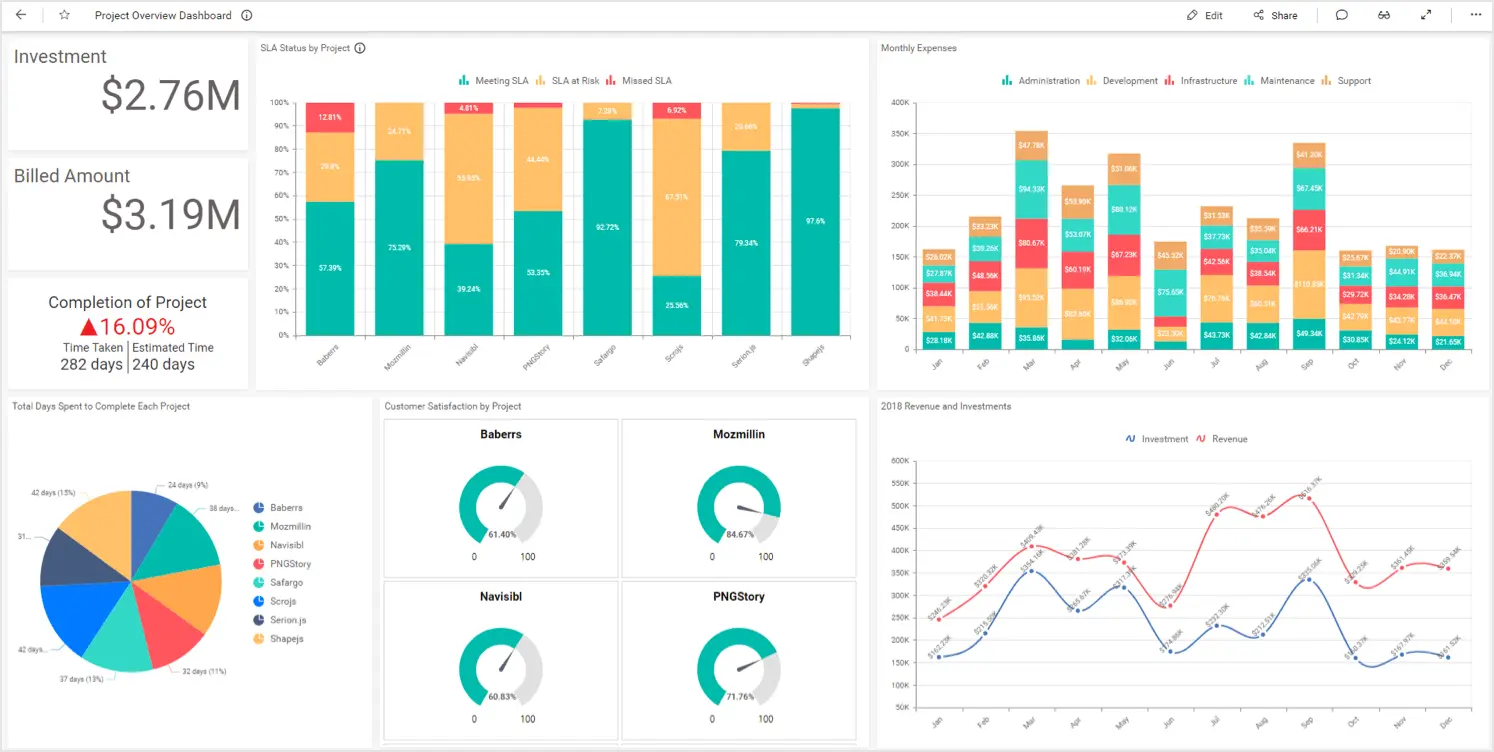
Support Ticket Management DashboardIn addition, consider a project overview dashboard to track the following KPIs to measure financial costs for projects and customer satisfaction:
- Funds allocated and billed.
- Monthly expenses by department.
- Yearly revenue and investments.
- Total days spent to complete each project.
- Customer satisfaction by project.
TV dashboards for sales monitoring
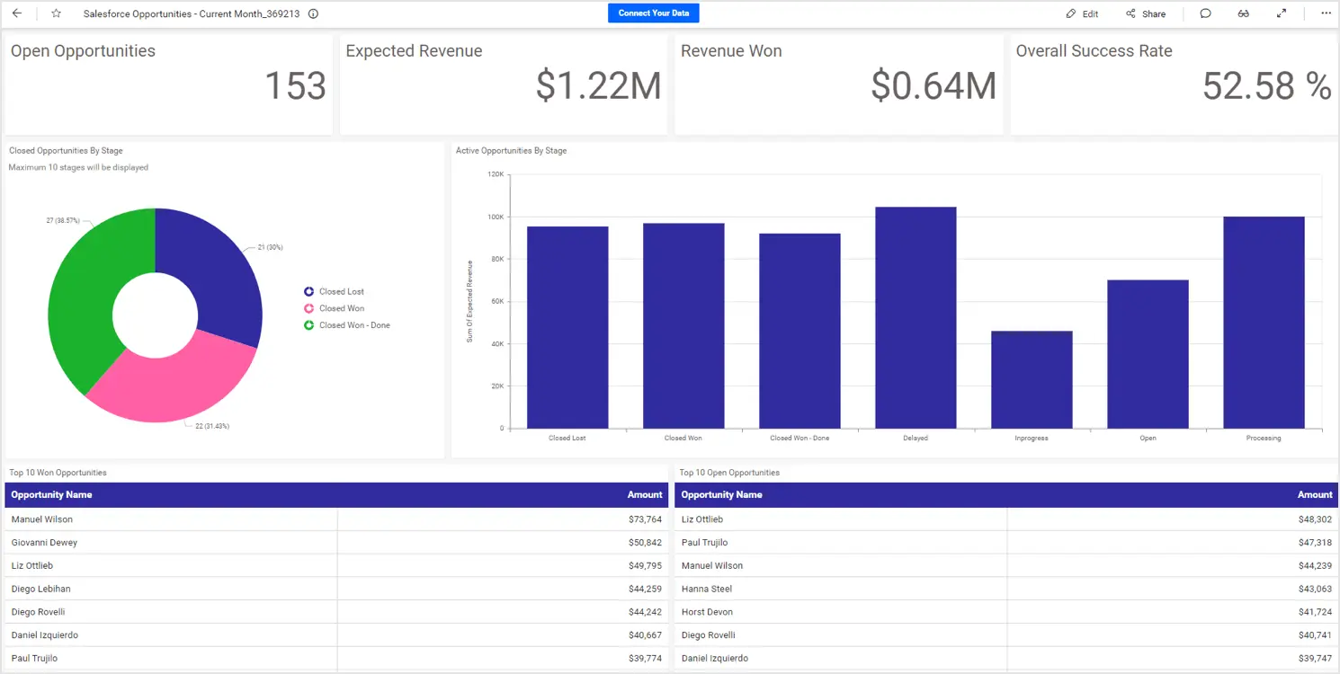
For a sales team, leads and opportunities need to be tracked to identify any potential areas for improvement. Salespeople can benefit from having these showcased on TV, and can use them to identify potential leads for conversion and know their progress toward their goals. Leads and opportunities KPIs can be showcased as separate dashboards and organized for TV display. For example, consider a Salesforce opportunities dashboard to track the following opportunities-related KPIs to stay on top of every opportunity and close more business on time:
- Open and closed opportunities.
- Monthly conversation rate.
Also, consider a Salesforce leads dashboard to track KPIs such as sales progress, monthly leads created, monthly leads converted, and top lead sources based on the previous month.

TV dashboards for the insurance industry
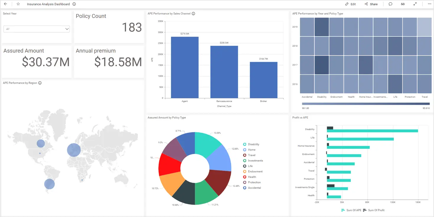
In the insurance industry, sales managers and auditors assess the insurance company’s performance and claims made to effectively use its resources. Organizing these metrics as TV dashboards helps the managers and auditors monitor important information on the go and make decisions quickly. Consider this insurance company performance analysis dashboard, which showcases the following KPIs to help assess the revenue of the company and its policies:
- Breakdown of total assured amount.
- Total sales from agents, brokers, and bancassurance.
- APE performance based on region and sales channels.
- Profits and APE by policy type.
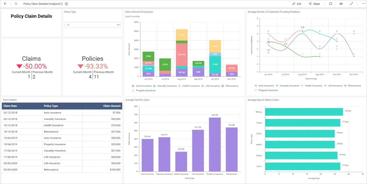
That dashboard, combined with this insurance claims dashboard which visualizes the following KPIs to help management allocate resources more efficiently, illustrates the areas in which the company is doing well and where it could improve:
- Total claims received over a month.
- Average cost per claim.
- Average days to settle a claim.
TV dashboards for energy
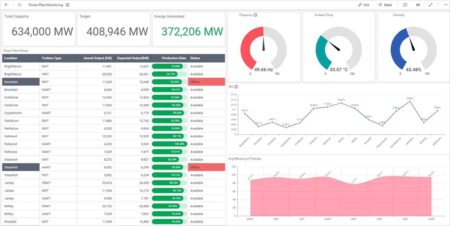
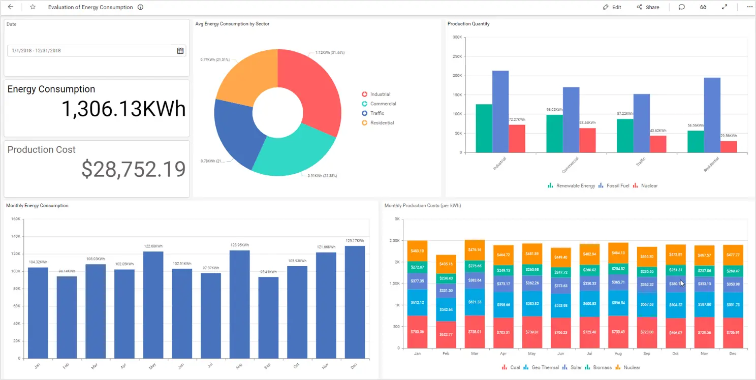
In the energy industry, a production manager needs to monitor the production from a power plant and the consumption of energy in the area the plant serves. This information can be organized easily with TV dashboards. For example, these power plant monitoring and energy consumption dashboards can be organized as TV dashboards.
Setting up TV dashboards as a slideshow
Let’s see how to set up TV dashboards as a slideshow using Bold BI®.
In the Bold BI application, slideshows can be added when you have Create permission for the All Slideshow entity.
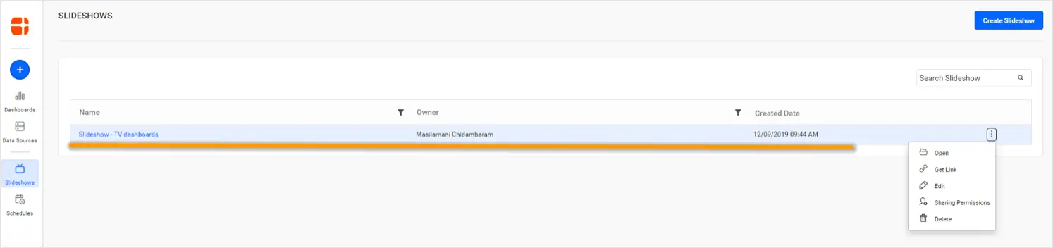
To create a slideshow, select the Slideshows option in the navigation bar to the left of the dashboard listing page (assuming the dashboards to be used as a slideshow are listed in the dashboards section).
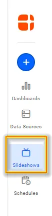
On the right side of the page, click Create Slideshow to configure the dashboards and the transition interval between them.
From here, you can also view, share, update, and delete slideshows.
After configuring the slideshow, you will have full-screen, live dashboards one after the other at equal time intervals. Slideshows will be visible in the Slideshows page based on the user’s permissions.
Conclusion
We hope this article helped you in organizing and setting up TV dashboards using Bold BI®. If you have any questions on this blog, please feel free to post them in the following comment section. Get started with Bold BI by signing up for a free trial and create more interactive business intelligence dashboards. You can also contact us by submitting your questions through the Bold BI website or, if you already have an account, you can log in to submit your support question.