7 SaaS Dashboard Examples to Track Business Growth in 2026

TL;DR: In 2026, SaaS dashboards deliver real‑time visibility by unifying data into a single, actionable view. This blog showcases 7 SaaS dashboard examples that demonstrate how modern dashboards overcome fragmented data and enable faster, smarter decisions.
Introduction
SaaS companies generate massive volumes of data for product usage, subscriptions, sales, and customer support. Yet many teams still struggle to turn this data into insights they can actually use. Data lives in separate tools, reporting is slow, and visibility into customer behavior is often limited. That’s why SaaS dashboards are essential in 2026.
In this blog, we’ll explore 7 SaaS dashboard examples, including what each dashboard tracks, who it’s for, and why it matters, to help you understand what makes an effective SaaS dashboard today.
What is a SaaS dashboard?
A SaaS dashboard is a centralized interface that displays key business metrics and data from cloud-based applications in a visual and interactive format. SaaS teams use interactive, real-time dashboards to track revenue, engagement, churn, and growth.
Why SaaS dashboards matter in 2026
As businesses rely more on cloud tools, data continues to grow in volume and complexity. Without a centralized view, it becomes difficult to maintain visibility and control.
SaaS dashboards help solve this by:
- Improving real-time visibility: Teams can monitor performance as it happens, instead of relying on delayed reports.
- Reducing data fragmentation: Data from multiple tools is unified into a single, consistent view.
- Enabling faster decision-making: Clear and interactive visuals help teams understand metrics and act quickly.
- Enhancing collaboration: Shared dashboards ensure all teams work with the same data.
- Simplifying data analysis: Users can understand performance without deep technical expertise.
Features to look for in dashboard software for SaaS
- Real-time data updates: Dashboards reflect the latest data to support timely decisions.
- Interactive visualizations: Users can filter and drill down to explore the data.
- Customizable layouts: Dashboards adapt to different roles and business needs.
- Seamless integrations: Connect to common SaaS apps, databases, and APIs.
- AI-powered insights: Alerts for anomalies, automated explanations, and forecasting for key KPIs.
- Scalability: Ability to handle growing data and users without performance issues.
Now let’s look at seven SaaS dashboard examples to consider in 2026.
7 SaaS dashboard examples and benefits in 2026
1. Finance industry dashboard example
A budget vs actual dashboard compares planned financial targets with real income and expenses in real time. It enables teams to track variances, control costs, and improve financial accuracy.
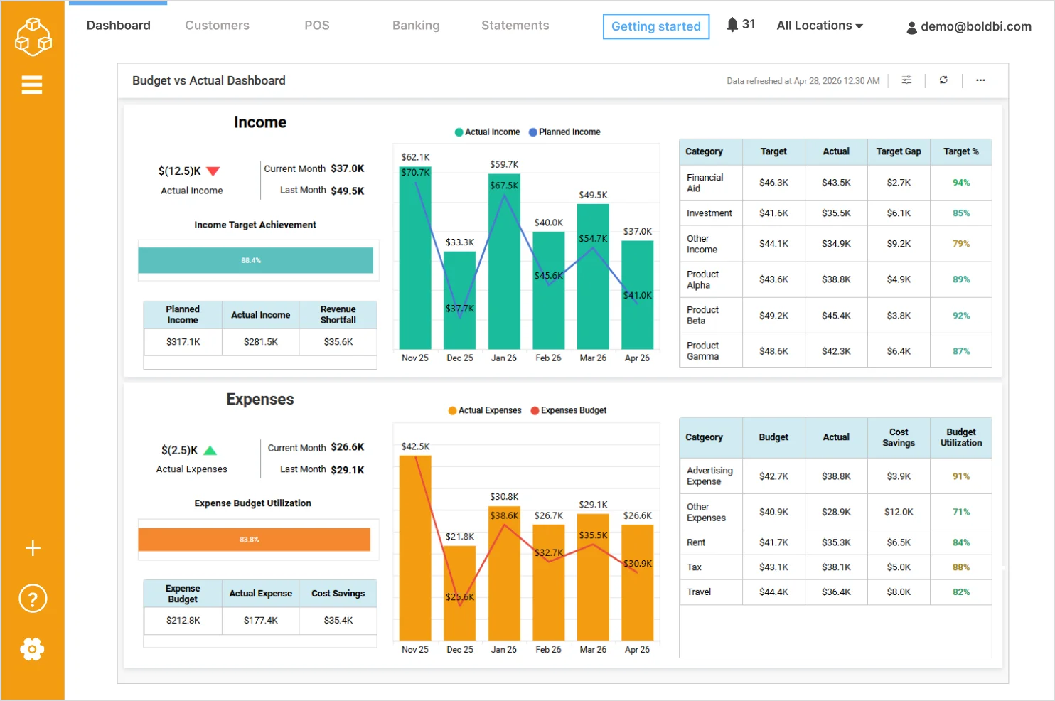
- Actual vs planned income: Compares current and historical actual income against planned targets to monitor revenue performance.
- Income target achievement: Shows the percentage of income targets achieved for quick performance assessment.
- Income variance by category: Analyzes gaps between target and actual income across categories such as Financial Aid, Investments, and Products.
- Actual vs budgeted expenses: Tracks real spending against expense budgets to identify cost overruns or savings.
- Expense budget utilization: Displays how much of the allocated expense budget has been consumed.
Check out more of our SaaS dashboard example for finance.
2. Sales industry dashboard example
A sales analysis dashboard tracks revenue, product performance, and sales trends over time. It helps teams understand sales performance and identify growth opportunities.
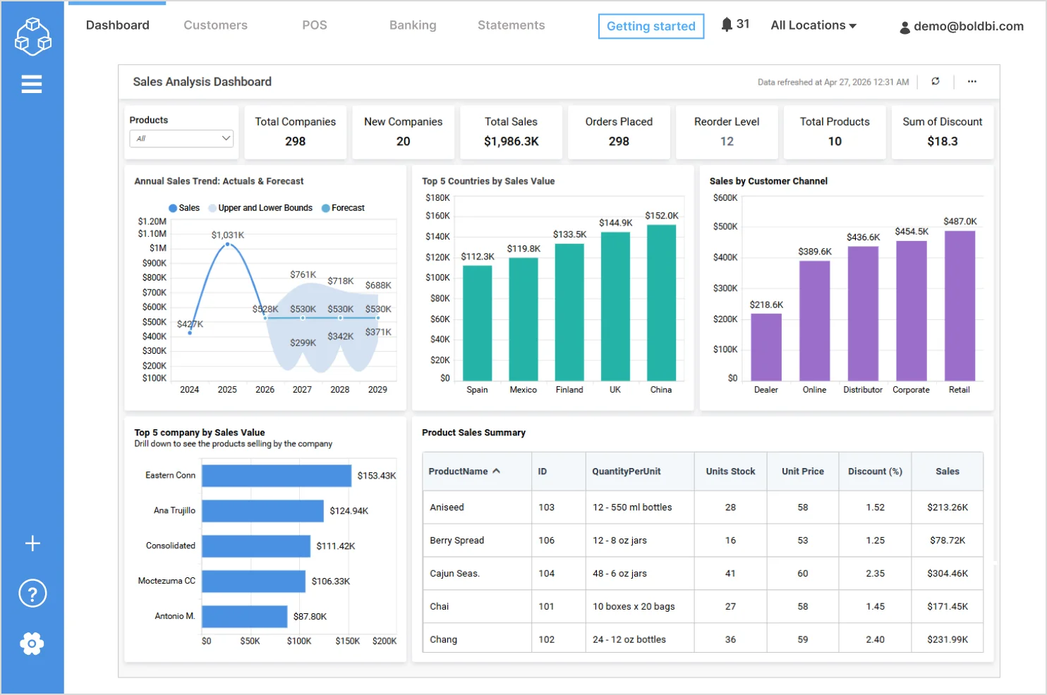
With the dashboard, you can track:
- Annual sales trend (actuals and forecast): Visualizes historical sales performance alongside future sales projections.
- Top countries by sales value: Highlights the countries contributing to the highest sales revenue.
- Sales by customer channel: Breaks down sales across customer channels such as Dealer, Online, Distributor, Corporate, and Retail.
- Top companies by sales value: Identifies the highest‑performing companies based on total sales.
- Product sales summary: Displays product‑level details including quantity per unit, stock, unit price, discount, and sales value.
Check out more of our SaaS dashboard for the sales industry.
3. Information technology dashboard example
A project management dashboard centralizes project progress, costs, revenue, and SLA performance. It helps IT teams manage delivery timelines, budgets, and service quality.
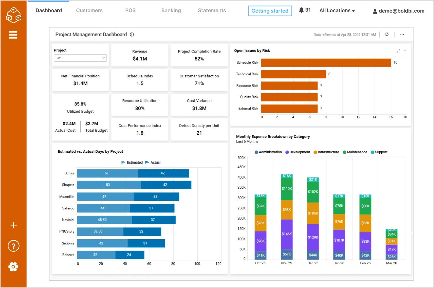
With the dashboard, you can track:
- Revenue and net financial position: Provides visibility into overall project financial performance.
- Project completion rate: Shows progress across projects to assess delivery status.
- Schedule and cost performance indicators: Tracks schedule index, cost variance, and cost performance index.
- Budget utilization: Compares actual cost against total budget to monitor spending efficiency.
- Customer satisfaction: Displays satisfaction levels to evaluate delivery quality.
Check out more of our interactive SaaS dashboards for IT teams.
4. Marketing dashboard example
A marketing performance dashboard tracks lead generation, acquisition costs, and campaign effectiveness across channels. It helps marketing teams optimize spend, improve conversion rates, and maximize ROI.
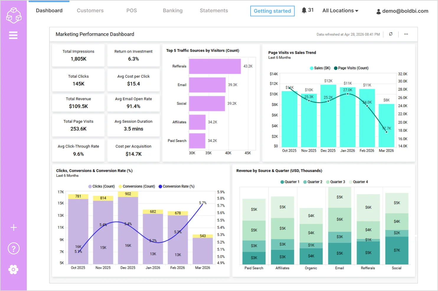
With the dashboard, you can track:
- Click‑through rate (CTR): Highlights how effectively impressions convert into clicks.
- Return on investment (ROI): Evaluates the profitability of marketing activities.
- Cost efficiency metrics: Tracks average cost per click (CPC) and cost per acquisition (CPA) to assess spending effectiveness.
- Traffic sources by visitors: Compares visitor contribution from channels such as Referrals, Email, Social, Affiliates, and Paid Search.
- Page visits vs sales trend: Visualizes the relationship between website traffic and sales performance over time.
Check out more of our SaaS dashboard examples for marketing:
5. Support dashboard example
A customer support monitoring dashboard provides real‑time visibility into support requests, service levels, and customer satisfaction. It enables teams to improve response times and support quality.
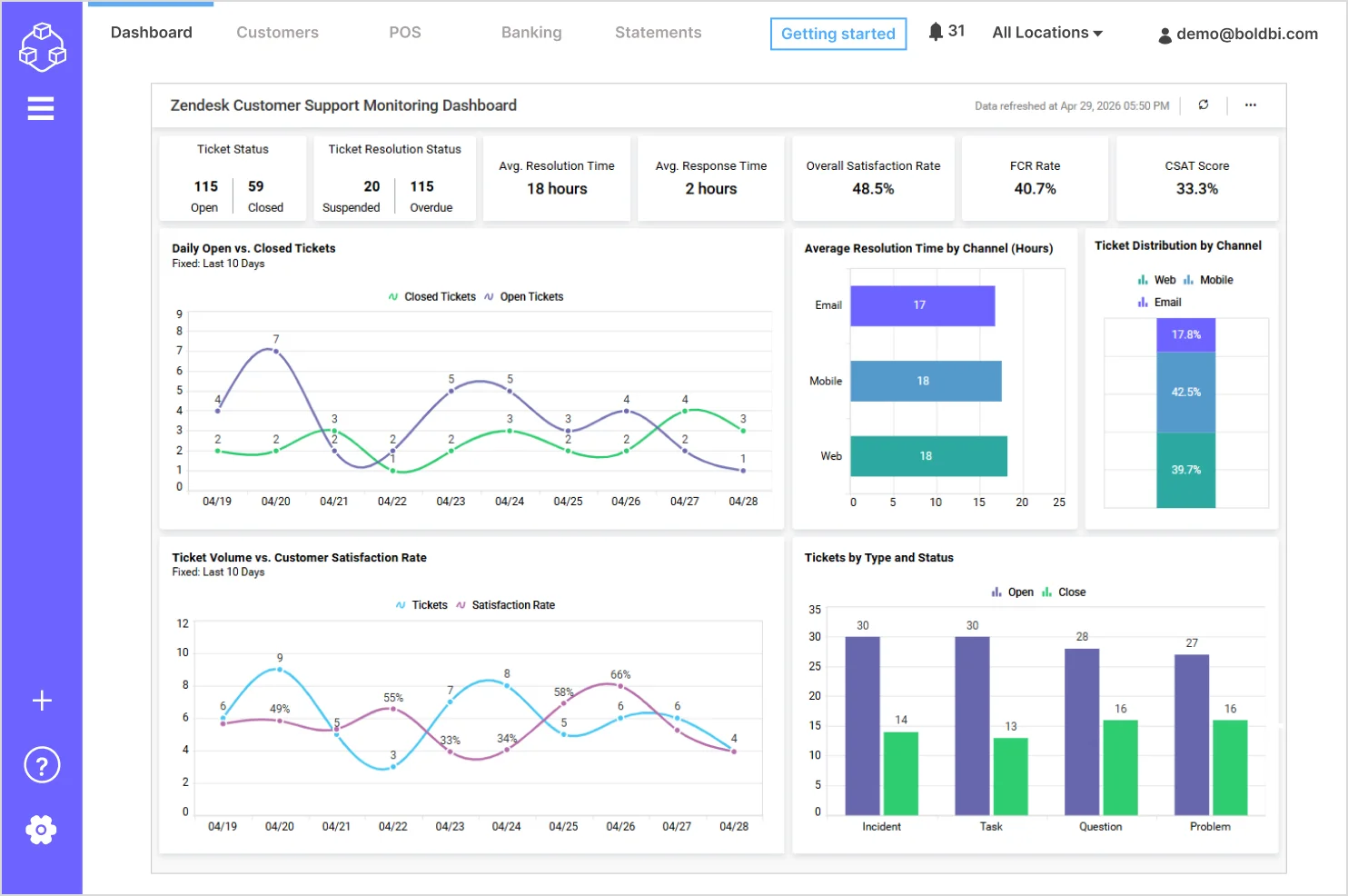
With the dashboard, you can track:
- First contact resolution rate: Indicates how many issues are resolved during the first interaction.
- Daily open vs closed tickets: Visualizes daily trends to assess ticket backlog and resolution efficiency.
- Tickets by type and status: Categorizes tickets by issue type such as incident, task, question, and problem, along with their resolution status.
- Ticket volume vs customer satisfaction: Highlights the relationship between ticket load and customer satisfaction trends.
- Average resolution time by channel: Compares resolution efficiency across email, mobile, and web support channels.
Check out more of our interactive SaaS dashboards for customer support.
6. Agile Customer satisfaction dashboard example
A customer satisfaction dashboard visualizes sprint progress, backlog status, and delivery performance. It helps agile teams and project managers improve sprint planning, predict delivery timelines, and maintain customer satisfaction.
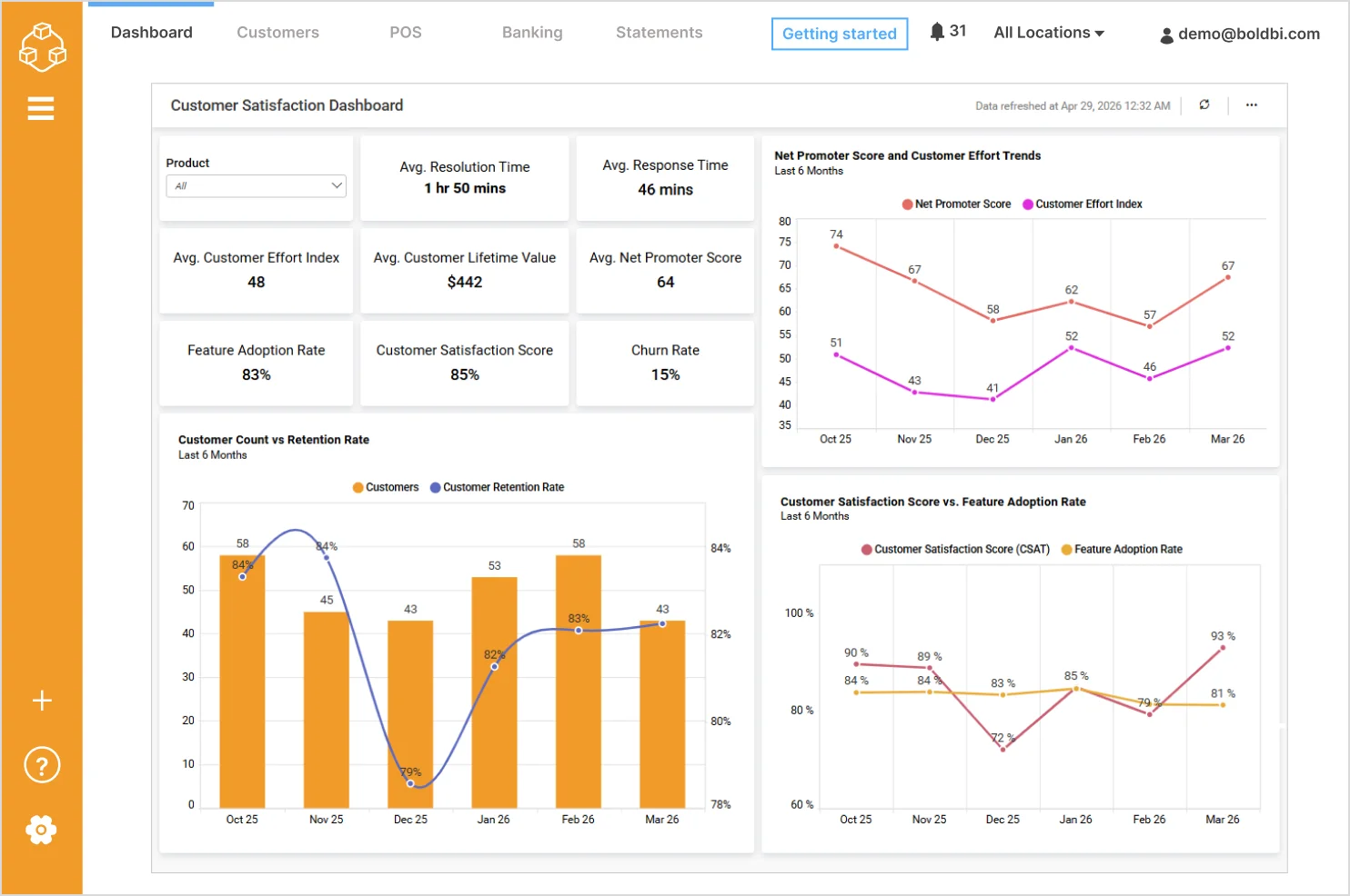
With the dashboard, you can track:
- Feature adoption rate: Tracks how widely customers are adopting key product features.
- Churn rate: Highlights customer attrition trends to identify retention risks.
- Customer count vs retention rate: Compares changes in customer volume with retention performance over time.
- Customer satisfaction vs feature adoption: Analyzes the relationship between product usage and customer satisfaction levels.
- NPS and customer effort trends: Visualizes long‑term trends to assess improvements in customer experience.
Check out more of our SaaS dashboards for agile and project management teams.
7. Survey dashboard example
A survey analysis dashboard consolidates customer feedback, sentiment, and satisfaction metrics into a single view. It helps businesses understand customer needs, measure experience, and guide product improvements.
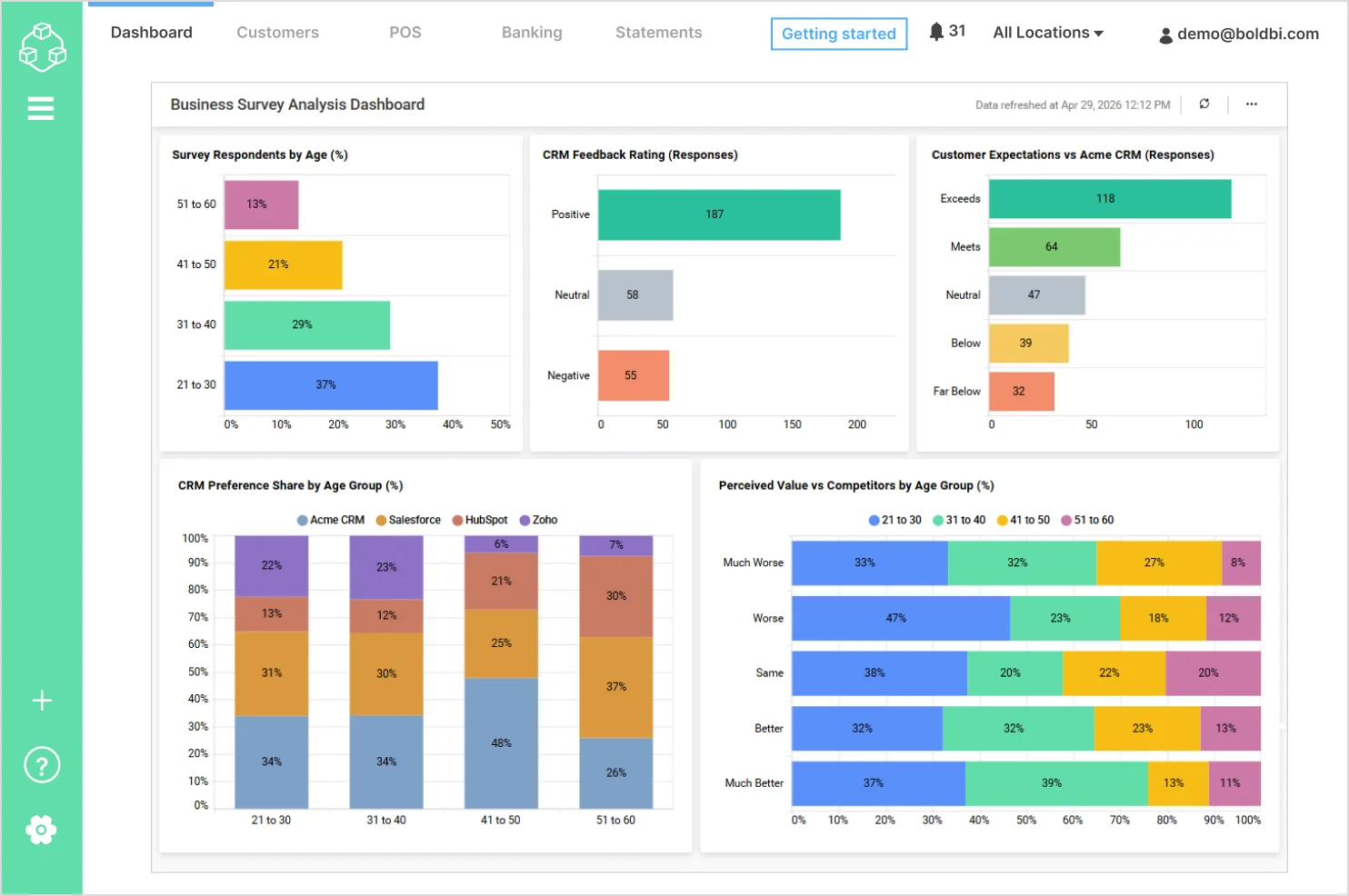
With the dashboard, you can track:
- Survey respondents by age group: Shows the demographic distribution of survey participants across different age ranges.
- CRM feedback rating: Breaks down customer feedback into positive, neutral, and negative responses to assess overall sentiment.
- Customer expectations vs product experience: Compares how customer experiences align with expectations, including exceeds, meets, neutral, and below expectations.
- CRM preference share by age group: Highlights how CRM product preferences vary across different age segments.
- Perceived value vs competitors: Evaluates how customers perceive the product’s value compared to competitors across age groups.
Check out more of our interactive SaaS dashboards for survey analysis.
How Bold BI helps you build SaaS dashboards
Building a SaaS dashboard requires flexibility, real-time data access, and powerful visualization capabilities.
With Bold BI, you can create interactive SaaS dashboards that bring all your data into one place.
- Connect to multiple SaaS data sources using APIs and connectors
- Build dashboards with drag-and-drop widgets
- Visualize real-time data with charts, KPIs, and tables
- Customize dashboards for different teams and use cases
- Use AI-powered features like Prompt to Dashboard to generate dashboards instantly
Bold BI helps organizations reduce data silos, improve visibility, and make faster decisions with ease. To learn more, explore our blog on 10 Best Practices for Designing Powerful Dashboards or watch a YouTube video.
If you want to deliver customer-facing dashboards and internal analytics from one platform, try Bold BI® free trial or request a personalized demo.
Frequently asked questions
- 1.
What is a SaaS dashboard used for?
A SaaS dashboard is used to monitor business metrics, track performance, and make data-driven decisions using real-time insights.
- 2.
Can SaaS dashboards show real-time data?
Yes, modern SaaS dashboards support real-time or near-real-time data updates.
- 3.
What kind of teams use SaaS dashboards?
Sales, marketing, finance, operations, product, and executive teams all use SaaS dashboards.
- 4.
How do I build a SaaS dashboard?
You can build a SaaS dashboard using tools like Bold BI by connecting data sources and creating visualizations.