
Top 5 Dashboard Reporting Tools Every Business Should Use

TL;DR: Dashboard reporting tools help organizations monitor performance and visualize key metrics through interactive dashboards. Choosing the right tool depends on usability, data connectivity, and the ability to support informed decision making.
Introduction
Effective decision-making relies heavily on insightful reporting. Dashboard reporting tools play a vital role in turning complex data into clear, actionable insights. With so many reporting options available, selecting the right dashboard tool can significantly enhance your analytics capabilities. This blog breaks down what dashboard reporting tools are, how they benefit organizations, and the key features to consider when choosing one. You’ll also discover five tools widely used in 2025 and learn how Bold BI® supports modern reporting needs.
What is a dashboard reporting tool?
Dashboard reporting tools are software applications that visualize and analyze data from various sources. They provide users with a consolidated view of key metrics and performance indicators through intuitive visualizations like charts, graphs, and tables. These tools enable businesses to transform raw data into actionable insights, helping stakeholders understand trends, monitor progress, and make data-driven decisions.
Benefits of dashboard reporting tools
Dashboard reporting tools empower teams to make data-driven decisions, improve operational efficiency, and foster collaboration by turning raw data into clear, actionable insights.
- Real-time decision making: Dashboard reporting tools provide instant access to live data, helping you make timely decisions. Whether you’re tracking sales, operations, or customer support, you can respond quickly to changes and avoid delays. Depending on configuration and data refresh settings, dashboards can provide near real-time visibility into performance metrics.
- Centralized data visibility: They consolidate data from multiple sources, such as databases, spreadsheets, and APIs, into one unified view. This eliminates the need to switch between systems or manually compile reports. This can provide a more consolidated view of business performance.
- Improved team collaboration: Dashboards can be shared across departments, enabling everyone to work from the same data. Role-based access ensures that each team sees what’s relevant to them. When collaboration is built in, teams align better, reducing miscommunication and redundant effort.
- Enhanced data insights: With interactive charts, filters, and drill downs, dashboard reporting tools help you uncover trends, patterns, and anomalies that might go unnoticed in raw data. You gain deeper insights that support smarter decision-making.
- Time and cost efficiency: Automated reporting saves hours of manual work. Instead of building reports from scratch, dashboards update themselves based on the latest data. This approach is designed to reduce manual reporting effort and support more strategic initiatives.
- Customization and personalization: You can tailor dashboards to specific roles, KPIs, or business goals. Whether you’re a marketer, analyst, or executive, the dashboard adapts to your needs. You see only what matters most to your role or objective.
- Performance monitoring: Dashboards help you track progress against goals, daily, weekly, or monthly. You can set alerts for underperformance to take corrective action early and stay proactive instead of reactive.
Let’s take a look at the key features to consider when choosing a dashboard reporting tool.
Key features to look for in dashboard reporting tools
When selecting a dashboard reporting tool, consider the following criteria:
- Ease of use and customization: A user-friendly interface with intuitive navigation and customizable widgets, layouts, and themes ensures users of all skill levels can build dashboards that suit their specific needs.
- Integration and compatibility: Top tools should integrate seamlessly with your existing data systems, whether they’re CRMs, ERPs, or databases, allowing for a unified data view without manual effort.
- Real-time data access: Real-time data updates are essential for timely, informed decisions. They ensure you’re always working with the most current insights.
- Security and support: Robust data security features like encryption and user authentication are critical, as is having access to dependable customer support during setup and usage.
- Flexible visualizations: Look for tools that support a range of visuals like charts, graphs, and tables that make it easier to present complex data in a clear and compelling way.
With these criteria in mind, let’s now explore five leading dashboard reporting tools on the market today, each offering unique features and strengths to meet different business needs.
5 leading dashboard reporting tools in 2025
As businesses increasingly rely on data-driven decisions, dashboard reporting tools have become essential for turning raw data into actionable insights. The following five tools are widely used for their dashboard reporting capabilities. Each has different strengths, so organizations typically evaluate them based on their data sources, governance needs, deployment preferences, and scale.
Bold BI
Bold BI is a powerful business intelligence platform designed for building interactive dashboards with drag-and-drop simplicity. It supports rich visualizations, AI-powered analytics, and extensive integration with databases, cloud services, and third-party applications.
Here’s a breakdown of its key dashboard-specific features:
- Real-time data connectivity: Bold BI connects to live data sources, making it useful for scenarios where timely data matters.
- Customizable widgets and layout options: Design dashboards effortlessly using the drag-and-drop interface and a wide range of widgets, including charts, gauges, and maps, no coding required.
- Support for over 140+ data sources: Integrate data from platforms like SQL Server, Salesforce, Google Analytics, Excel, and REST APIs to create unified, cross-platform dashboards.
- Embedded analytics: Embed dashboards directly into internal applications or portals to give teams access to insights within the tools they already use.
- AI-powered analytics: Bold BI includes AI-powered features such as the AI Copilot for designing dashboards, the AI Agent for conversational ad hoc analysis, generative-AI narrations for summaries, and prompt-to-dashboard capabilities that streamline data exploration.
- Data visualization and interactive dashboards: Bold BI enables users to transform complex data into clear, compelling visuals using a wide range of charting options. Its interactive dashboard features, like filters, drill-down menus, and parameters, allow users to explore data dynamically, uncover deeper insights, and make informed decisions with ease.
- Self-service analytics: Business users are empowered to build and customize dashboards independently using the intuitive drag-and-drop designer, no coding required. This reduces reliance on IT departments and accelerates decision-making.
- Multitenancy: Manage multiple clients or departments securely with the multitenant architecture. Features like role-based access, row-level security, and white-labeling support tenant isolation and scalable deployment.
- Collaboration: Facilitate secure, role-based access and real-time updates so teams can collaborate effectively using shared dashboards and scheduled reports.
Microsoft Power BI
Microsoft Power BI is a widely adopted business intelligence tool, particularly within organizations using Microsoft technologies. It combines intuitive dashboard design with AI-powered analytics to enhance decision-making. Key features include:
- Integrated ecosystem: Power BI works with Excel, Azure, SharePoint, and other Microsoft tools, making it a natural fit for organizations already using the Microsoft ecosystem.
- User-friendly design tools: Create rich, interactive dashboards using Power BI’s drag-and-drop interface. Users can build visual reports quickly without needing advanced technical skills.
- Collaborative reporting: Share dashboards and reports instantly through Microsoft Teams, OneDrive, or the Power BI service, streamlining collaboration across departments.
Tableau
Tableau is known for its rich visualization capabilities and intuitive design, making it a favorite among data analysts and business users. Its AI platform enhances dashboard reporting by simplifying analysis and delivering personalized insights. Key features include:
- Agent-powered intelligence: Tableau’s Agent enhances data exploration by enabling collaboration between users and an AI-powered assistant.
- Trusted data governance: Tableau provides advanced governance tools to ensure data accuracy, consistency, and secure access across dashboards.
- Deployment flexibility: Tableau supports deployment to Windows and Linux, on-premises or in the cloud, providing organizations with flexibility aligned to their reporting infrastructure needs.
Looker
Looker, which is part of Google Cloud, focuses on data modeling and embedded analytics, making it ideal for organizations that need customized data experiences. It enhances dashboard reporting with scalable, governed, and AI-integrated features. Key features include:
- Advanced data modeling: Looker uses LookML to create reusable, governed data models that ensure consistency and scalability across dashboards and teams.
- Flexible embedding: With robust APIs and SDKs, Looker makes it easy to embed dashboards and analytics directly into your applications, workflows, or customer-facing platforms.
- Robust data connectivity: Looker integrates seamlessly with Google Cloud and a wide range of data sources, enabling unified dashboards across diverse platforms and environments.
Qlik Sense
Qlik Sense is a flexible analytics platform that combines associative exploration with governed AI. It supports dynamic dashboard reporting and empowers users to uncover insights quickly. Key features include:
- Interactive dashboards: Experience fluid, intuitive data exploration with responsive dashboards that support real-time filtering, drill-down options, and visual storytelling.
- Flexible pricing models: Qlik Sense offers capacity-based pricing options designed to support teams of different sizes.
- AI-enhanced insights: A built-in AI assistant and natural language capabilities help users generate insights faster, making dashboards smarter and more accessible.
With the landscape of dashboard reporting tools in the rear-view mirror, let’s now look at six industry-specific dashboard reporting examples built with Bold BI.
Industry examples of dashboard reporting with Bold BI
Here are a few Bold BI dashboards tailored for different sectors.
Healthcare
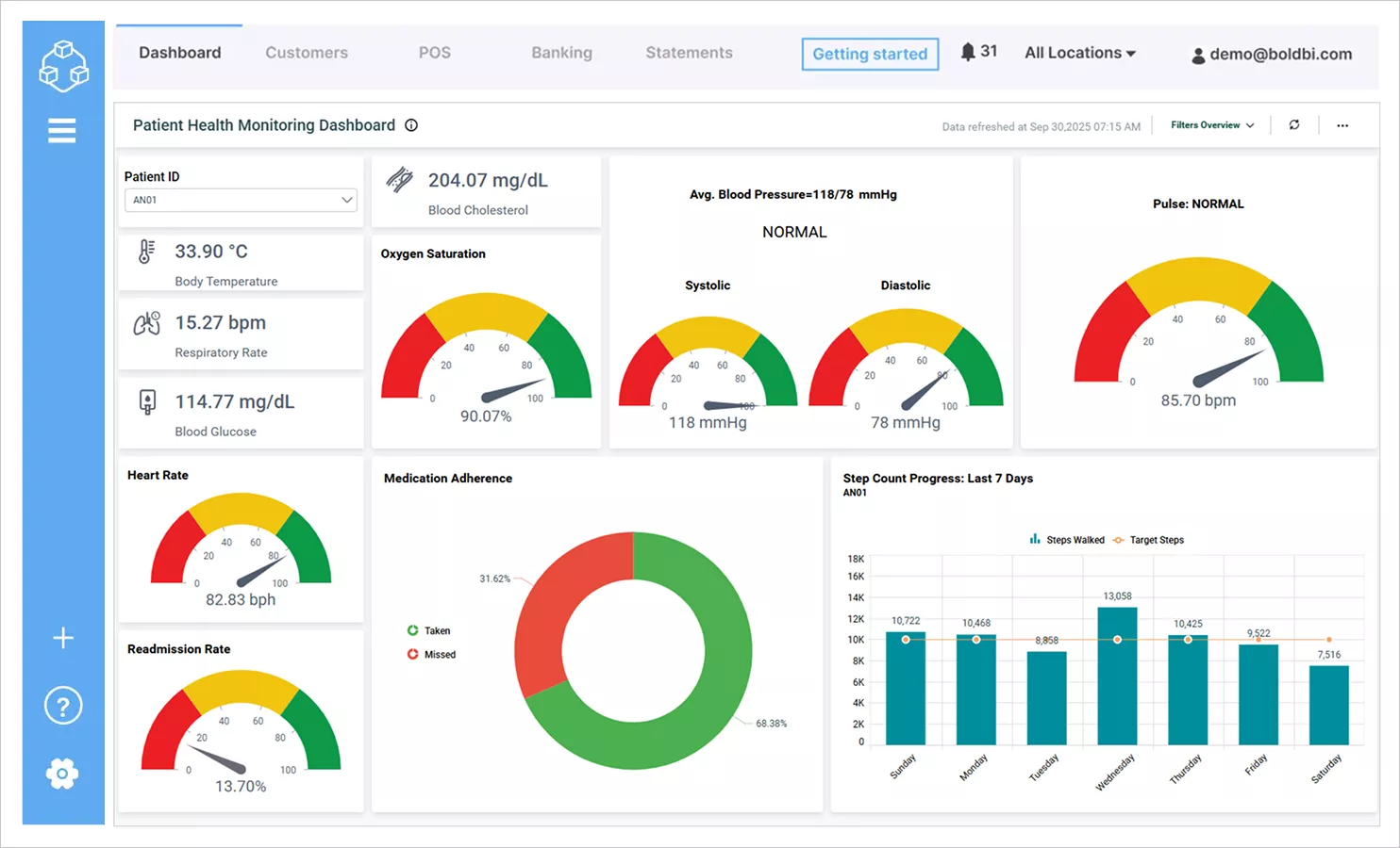
This patient health monitoring dashboard centralizes vital signs, including temperature, respiratory rate, blood pressure, oxygen saturation, and heart rate, in a single view. It helps healthcare teams monitor patients in real time and supports timely clinical review.
Finance
The finance management dashboard brings together key financial metrics like accounts receivable and payable, equity ratio, current ratio, and burn rate. It supports cash flow tracking, liability monitoring, and financial planning activities by presenting key indicators in a consolidated view.
Education
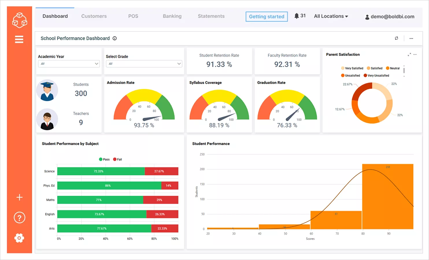
This student performance dashboard displays essential academic indicators such as retention rates, syllabus coverage, graduation rates, and pass and fail percentages. It can help educators and administrators identify patterns and support targeted interventions, based on institutional policies and data availability.
Sales
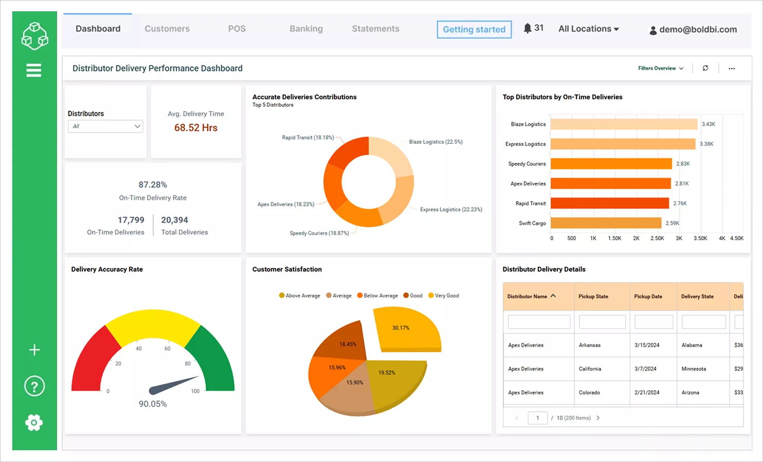
This distributor delivery performance dashboard consolidates delivery metrics like average delivery time, on-time rate, and accuracy. It supports logistics monitoring and helps teams identify process improvement opportunities.
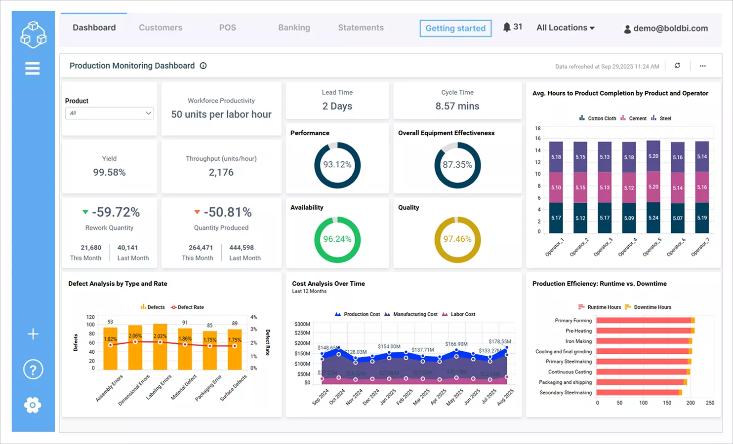
Manufacturing
This production monitoring dashboard tracks metrics like workforce productivity, throughput, yield, rework quantity, and overall equipment effectiveness. It is designed to support performance monitoring and help teams identify bottlenecks and areas for improvement based on available operational data.
Information technology
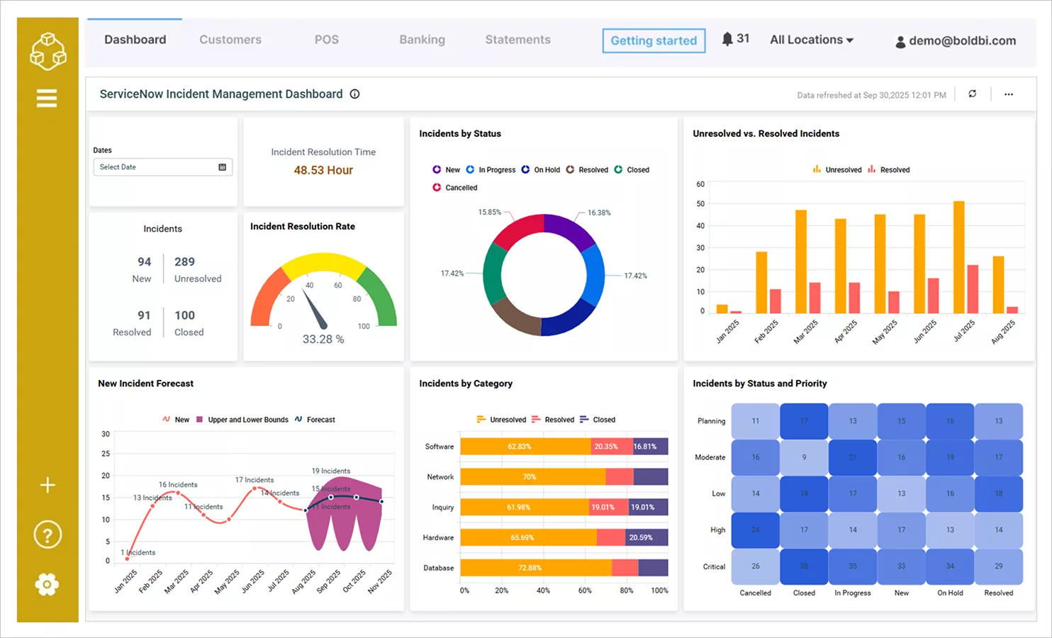
This incident management dashboard presents key IT metrics like issue resolution time, resolution rate, and incident status breakdowns. It can help IT teams monitor service performance and support prioritization and response workflows.
These are just a few examples of the dashboard reporting capabilities offered by Bold BI. Visit our dashboard examples page to explore a wide range of dashboards across industries, departments, and analytics use cases.
To wrap up, let’s take a closer look at why organizations select Bold BI for dashboard reporting in 2025.
Why choose Bold BI for dashboard reporting in 2025?
Choosing the right dashboard reporting tool depends on your organization’s reporting complexity, deployment preferences, and scalability requirements. Bold BI® is designed to support interactive dashboards, embedded analytics, multitenant environments, and flexible deployment models across cloud and on-premises infrastructures.
With its focus on usability, extensibility, and integration, Bold BI provides organizations with a structured approach to modern reporting workflows.
Ready to explore further? Sign up for a free trial or request a personalized demo to evaluate how Bold BI aligns with your reporting objectives.
Frequently asked questions
- 1.
What is a dashboard reporting tool?
It is a platform that presents data through visual dashboards to track metrics and trends.
- 2.
How do dashboard reporting tools support decision-making?
They provide quick access to insights by presenting data in a clear and interactive format.
- 3.
Are dashboard reporting tools suitable for non-technical users?
Many tools offer intuitive interfaces that allow business users to explore data without technical training.
- 4.
What features should teams look for in dashboard reporting tools?
Key features include interactivity, data connectors, customization, and ease of use.
- 5.
Can dashboards replace static reports?
In many scenarios, dashboards offer more timely and actionable insights than static reports.