
5 Interactive Data Visualization Features You Should Know

Gone are the days when data visualizations were static, when you could view plotted data but not interact with it. Raw data, when captured, isn’t useful unless you allow the user to break it down and evaluate it. Interactive data visualization can act as a standalone solution to help you achieve faster decision making, see your data clearly, and allow stronger user engagement. Interactive visualization can be anything from drill-down in a chart to hovering over a chart to select specific data points and visualize the story in your own way. In this article, we’ll look at the five most useful interactive data visualization techniques and how to apply them using Bold BI®.
Filters
If you have a huge data set and want to concentrate only on a specific area, you can add filters to limit the data displayed in the chart or dashboard. Filters can also be used to provide different combinations of data. So, instead of having a separate visual or dashboard for each category, you can add filters and let users change their criteria to explore the data. Bold BI allows you to add filters to your dashboard through customizable filter widgets as well as built-in grid filters.
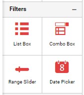
To add a filter, drag and drop the filter widget from the toolbox to the designer canvas and configure the field you want to filter.
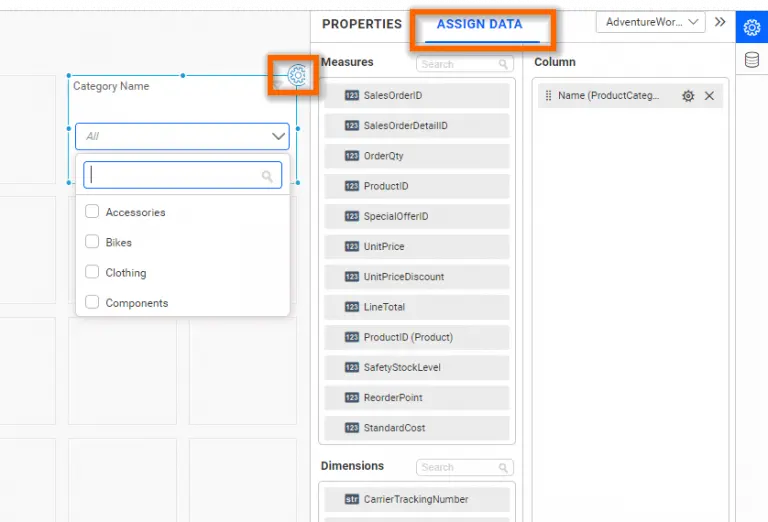
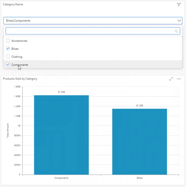
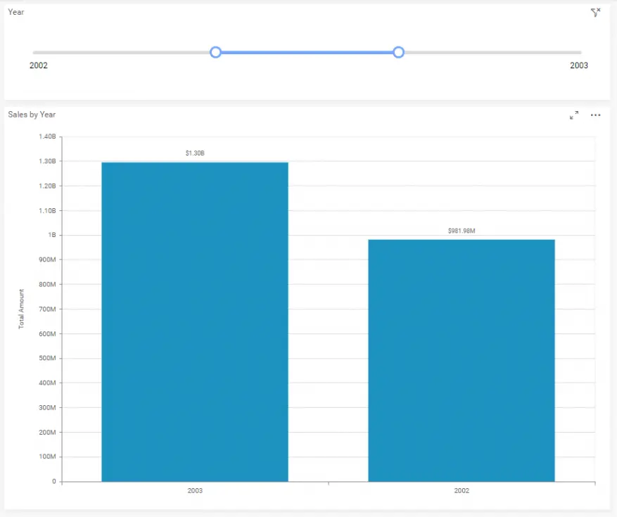
Filters can be added to any field based on the field type. Bold BI provides filter widgets such as range slider, combo box, and date picker for numeric, string, and date-time fields, respectively. The following image shows visualizations bound to the different field types.
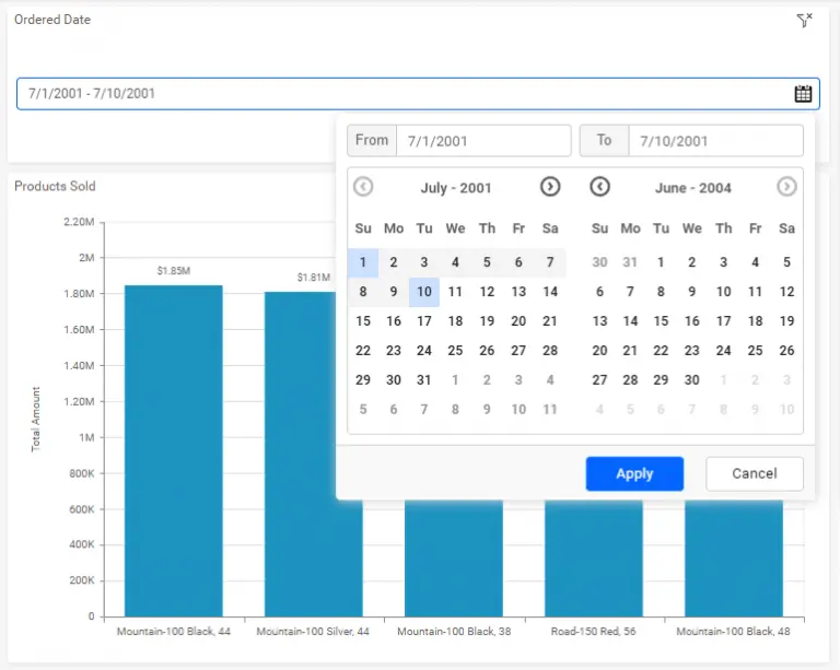
You can customize filters for a single widget or a group of widgets using the filter configuration window. In the filter configuration window, for a selected master widget, you can add one or more listener widgets from the widgets list.

The filter configuration window also has various other features. Filter profiles allow you to add custom relationships for a group of widgets if you need to target a different column for that group. Cross-data-source filtering is also possible by adding a custom relationship that includes the target data source and the target column. Learn more about filter configurations from our user guide.
Drill Down
Drill down allows users to explore in-depth details associated with displayed chart elements at the click of a mouse. For example, a chart showing sales across various countries can be drilled down by clicking a chart element to show sales across the states in that country. This allows users to analyze different layers of multidimensional data. Bold BI allows you to add drill downs for charts and tree maps. To configure a drill down, add multiple dimensions based on the required number of hierarchy levels to the columns section.
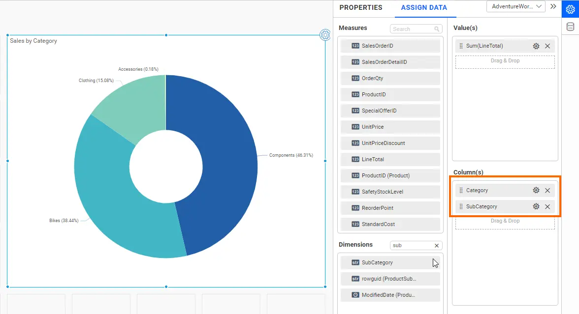
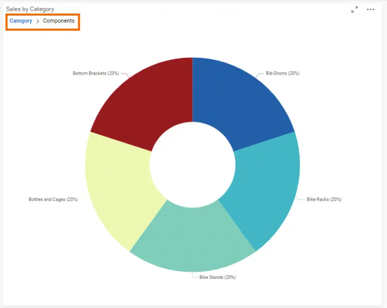
In the dashboard viewer, you can click on the pie slice or tree map region you want to explore and drill down to gain a deeper understanding of the data. You can also navigate back to the top hierarchy using the bread crumb available at the top of the chart or tree map.
Linking
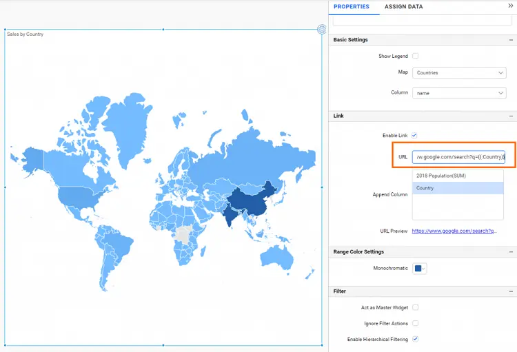
Widget linking can help you connect dashboards that are related to one another. For example, you may have high-level key performance indicators (KPIs) in one dashboard, and another dashboard holding details at a department level. You can add detailed dashboard links to your master dashboard’s widget and navigate to them see the complete story of the data. You can also add parameters and filter details in a secondary dashboard, based on the item selected in your master dashboard. Bold BI supports linking in all the widgets except card, gauge, and filters. Linking can also be done with external web content. To configure links in a widget, select the widget and choose Enable Link in the properties panel. Enter the URL of the other dashboard or the URL of the external web content in the URL text box. You can also send the selected value as a query parameter using the Append Column list box below the URL text box. Double-click the required field to append the parameter to the URL. You can learn more about linking from our documentation.
Show or hide values
Showing or hiding values can be a very useful feature when you have a large data set, and when legends are dynamically generated, as shown in the following example.
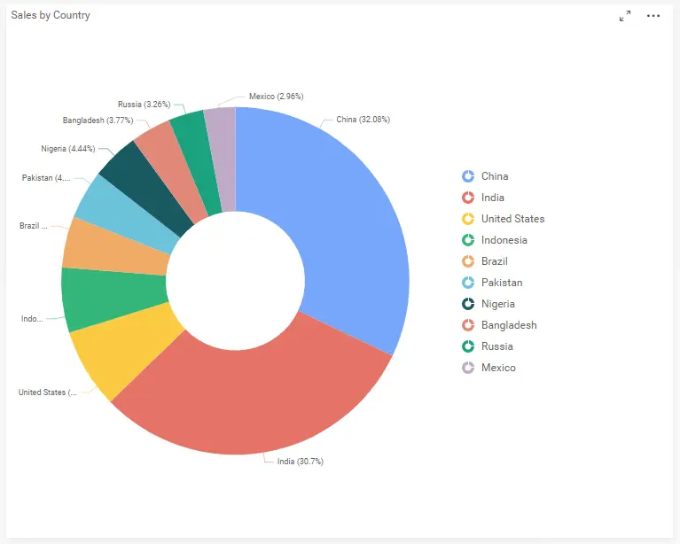
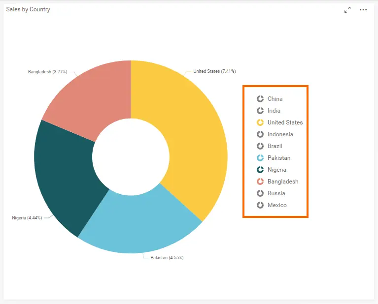
In the previous figure, the pie chart shows sales by country. If you want to exclude one or more data points and dig into only two or three countries where you want to create a sales strategy, all you need to do is click the legend items for the series you want to hide. The legend items will go into a disabled state and the corresponding data points will be removed from the chart and all aggregation calculations. The following figure shows the example pie chart with several legends and their data points removed from the chart.
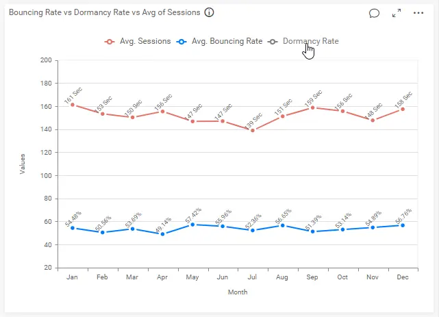
In Bold BI, you can also click on a series legend to exclude it from the chart as shown in the following image.
Sorting
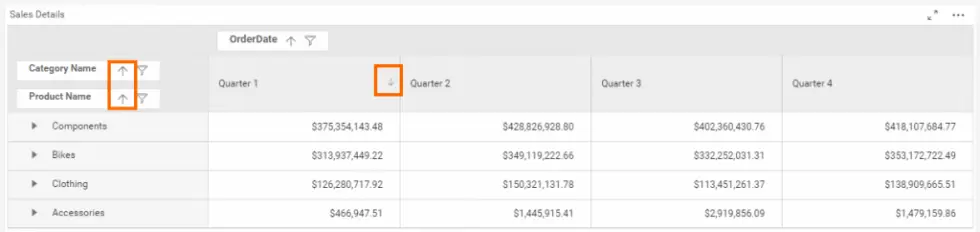
Sorting allows users to visualize data in ascending or descending order. In Bold BI, the comparison charts display values in descending order by default for better readability and easy comparison. You can also reverse the order or sort based on a condition when configuring the chart widgets. Grid widgets, on the other hand, provide support for interactive sorting by simply clicking on a column header. The following images show the sorting functionality in the grid and pivot grid widgets.

Conclusion
We hope this article helped you improve your dashboards by adding interactive data visualization features to them. If you have any questions on this blog, please feel free to post them in the following comment section. Get started with Bold BI® by signing up for a free trial and create more interactive business intelligence dashboards. You can also contact us by submitting your questions through the Bold BI website or, if you already have an account, you can log in to submit your support question.