
From Data to Clarity: Visualizing Dropbox Insights

A successful business relies on efficiency and collaboration. Integrating Dropbox into your workflow unlocks productivity by simplifying file management and modernizing teamwork. In this blog, we’ll walk you through the steps to create seamless connections between Dropbox and Bold BI®, as well as how to visualize Dropbox data to boost your business’s overall efficiency.
What is Dropbox?
Dropbox is a cloud-based service that stores and syncs files across various devices. It offers collaboration features for team-based work and provides a user-friendly interface. Dropbox ensures data security through encryption and offers free and paid plans with various storage options. It simplifies file management and enhances accessibility, making it an excellent tool for both personal and business use.
Locating files in your Dropbox account
Locating files within Dropbox is an easy and efficient process. You can quickly find your files using the search bar, which supports partial matches and displays real-time results. The integration of Bold BI and Dropbox supports file formats like CSV, JSON, XML, and XLSX.
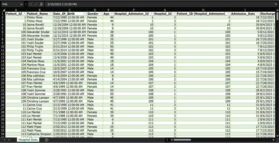
Let’s examine how files stored in your Dropbox account can be integrated into Bold BI.
Integrating Dropbox data with Bold BI
To integrate and configure Dropbox as a Bold BI data source and retrieve data from your Dropbox account, follow these steps:
- Click the Data Sources button on the dashboard home page to access to the data source creation page.
- Click Create New on the data source pane to start a new data source connection.
- Go to the Cloud Storage category and choose Dropbox.
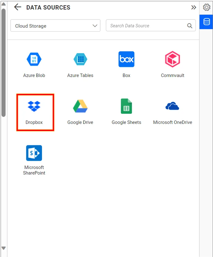
Data Connection Listing Panel - Provide your Dropbox credentials in the authentication pop-up to connect your Dropbox account to Bold BI.
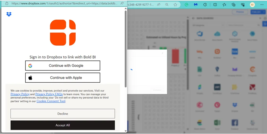
Dropbox Authentication - The linked account will appear as shown in the following image. Click Connect.
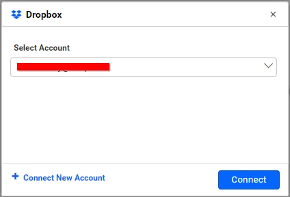
Select Dropbox Account - After you’ve finished authenticating, provide the name of the data source.
- Choose the file in your Dropbox that you’d like to preview and establish a connection with.
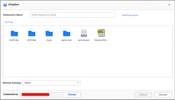
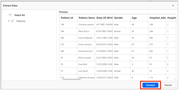
Select a File - Connect and preview the data source.
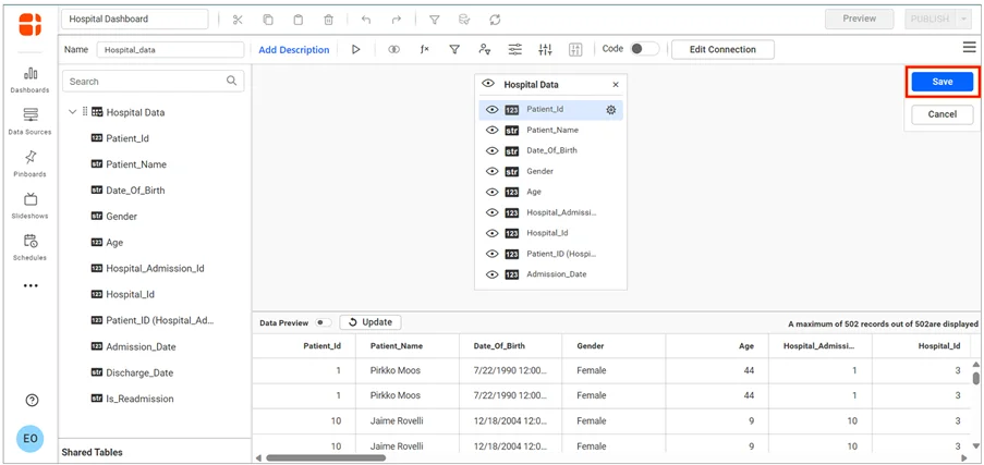
Preview and Connect - Once you’ve established a connection, proceed to the data source designer page and drag a table onto the canvas. Click Save.
Save Data Source
Once you’ve linked the data source to your Bold BI account, you can create a dashboard for proper data visualization.
Create a dashboard with Dropbox data
Let’s re-create this hospital management dashboard using Dropbox integration data. We can build the dashboard from the ground up by dragging widgets into the dashboard designer. This hospital management dashboard offers a thorough summary of healthcare metrics and KPIs. This includes data on doctors, patients who have been admitted and readmitted, and the readmission rate. This information is crucial for making informed decisions about delivering care and enhancing patient outcomes.
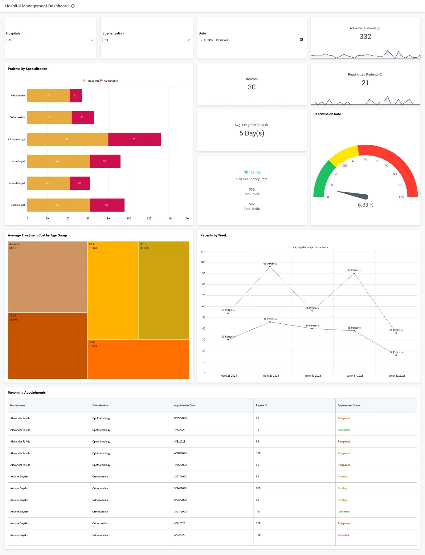
Using this hospital management dashboard, we can visualize key healthcare metrics, such as:
- Admitted patients: Total number of patients newly admitted to the hospital or healthcare facility.
- Doctors: Number of healthcare providers available in the facility.
- Readmitted patients: Number of patients readmitted to the hospital within a defined period after their initial discharge.
- Patients by specialization: Breakdown of total admissions based on medical specialization or department.
- Average length of stay: Average number of days patients spend in the hospital from admission date to discharge date.
- Bed occupancy rate: Percentage of hospital beds occupied during a specific period.
- Readmission rate: Percentage of patients readmitted within a specific time frame after their initial discharge.
- Average treatment cost by age group: Average cost of treatment for patients in different age groups.
- Patients by week: Number of patients admitted and discharged weekly.
- Upcoming appointments: Number of scheduled appointments for a specific period.
You can then visualize these metrics in the dashboard by configuring them into widgets.
Configuring data into widgets in the dashboard
Before arranging the Dropbox data into widgets, we need to set up expressions for the metrics. Use the functions in the following table to create expression columns to be used in the widget configurations:
| Expression | Function |
| Female | IF([Gender]= ‘Female’,1,0) |
| Male | IF([Gender]=’Male’,1,0) |
| Age Group | IF([Age]>0 AND [Age]<=10,’0 -10′,IF([Age]>10 AND [Age]<=30,’10-30′,IF([Age]>30 AND [Age]<40,’30-40′,IF([Age]>= 40 AND [Age]<50 ,’40-50′,IF([Age]>=50,’Above 50′,’0′))))) |
| Readmitted | IF([Is_Readmission] = ‘Yes’,[Hospital_Admission_Id],0) |
| Days in Hospital | DATEDIFF(day,[Admission_Date],[Discharge_Date]) |
| Total Discharges | IF([Discharge_Date]< TODAY(), 1, 0) |
| Length of Stay | [Days in Hospital]/[Total Discharges] |
| Readmission Rate | (countd([Readmitted])/sum([InPatients]))*100 |
| OutPatients | if([Patient_Type]=0,1,0) |
| InPatients | if([Patient_Type]=1,1,0) |
| Bed Occupancy Rate | (Sum([InPatients])/sum([Total_Beds]))*100 |
Follow these steps to visualize the metrics derived from the expressions in the preceeding table:
- Drag and drop the required widgets to the dashboard designer page. Configure the data sources using the formats in the following table:
| Metric/KPI | Configuration |
| Hospitals | Type: Combo box
Value: Hospital_Name |
| Specialization | Type: Combo box
Value: Specialization |
| Date | Type: Combo box
Value: Admission_Date |
| Admitted Patients | Type: Number Card
Value: InPatients |
| Readmitted Patients | Type: Number Card
Value: Readmitted |
| Doctors | Type: Number Card
Value: Doctor_id |
| Avg. Length of Stay | Type: Number Card
Value: Length of Stay |
| Readmission Rate | Type: Radial Gauge
Value: Readmission Rate |
| Bed Occupancy Rate | Type: KPI Card
Actual Value: InPatients Target Value: Total_beds |
| Patients by Specialization | Type: Stacked Bar Chart
Value: InPatients, OutPatients Column: Specialization |
| Average Treatment Cost by Age Group | Type: Tree Map
Value: Cost Column: Age Group |
| Patients by Week | Type: Line chart
Value: InPatients, OutPatients Column: Converted Date |
| Upcoming Appointments | Type: Grid Widget
Column: Doctor_Name, Specialization, Appointment_Date, Patient_ ID, Appointment_Status |
With the widgets in place and the data assigned, the hospital management dashboard is ready and can be shared among administrators to provide valuable insights within the hospital. The dashboard can also be scheduled to sync and refresh to showcase regular updates.
Scheduling data refreshes for a Dropbox dashboard
To ensure your data remains up to date, you can establish data refresh schedules for the dashboard. For the Dropbox integration, simply use the Refresh Settings feature to set a schedule for data transfer from your cloud storage to an intermediate database location.
To configure these settings:
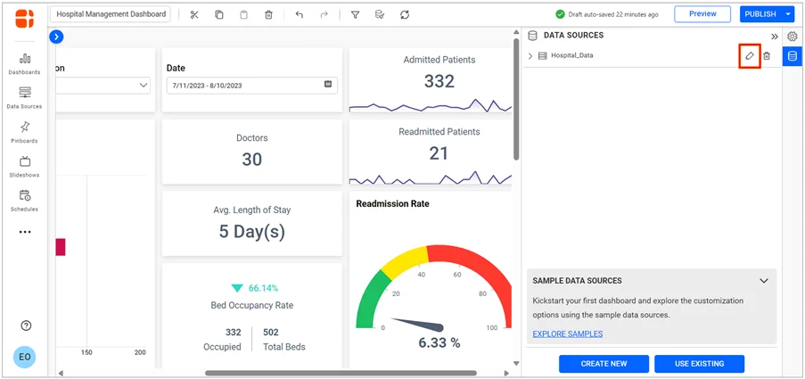
1. Navigate to the dashboard designer page. On the Data Sources pane, click the Edit icon.
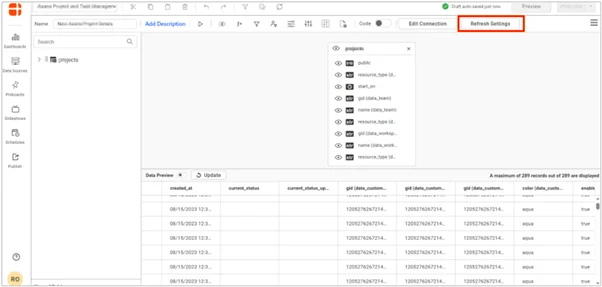
2. Click Refresh Settings on the data source designer page.
The Refresh Settings schedule will pop up, as shown in the following figure.
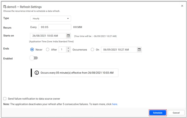
3. In the Refresh Settings window, set the data refresh intervals and click Schedule to enable the data refresh schedule.
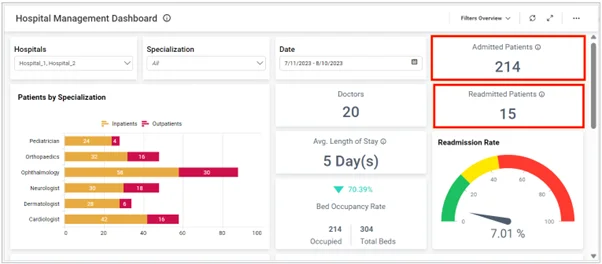
Once the refreshes have been scheduled, the dashboard will automatically refresh, and the most recent refresh time will be displayed next to the toolbar at the top. In the following figure, the data in the dashboard has been refreshed, resulting in updated Admitted Patients and Readmitted Patients cards.
I hope you now have a better understanding of the ways healthcare practitioners and administrators can simplify hospital management by dashboard integrated with Dropbox. This blog post has demonstrated how to set up such a dashboard using Bold BI®. I encourage you to create one with your own Dropbox data and discover its usefulness! If you’re new to Bold BI, you can sign up for a free trial on our website.