Microsoft SQL Server is a relational database management system widely used by top industries. It has a large user base across different industries such as IT, healthcare, retail, insurance, finance, education, management, sales, and marketing for their storage and data processing operations. In this article, we learn how to prepare a dashboard to analyze product sales and prioritize products in production with the Contoso BI demo database using Bold BI Dashboards.
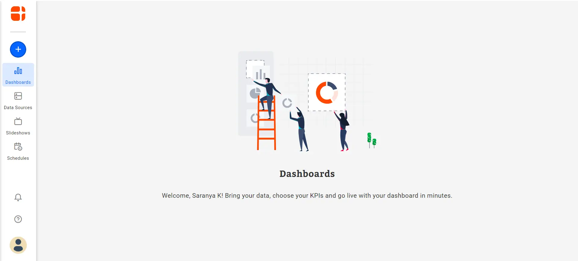
If you are new to the Bold BI Dashboards, sign up for a free 30-day trial on our website. At the end of the registration process, you will reach the following page view.
Homepage view in Bold BI Dashboards
Set up SQL Server and Contoso demo for sales dashboard
Let’s consider the following metrics to analyze product sales:
The total sales and total return amounts.
Difference in return amounts among product categories.
Return quantities by product category during each sales year.
Top 10 products with lowest production cost.
Top 10 products with good returns.
Distribution of return amount by year and month.
Set up SQL Server and Contoso demo for sales dashboard
Install the SQL Server in your local machine or in a remote accessible server by referring to the Microsoft documentation.
Furthermore, Download, extract, and restore the Contoso BI demo database by referring to the Install Instructions.
Creating a dashboard and data source
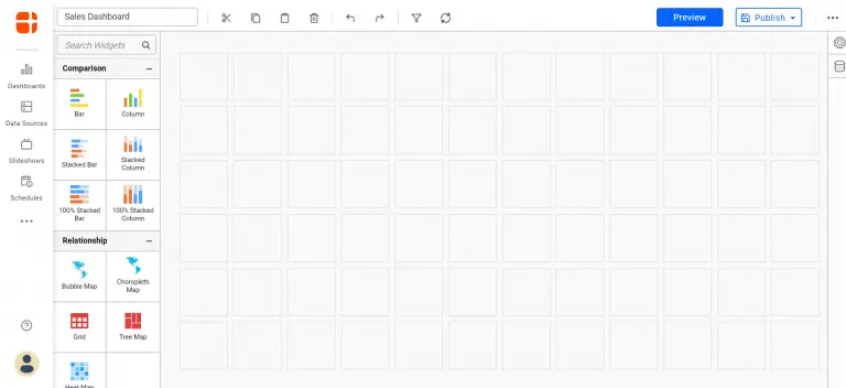
Firstly, select the New Dashboard tile in the homepage and click Start from Scratch of the Bold BI Dashboard Platform. The Dashboard Designer page will open with a new blank dashboard created like in the following.
A blank dashboard design view
Connecting to Microsoft SQL Server database
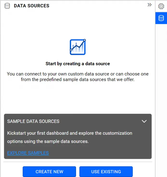
Select the data source icon on the right. The data source panel will expand as shown in the following.
An empty data sources panel
Similarly, select CREATE NEW in the previous panel.
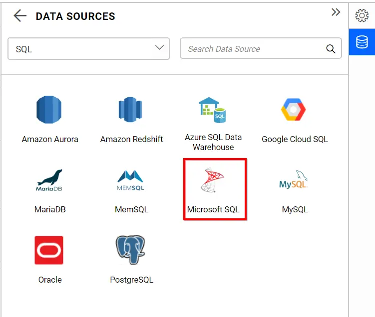
Furthermore, choose the category SQL in the Categories drop-down list. As a result, this list shows the data connectors available under this category like in the following.
Choosing MS SQL Server
Finally, choose the Microsoft SQL connector. The Microsoft SQL data connection window will display in the DATA SOURCES panel like in the following.
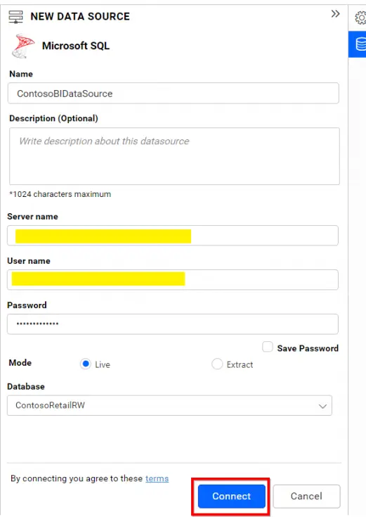
SQL Server Data Source Configuration Window
Creating a data source
Firstly, name the data source as ContosoBIDataSource at Name field in the NEW DATA SOURCE window.
Furthermore, fill the SQL Server name where your database resides in Server name field. For example, remotemachine(or)ipaddress,1433 where, 1433 is the port number. In addition, the SQL Server running at remote machine should be reachable for Bold BI Dashboard’s site.
Likewise, fill the login details at User name and Password fields.
Finally, choose the database in Database field for Contoso BI demo data. For example, the database name is ContosoRetailDW.
Editing the data source
Firstly, navigate to the dashboard design page and expand the DATA SOURCES panel on the right.
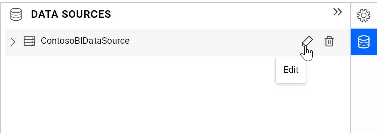
Furthermore, click the Edit icon near the ContosoBIDataSource data source. As a result, the data source window will open like in the following.
Editing SQL Server Data Source
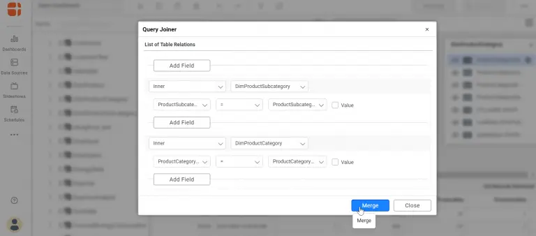
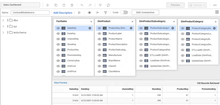
Likewise, drag and drop the FactSales table and related dimension tables such as DimProduct, DimProductSubcategory, and DimProductCategory by using INNER JOIN with their respective keys.
Join Editor
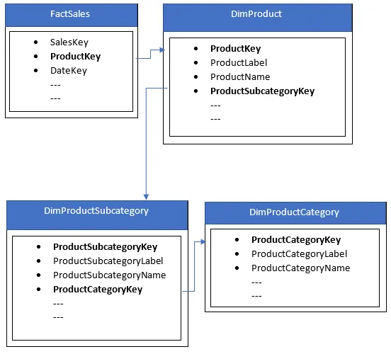
Most importantly, the actual relationship among these tables is like in the following image.
Relationship Diagram
As a result, the data source editing view is like in the following image.
Editing view of a data source
Finally, save the data source.
Configuring widgets in dashboard
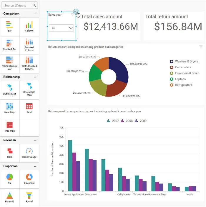
Select the widget to configure and click the Widget Settings icon at the top-right corner of the focused border like in the following.
Focused view of widget in dashboard
As a result, the panel on the right side expands toward the left. Choose the ASSIGN DATA tab and start configuring the mentioned fields in corresponding sections as described in the following table.
Widget Title
Widget Type
Data Configuration
Sales year
Combo Box
Column(s): DateKey
Format: Year
Return amount comparison among product subcategories
Doughnut Chart
Value(s): ReturnAmount
Aggregation: Sum
Format:
Type: Currency
Representation: Millions
Column: ProductSubcategoryName
Total sales amount
Card
Actual Value: SalesAmount
Aggregation: Sum
Format:
Type: Currency
Representation: Millions
Total return amount
Card
Actual Value: ReturnAmount
Aggregation: Sum
Format:
Type: Currency
Representation: Millions
Return quantity comparison by product category level in each sales year
Column Chart
Value(s): ReturnQuantity
Aggregation: Sum
Format:
Type: Number
Representation: Thousands
Column(s): ProductCategoryName and ProductSubcategoryName
Row: DateKey
Format: Year
Top 10 products with lowest production cost
Bar Chart
Value(s): TotalCost
Aggregation: Sum
Format:
Type: Currency
Representation: Thousands
Column(s): ProductName
Filter: Rank Bottom 10 based on Sum(TotalCost)
Top 10 products based on return amount
Bar Chart
Value(s): ReturnAmount
Aggregation: Sum
Format:
Type: Currency
Representation: Thousands
Column(s): ProductName
Filter: Rank Top 10 based on Sum(ReturnAmount)
Return amount comparison for each month of sales year
Heatmap
Value: ReturnAmount
Aggregation: Sum
X-Axis: DateKey
Format: Year
Y-Axis: DateKey
Format: Month
Finally, the sales dashboard is ready.
Sales Dashboard
Sharing dashboard
Now, share this dashboard with your sales team to analyze the sales and make wise decisions about product(s) to improve them.
Start Embedding Powerful Analytics
Try out all the features of Bold BI with 30-day free trial.
We hope this article helps you build a sales analysis dashboard with Microsoft SQL Server data using the Bold BI Dashboards. If you have any questions on this blog, please feel free to post them in the following comment section. Get started with Bold BI by signing up for a free 30-day trial and create more interactive business intelligence dashboards. You can also contact us by submitting your questions through the Bold BI website or, if you already have an account, you can log in to submit your support question.
At Bold BI, Suriyaprakasam R serves as both a senior product manager and an SEO manager. He assists people in implementing best practices for dashboarding and integrated analytics in their applications. To develop your BI and analytical abilities, subscribe to Bold BI blogs.
Discover what AI analytics is, why it matters, and how Bold BI provides features that simplify insights through real-time dashboard creation across industries.
Discover the AI data visualization tools you should use to streamline your workflows, uncover insights & make better decisions through natural language input.