
Build Your Own KPI Examples with Sample Data Sources

A key performance indicator (KPI) is a progress indicator for evaluating the performance of a business’s activities toward an intended outcome. Organizations use KPIs to measure their success at reaching their targets on different performance aspects. They must be well defined so that individuals, specific departments, and teams know what they’re trying to achieve and whether they are choosing the right path to reach those goals. Bold BI® allows you to build your own KPI examples with an integrated gallery of sample data sources. Select the right KPI and visualize data in a relevant widget using Bold BI for the part of the business you would like to track. In this blog post, let’s go through some of these sample data sources to see which KPIs are most needed in relevant industries and how those KPI examples need to be created and tracked.
Gallery of sample data sources
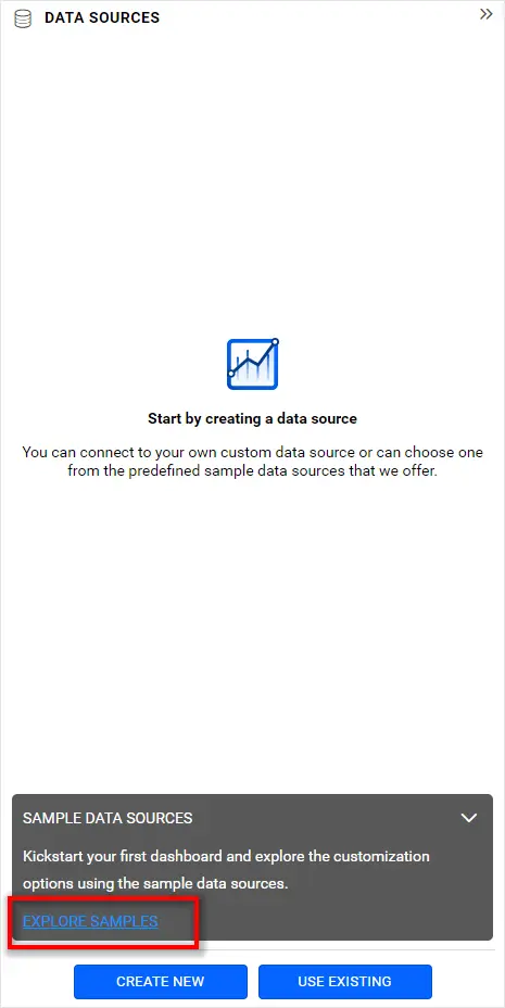
To explore the sample data sources gallery, create a new blank dashboard. Expand the DATA SOURCES panel and click EXPLORE SAMPLES.
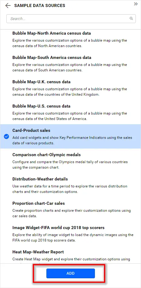
The sample data sources gallery opens. This gallery holds the list of data sources, each of which has sample data relevant to a specific industry or department along with a widget suggestion (prefixed in the data source name) with which a KPI example can be created. Select the data source you would like to try and click ADD.
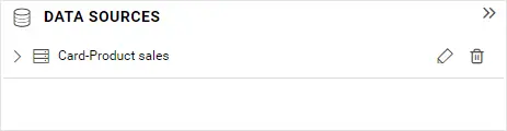
Finally, the selected data source will be imported and added in the DATA SOURCES listing panel like in the following.
Building KPI examples
Let’s explore some of these data sources, define KPIs, and build KPI examples with relevant widgets.
Olympic medals
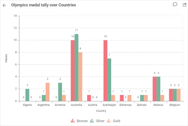
This data source showcases the Olympic medal tally of various countries. It is best to represent this KPI in a comparative manner, which a column or bar chart can do.
Population census
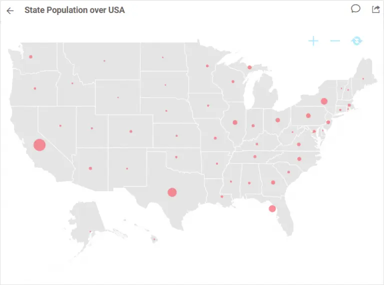
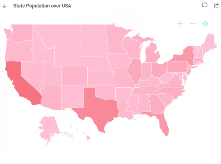
Maps can visually convey the population of a country by its states or provinces best. Bubbles or gradient colors can best visualize population density in states.
Northwind products and suppliers
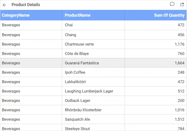
In this data source, the overall list of products associated with Northwind Traders is showcased along with individual price, category, and quantity details. An overview of all products is best visualized through a flat grid widget.
Order detail
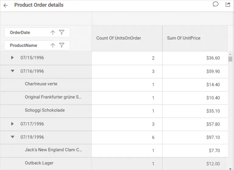
A pivot grid in summarized view visualizes product order details best. You can easily get an overview of the quantity sold and the sale amount by order date.
Weather Report
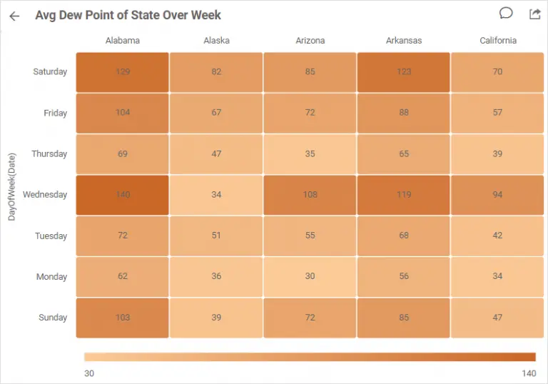
The daily average dew point of states over a week can be visualized best in a heat map. You can easily see which states have an extreme dew point because of the gradient colors.
Product sales
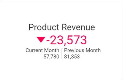
This data source lets you visualize product sales comparatively between the current month and the previous month. A KPI card is best to showcase this KPI.
Car sales
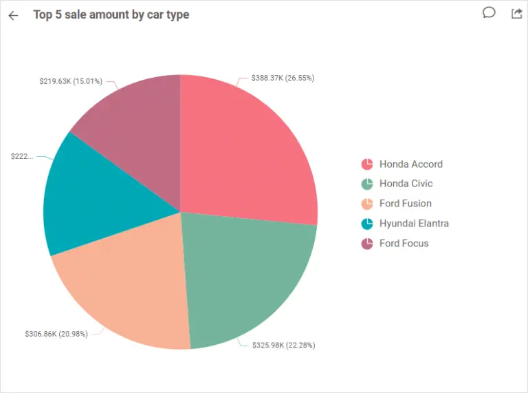
This data source contains total revenue for the top five car types sold. The pie chart is suitable to visualize this KPI.
Conclusion
We have explored some of the sample data sources in the gallery and how the KPI examples can be created and tracked. We hope you now have an idea of how to utilize the sample data sources gallery to build your own KPI examples. If you have any questions on this blog, please feel free to post them in the following comment section. Get started with Bold BI® by signing up for a free trial and create more interactive business intelligence dashboards. You can also contact us by submitting your questions through the Bold BI website or, if you already have an account, you can log in to submit your support question.