
From Data to Safety: Analyzing Weather Patterns with Heatmaps

Understanding and predicting weather is crucial for many industries and daily activities. Traditional weather reports often lack detailed information, making heatmap visuals a significant tool for accurate tracking. This article explores the importance and advantages of heatmaps in weather analysis, starting with the challenges of such analysis that heatmaps can address.
Key challenges in weather analysis
Here are some of common challenges in weather analysis:
- Data volume and variety: The sheer volume and diversity of weather data, including information from satellites, sensors, radars, and weather stations, can be overwhelming. Integrating and processing this data effectively is a challenge.
- Communication and visualization: Presenting complex weather analysis results in a clear and actionable manner to diverse audiences can be challenging. Choosing the right visualization techniques is crucial.
- Real-time processing: In scenarios where real-time decision-making is necessary, processing and analyzing weather data in a timely manner becomes challenging due to the speed at which weather conditions change.
- Resource intensiveness: Running complex algorithms and models to analyze weather data can require substantial computational resources, both in terms of hardware and processing time.
- Scalability: Handling data at the scale of global weather patterns requires scalable infrastructure and distributed processing to manage large datasets.
- Collaboration: Accurate weather analysis often requires collaboration between meteorologists, data scientists, and domain experts to interpret data in the context of specific industries.
Having discussed the challenges of weather analysis, let’s now delve into how business intelligence (BI) plays a pivotal role in enhancing our ability to effectively tackle these weather-related complexities.
The role of BI in weather analysis
The role of BI in weather analysis is instrumental in transforming raw meteorological data into actionable insights for various industries and decision-makers. Here are several key aspects of BI’s role in weather analysis:
- Data integration and aggregation: BI tools excel at collecting and integrating data from multiple sources, including weather stations, satellites, radar systems, and historical databases. This data aggregation creates a comprehensive and unified view of weather conditions over time.
- Data sanitization and quality control: These tools can identify and correct inaccuracies or discrepancies in data, assuring high-quality and reliable information for analysis.
- Real-time monitoring: BI systems provide immediate access to weather data, allowing meteorologists and analysts to swiftly react to changing weather events. This is particularly crucial for sectors such as aviation, agriculture, and emergency management.
- Data cleansing and quality assurance: BI tools can automatically clean and validate weather data, identifying and rectifying errors or inconsistencies. This ensures the accuracy and reliability of the data used for analysis.
- Predictive Insight: BI systems accumulate and dissect historical weather data, enabling the analysis of trends and the identification of extensive weather patterns. This is fundamental for climate studies, appraising environmental impacts, and strategizing businesses in industries reliant on weather conditions.
- Alerting and notification: BI tools can be configured to issue automated alerts and notifications when predefined weather thresholds are reached. This proactive feature is crucial for disaster management, agriculture, and energy production.
Now, we will explore a heatmap for weather analysis to understand climatic patterns across regions. This visual will present data clearly, enabling a comprehensive interpretation of weather trends and anomalies.
Unlocking insights through heatmap visualization
So, what is a Heatmap?
A heatmap illustrates tabular data by using gradient colors to showcase the correlation between chosen items on the x and y axes. Effective for displaying multi-row, two-column data, heatmaps employ varying colors and gradients to emphasize ratings, ranging from low to high or weak to good. These are commonly used in meteorological studies to illustrate various weather aspects such as temperature, humidity, pressure, and wind speed over a specific geographical region.
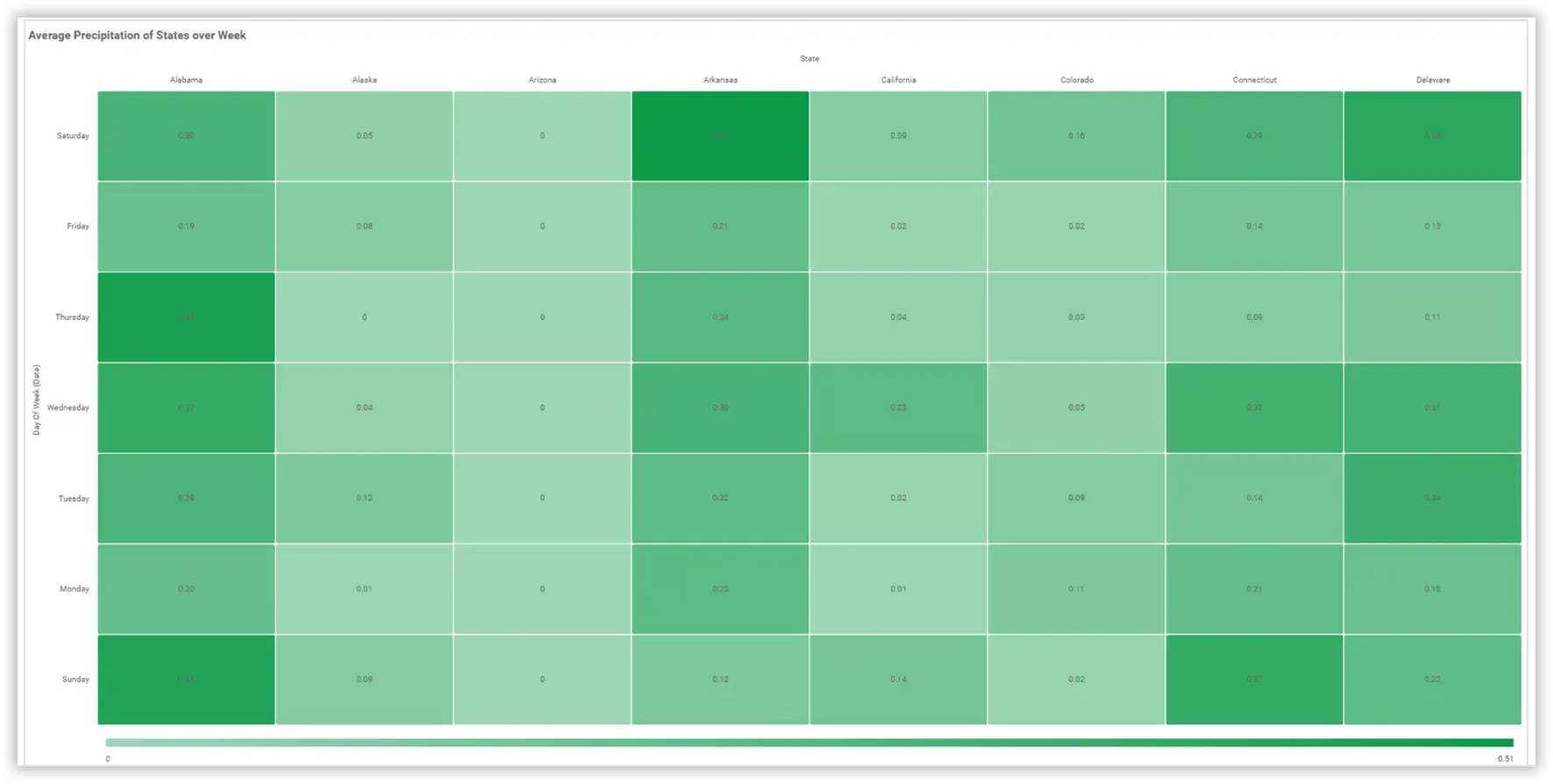
The power of heatmaps and their relevance in weather analysis
Weather greatly impacts our daily lives and economic activities. Our understanding of meteorology has improved by data visualization through visuals like heatmaps. These color-coded visuals forecast and monitor weather conditions like temperature, humidity, and wind speed. They help users visualize complex weather data, track extreme weather events, and improve weather prediction accuracy. Combined with Geographic Information Systems (GIS), they provide location-specific weather information crucial for industries like agriculture, construction, and tourism.
Let’s look at a sample heatmap of humidity variation by state and month.
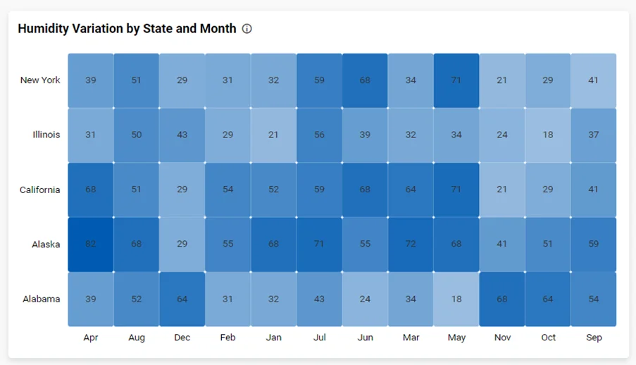
Monitoring humidity variation by state and month through a heatmap provides valuable data for understanding climate patterns and predicting weather changes. It aids in sectors like agriculture, construction, and health where moisture levels significantly impact operations and conditions.
The relevance of heatmaps in weather analysis is quite significant due to the following reasons:
- Simplifying complex data: Weather data is often complex and can be difficult to understand in raw, numerical form. Heatmaps use color gradients to represent this data in a visual and intuitive way, making it easier to interpret.
- Pattern recognition: Patterns and trends in weather data can be easily discerned from a heatmap. For instance, a temperature heatmap can reveal how temperatures fluctuate across different regions.
- Weather forecasting: Heatmaps are a valuable tool for predicting future weather conditions. For example, analyzing previous rainfall heatmaps can help predict which areas are likely to experience rain in the future.
- Quick overview: A heatmap offers a swift snapshot of weather conditions across an extensive area, which is particularly beneficial for weather prediction and climate research.
- Decision support: Heatmaps can assist in decision-making processes in various sectors such as agriculture, aviation, and outdoor event planning, where weather is a critical factor.
Having understood the power of heatmaps and their relevance in weather analysis, it’s crucial to further explore creating impactful weather heatmaps. Now, let’s generate a weather heatmap.
Generating an impactful weather heatmap
A heatmap allows you to visualize large amounts of weather data as clustered rectangles with a color scale. The following image gives an overview of the steps for generating an impactful weather heat map.
Now let’s dive into these steps in detail.
- Collecting data: The initial phase involves accumulating precise and comprehensive weather data from dependable sources. This may encompass temperature, rainfall, and wind velocity, among others.
- Processing data: The raw data often needs to be cleaned and structured. Any outliers or inconsistencies must be dealt with to make sure the heatmap is a true reflection of the conditions.
- Selecting appropriate parameters: Based on what you intend to visualize, choose the relevant parameters. For example, illustrating temperature variations might call for a different method as compared to monitoring rainfall.
- Choosing the color scheme: The color scheme is of vital importance. Warm tones like red and orange may signify high temperatures, while cool hues like blue and green could denote rain or cooler temperatures.
- Creating the heatmap: Employ specific software or coding libraries to convert the data into an aesthetically pleasing heatmap. Ensure that the color intensity correctly corresponds to the data values.
Visualizing weather insights for informed decision-making
Heatmaps offer a powerful visual for analyzing large datasets. To learn more about heatmaps, refer to our blog on Cracking the Code: Heatmap Visualization for Insights. Now that you have gained insights into what heatmap is, the power of a heatmap, and its relevance in different weather conditions, let’s explore some of the heatmaps suitable for performing weather analysis.
Monthly average temperature by state
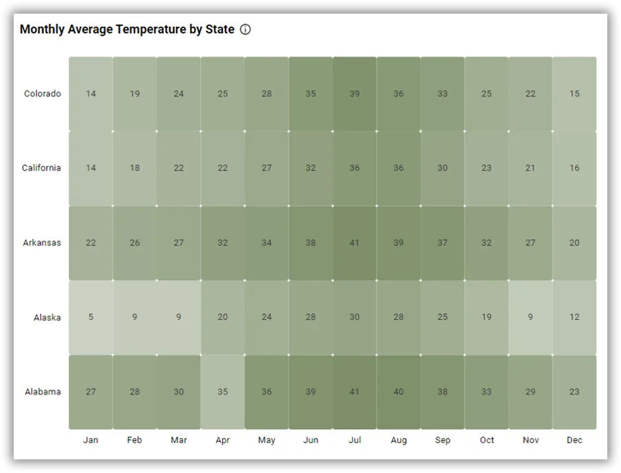
This temperature heatmap visually represents temperature variations across the U.S. for each month. It aids in weather pattern analysis, helping meteorologists, scientists, and analysts identify seasonal trends, monitor climate changes, and assess temperature impact. This visualization informs decisions in agriculture, energy planning, and climate change adaptation by offering a concise view of regional temperature fluctuations.
State-wise precipitation rates by month
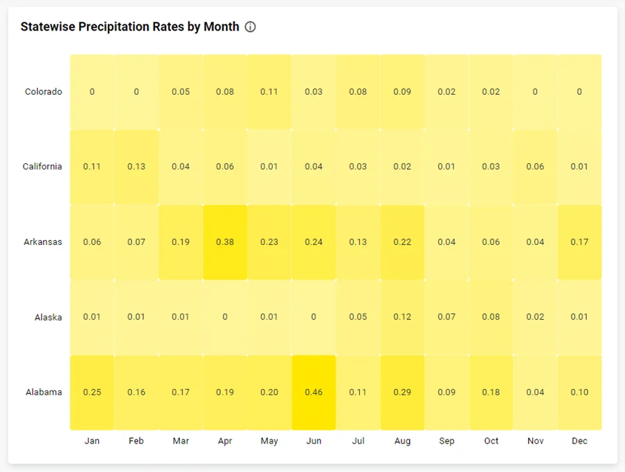
This precipitation rates heatmap visually represents rainfall distribution across regions, aiding in the identification of geographic patterns and disparities. It’s crucial for weather analysis, helping experts and policymakers make informed decisions about water resources, agriculture, and disaster planning at a regional level, addressing climate variations and extreme weather challenges.
You can access all of these visualizations within a dedicated dashboard crafted using Bold BI®. This interactive dashboard empowers you to explore and analyze weather data with ease.
Conclusion
Using heatmaps for weather tracking simplifies complex meteorological data, aiding in identifying disaster-prone areas. BI tools further enhance this by visualizing crucial weather patterns and severe conditions, thus improving disaster prediction and preparedness. The integration of heatmaps in weather tracking and disaster management safeguards lives and resources.
If you have any questions or need assistance, don’t hesitate to reach out through the Bold BI website; simply log in to submit your inquiries if you already have an account. If you’re not yet a customer, get started with Bold BI now by signing up for a free trial!