
Mastering the Art of Presenting Data with Column Charts

A column chart is a type of data visualization that represents information using vertical columns. It is commonly used to display categorical data and compare values across different categories or time periods. By leveraging column charts, data is represented in a clear and concise manner enabling efficient comparison and analysis, hence promoting effective communication and informed decisions.
What is a column chart?
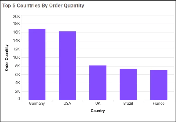
In a column chart, each bar corresponds to a specific category and its height represents the value related to that category. Here is an example of a column chart.
Types of column charts
Here are some of the common types of column charts:
Stacked Column Chart
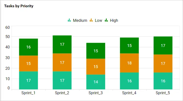
Stacked column charts are used to show the composition of a whole and the relative contribution of each category.
100% Stacked Column Chart:
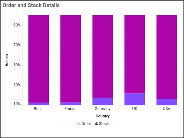
In this chart, the height of each column represents the percentage of the whole, making it easier to compare relative proportions of different categories.
Here are some of the benefits of column charts:
- Easy data comparison: Column charts are useful when dealing with large datasets or when trying to identify trends or patterns and comparing them.
- Visual impact: Column charts are clear and simple, drawing attention to the data’s key insights.
- Flexibility: They can handle a variety of data types and can be used to represent both discrete and continuous data.
- Highlighting discrepancies: Column charts are useful for identifying inconsistencies in data, making it easier to detect abnormalities and identify arears of improvement.
- Audience-friendly: Column charts are generally easy to understand since the visual representation simplifies multiplex data, enabling non-technical stakeholders to grasp key findings quickly.
When to use a column chart
While using a column chart, you should consider the following:
- Column charts can be used to understand how trends are evolving.
- They provide a clear visual display of the distribution of responses across different categories.
- They are good when you need to display ranked data, allowing viewers to identify which category has the highest or lowest value.
- They are ideal when you have data that falls into discrete categories.
- The are useful when you need to display a set of data that contains negative values.
- When you are trying to present data with short category labels, they handle that task well.
When not to use a column chart
- When you want to display continuous data.
- When visualizing large data sets.
- When representing proportions or percentages.
- When showing relationships containing many distinct variables.
- When making precise quantitative comparisons between different data points.
Best practices for using a column chart
- Choose the right data: Ensure your data is relevant, accurate, and suitable for a column chart.
- Keep it simple: Stick to the essential information to make it easier for viewers to interpret and understand the chart quickly.
- Label your axes: Label the horizontal (x-) and vertical (y-) axes vividly to assist viewers in understanding the data.
- Add titles and captions: Include a clear title for your chart that describes the main objective or message.
- Minimize distractions: Avoid unnecessary gridlines, borders, or decorations that may distract viewers from the data.
- Provide context: You can provide additional context to help viewers understand the significance of the data.
- Choose appropriate colors: Select colors that are visually attractive and allow for easy comparison between columns.
How to configure a column chart in Bold BI
Access your Bold BI® account and navigate to the desired dashboard. From there, you have the option to add a new widget where you can select the column chart type and choose the data source. Specify the x-axis and y-axis values, customize the appearance, enable interactive features like color, fonts, and data labels, and save the widget to represent the column chart on the dashboard. To configure a column chart in Bold BI, you can follow the steps on our documentation.
Real-time use cases of column charts
Column charts could be used in the following departments:
Sales: Categories of products with high sales
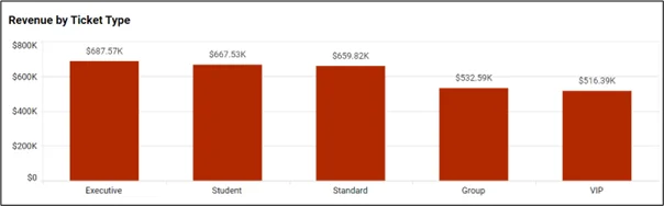
This column chart showcases products with high sales in a department based on their performance, and it presents them in a visually informative manner, allowing users to easily identify the high selling product categories.
Finance: Accounts payable by payment target
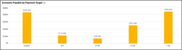
This column chart provides an overview of the amount a company owes its suppliers. It can be used to visually track and compare actual payables against a desired target, enabling better financial management and decision-making.
Education: Examination results by branch
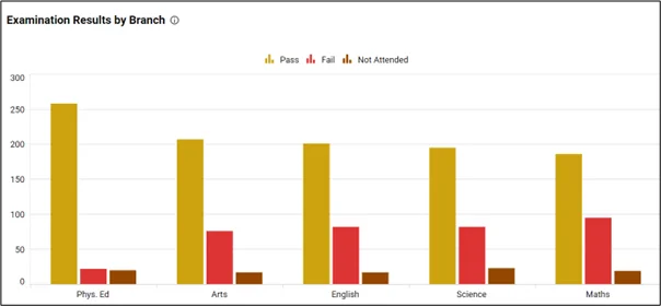
The column chart shows examination results of students in each subject in a school branch. It helps education stakeholders evaluate student performance and identify arears of improvement.
Construction: NCR reports by project
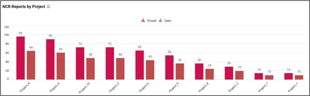
The selected column chart shows the number of closed and open NCR reports for each project. This helps a construction company observe and note work that has not met the required quality standards.
Energy: Energy consumption by sector
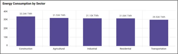
This displays how energy is utilized across different sectors, allowing users to analyze and compare energy usage patterns in industries such as residential, construction, agricultural, industrial, and transportation.
Government: Accidents by Day of the Week
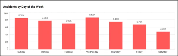
This column chart shows weekly accident analysis, enabling government stakeholders to identify contributing factors and risk areas, allowing them to execute measures for accident prevention.
Healthcare: Length of stay
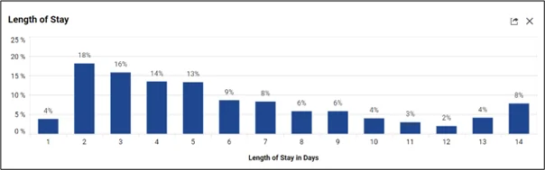
In this patient experience analysis dashboard, the length of stay column chart measures the average duration a patient stays in a hospital or healthcare facility, providing insight into resource allocation, patient flow, and operational .
Information technology: Planned vs. completed tasks by projects
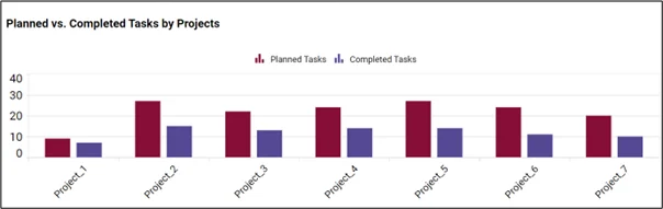
In IT departments, the “planned vs. completed tasks” metric visually represents the progress of tasks, showcasing the planned tasks alongside the completed ones, allowing for easy monitoring and assessment of project performance.
To conclude, a column chart is a robust visual technique for displaying and comparing data in a clear and brief manner. By leveraging the column chart’s creativity and simplicity, individuals and organizations can effectively conduct research and make informed decisions.
If you have any questions or need assistance, don’t hesitate to reach out through the Bold BI website; simply log in to submit your inquiries if you already have an account. If you’re not yet a customer, get started with Bold BI now by signing up for a free trial!