


Sankey Chart
Sankey Chart
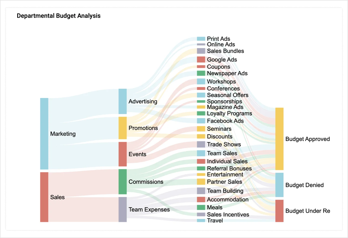
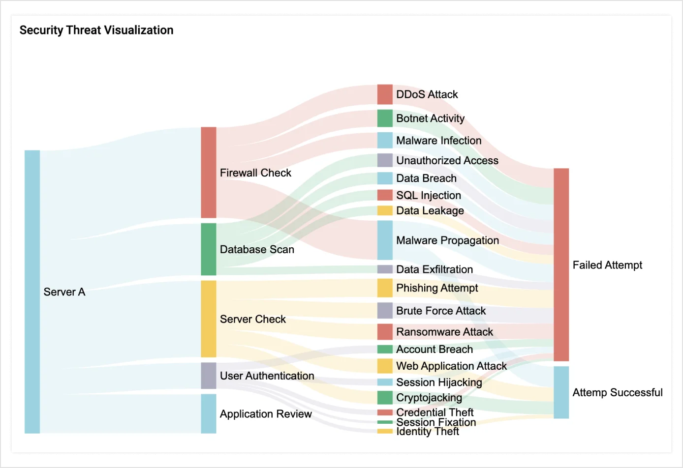
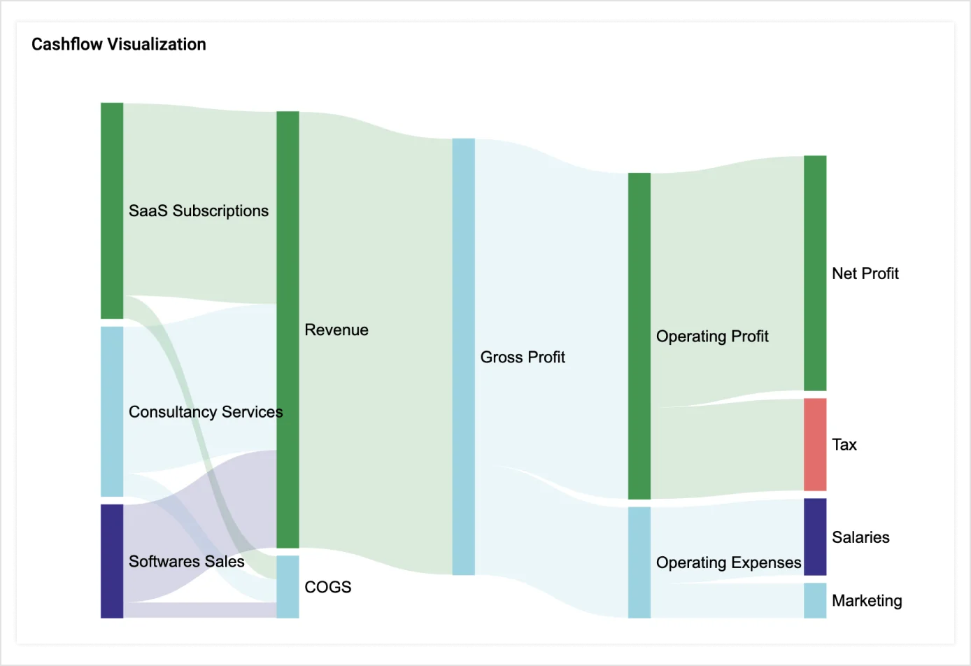
Explore complex data links, optimize understanding, and allocate resources more efficiently by examining a Sankey chart.
Explore more custom visuals


 Webinar - 9th Apr 2026, 10:00 AM ET
Webinar: Personalizing Dashboards with Role-Based Access and Row-Level Security
Bold BI 17.1.30 has arrived! Explore the latest features.


Sankey Chart
Explore complex data links, optimize understanding, and allocate resources more efficiently by examining a Sankey chart.
Explore more custom visuals
Visualize and analyze real-time data flows with ease using our Sankey chart, designed to clarify complex relationships and trends for more effective decision-making.
Download the custom visual from this page.
Publish the custom visual to your Bold BI® site.
Add to your dashboard and configure your data.
Run the dashboard and get actionable insights.
Fork the repo to enhance the custom visual on your own and use in your dashboard.

Know how to create a custom visual with Bold BI® and integrate with your dashboard.
