
3 Logistics Dashboards and KPIs for Operational Visibility
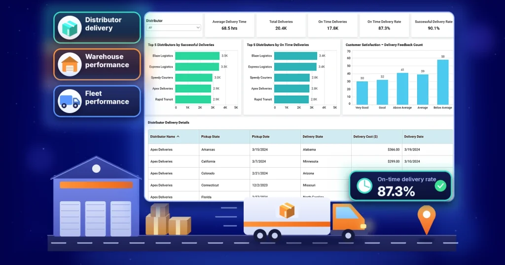
TL;DR: Your warehouse reports a 94% on-time delivery rate. Transportation reports 87%. Both are right, and that’s the problem. When teams measure the same KPI differently, no dashboard can settle the argument. This guide shows how to define logistics KPIs once, with formulas, owners, and business rules, then track them across delivery, warehouse, and transportation dashboards.
Introduction
Logistics dashboards and KPIs are supposed to give every team one view of operations. Yet in a Monday review, the warehouse team might report a 94% on-time delivery rate while transportation reports 87%. Both numbers are correct. One team measured against the carrier’s ETA, while the other measured against the date promised to the customer. The problem isn’t the dashboard. It’s the KPI definition.
This challenge is one reason why logistics dashboards and KPIs often fail to provide a single, trusted view of performance. Data flows in from warehouse management systems, transportation platforms, carrier feeds, telematics systems, and spreadsheets maintained by different teams. Without agreed definitions, even a well-designed dashboard can produce conflicting results and make decision-making harder. Bold BI® lets teams define KPI calculations once and reuse them across dashboards.
This guide starts with the fix, a set of standard KPI definitions, then shows three dashboards that put them to work.
Why KPI definitions matter more than dashboard design
Many dashboard projects focus on charts, filters, and visual design. In practice, the harder problem is agreeing on what each number means. A KPI definition is a documented explanation of what a metric measures, how it is calculated, and which business rules govern its use.
The following logistics KPI definitions provide a foundation for building reliable dashboards and measuring performance consistently across teams.
| KPI | Formula | Data source | Owner | Recommended rule |
| On-time delivery rate | On-time deliveries ÷ Total deliveries × 100 | TMS, carrier feed | Logistics operations | Use customer-promised date, not carrier ETA |
| Warehouse throughput | Total units processed ÷ Period | WMS | Warehouse manager | Use a consistent unit of measure across facilities |
| Labor productivity | Units processed ÷ Direct labor hours | WMS, labor system | Warehouse manager | Use the same unit as throughput; count direct labor hours only |
| Fleet utilization rate | Active vehicle hours ÷ Available vehicle hours × 100 | Telematics system | Transportation manager | Exclude vehicles that are out of service for planned maintenance |
| Successful delivery rate | Successful deliveries ÷ Total deliveries × 100 | TMS | Logistics operations | Define successful as no delivery exceptions, damage, or returns |
| Picking accuracy rate | Correctly picked orders ÷ Total orders picked × 100 | WMS | Warehouse manager | Track picking errors separately from fulfillment delays |
| Capacity utilization | Used capacity ÷ Available capacity × 100 | WMS | Warehouse manager | Use the same capacity calculation across facilities |
Other commonly tracked logistics KPIs include OTIF (On-Time In-Full), perfect order rate, inventory accuracy, dock-to-stock time, order cycle time, and cost per shipment.
For example, an on-time delivery KPI definition might include:
- Formula: (On-time deliveries ÷ Total deliveries) × 100.
- Data source: Transportation Management System (TMS) and carrier tracking data.
- Owner: Logistics operations team.
- Refresh schedule: Daily.
- Business rule: Measure against the customer-promised delivery date, not the carrier ETA.
Once KPI definitions are standardized, dashboards become trusted decision-making tools rather than competing versions of the truth.
3 logistics dashboards and KPIs: Examples by function
The following logistics dashboard examples cover three critical operational functions: delivery, warehousing, and transportation. Together, they provide visibility into how goods move through the logistics lifecycle.
Distributor delivery performance dashboard
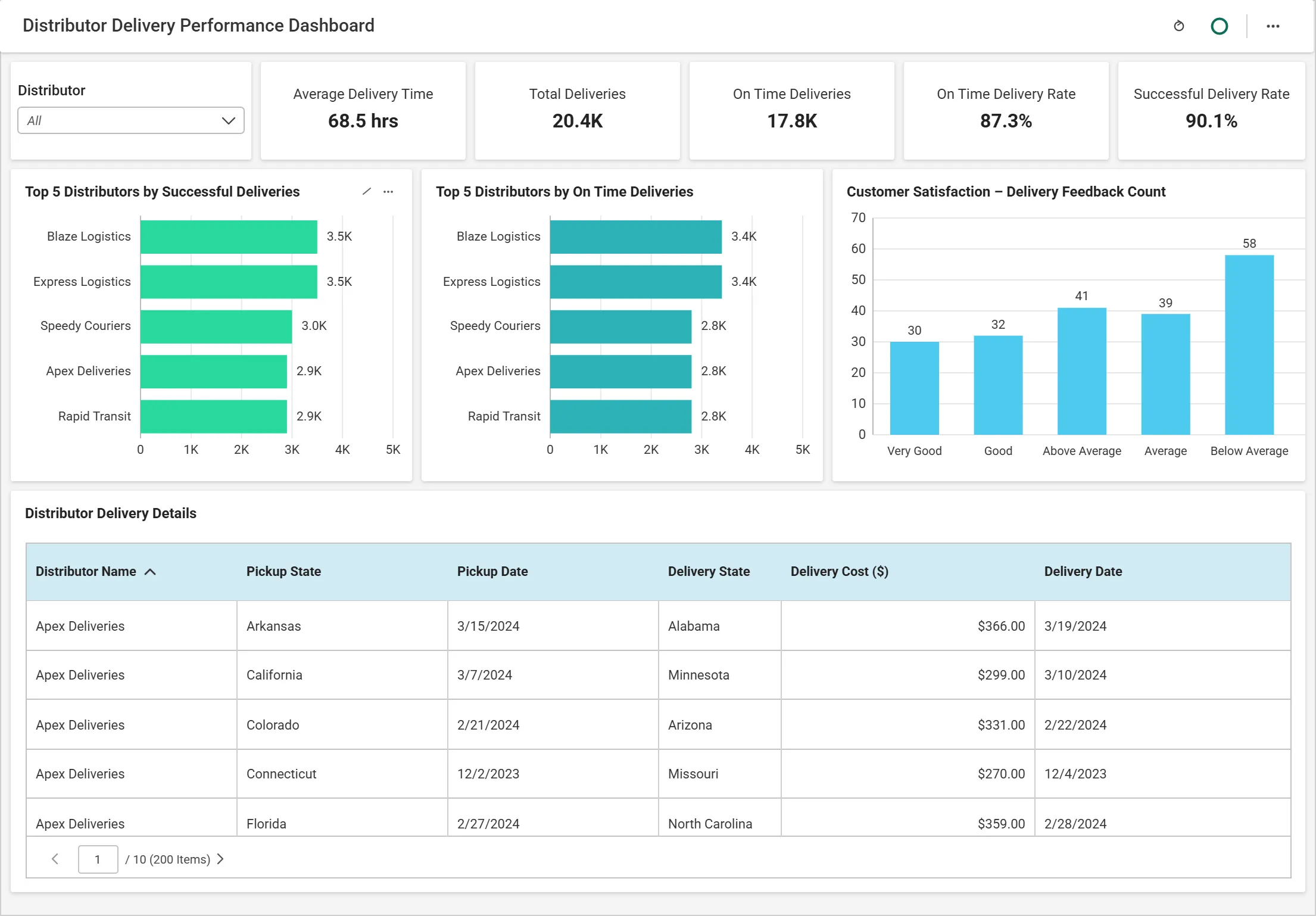
The Distributor Delivery Performance Dashboard tracks delivery reliability, distributor performance, and service-level compliance. By combining shipment data, delivery timelines, and customer feedback, it provides a centralized view of delivery operations.
Who uses it: Logistics managers and distribution teams, daily to catch late shipments and weekly to review distributor performance.
The KPI challenge
Distributor comparisons become unreliable when teams define delivery performance differently. For example, one team may calculate on-time performance using promised delivery dates, while another uses carrier ETAs.
Recommended definition: Calculate on-time delivery rate using the customer-promised delivery date rather than the carrier ETA.
Key KPIs include:
- On-time delivery rate: Measures the percentage of deliveries completed on time.
- Successful delivery rate: Measures the percentage of deliveries completed without delivery exceptions, damage, or returns.
Formula: (Successful deliveries ÷ Total deliveries) × 100
Supporting metrics
- Average delivery time: Measures the average time required to complete deliveries.
- Total deliveries: Tracks overall delivery volume across distributors.
- On-time deliveries: Shows the number of deliveries completed within the agreed timeframe.
What the dashboard helps answer
- Which distributors consistently meet delivery commitments?
- Which regions experience the highest delivery delays?
- Which distributors require additional performance reviews?
- Which shipments require investigation?
What to do when performance changes
If the on-time delivery rate declines, drill down by region, then by distributor, and finally to individual shipments to identify the source of delays.
Warehouse performance dashboard
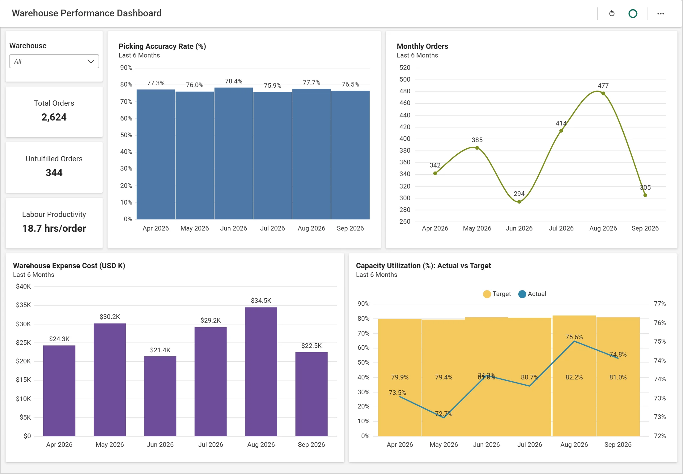
The Warehouse Performance Dashboard provides visibility into fulfillment operations, workforce productivity, warehouse capacity, and operating costs. This dashboard helps teams track key warehouse KPIs such as throughput, labor productivity, and capacity utilization.
Who uses it: Warehouse managers and shift supervisors, daily to manage workload and weekly to compare facilities.
The KPI challenge
Warehouse teams often compare performance across facilities, but those comparisons become misleading when throughput, productivity, and utilization are measured differently. Warehouse throughput should use the same unit of measure, whether orders, order lines, or units processed, across all facilities.
For example, a facility processing fewer but larger orders may appear less productive than another facility even when it operates more efficiently.
Key KPIs include:
- Warehouse throughput: Measures the volume of goods or orders processed during a specific period.
- Labor productivity: Measures output per labor hour, such as orders processed or order lines picked per hour.
- Picking accuracy rate: Measures the percentage of orders picked without errors.
Formula: (Correctly picked orders ÷ Total orders picked) × 100
- Capacity utilization: Measures the percentage of available warehouse capacity currently in use.
Formula: (Used capacity ÷ Available capacity) × 100
Supporting metrics
- Total orders: Measures the volume of orders processed by the warehouse.
- Unfulfilled orders: Tracks orders that have not yet been completed.
- Warehouse operating expense: Tracks warehouse operating costs over time.
What the dashboard helps answer
- Which bottlenecks are affecting fulfillment speed?
- How much volume is being processed over time?
- Which shifts or teams are most productive?
- Where is warehouse capacity becoming constrained?
- How are operational costs changing?
What to do when performance changes
If throughput drops, check labor productivity (are people slower?), capacity utilization (is space constrained?), and unfulfilled orders (is a backlog building?). The metric that moved first usually points to the bottleneck.
Fleet performance analysis dashboard
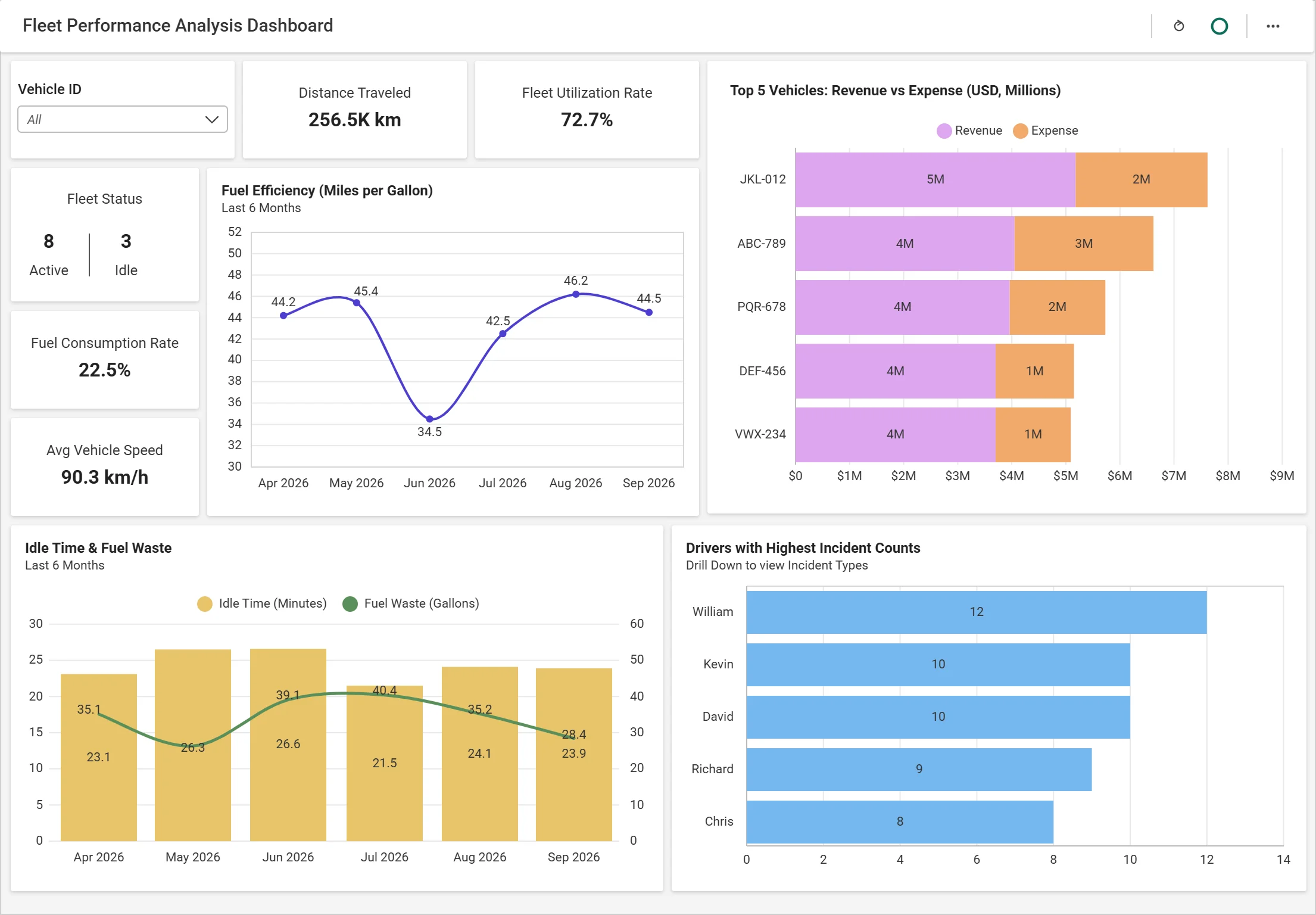
The Fleet Performance Analysis Dashboard covers the transportation stage of logistics, showing how goods move between warehouses, distributors, and customers.
Who uses it: Transportation and fleet managers, daily to plan dispatch and monthly to review fleet costs.
The KPI challenge
Fleet data is often managed separately from warehouse and delivery systems, making it difficult to evaluate transportation performance using the same standards applied elsewhere in the supply chain.
For example, some teams count every vehicle on the books, including those in the shop, which can make fleet utilization appear lower than it actually is. Fleet utilization is most effective when measured using active operating hours divided by available operating hours, excluding vehicles that are out of service for planned maintenance.
Key KPIs include:
- Fleet utilization rate: Tracks how effectively fleet assets are being used.
Formula: Active vehicle hours ÷ Available vehicle hours × 100
- Fuel consumption rate: Monitors fuel usage across vehicles.
Formula: Fuel used ÷ Distance traveled
Supporting metrics
- Distance traveled: Measures the total distance covered by the fleet.
- Average vehicle speed: Provides insight into route and transportation performance.
What the dashboard helps answer
- Which vehicles are underutilized?
- Where is fuel consumption increasing?
- Which vehicles or routes use the most fuel?
What to do when performance changes
If fleet utilization drops, review vehicle activity, route assignments, and operating schedules to identify underused assets and inefficiencies.
Where logistics dashboards go wrong
Even well-designed dashboards can fail if the underlying data and KPIs are not governed effectively.
Too many KPIs
Problem: Teams track every available metric, causing dashboards to become cluttered and difficult to use.
Fix: Limit each dashboard to five to seven KPIs tied to a specific decision. For additional guidance, see our article on 10 Best Practices for Designing Powerful Dashboards.
Undocumented definitions
Problem: KPI definitions exist informally and change from team to team.
Fix: Document formulas, business rules, owners, and data sources, and review them regularly.
Data refresh expectations
Problem: Users assume dashboards always contain the latest data.
Fix: Display whether a dashboard uses live queries or scheduled refreshes and show when the data was last updated.
Disconnected systems
Problem: Warehouse platforms, transportation systems, distributor portals, and telematics applications often operate independently. Without data integration, organizations struggle to form a complete view of operational performance.
Fix: Consolidate warehouse, transportation, carrier, and operational data into a unified analytics environment so teams can monitor performance end to end.
Building governed logistics dashboards with Bold BI
Defining KPIs is only the first step. Bold BI helps organizations apply those definitions consistently across logistics dashboards while maintaining governance and security.
Define KPI calculations once
Define a calculation such as on-time delivery rate once at the data-source level and reuse it across every dashboard. Update it in one place, and every dashboard reflects the change automatically.
Get alerted when a KPI slips
Configure alerts to notify teams when KPIs cross a threshold, for example when on-time delivery falls below 95%.
Share dashboards with distributors and customers
Dashboards can be embedded into customer, distributor, or carrier portals, enabling stakeholders to access logistics insights within the tools they already use.
Secure operational data
Logistics teams and stakeholders often need different levels of access to operational data. Row-level security ensures users only see the shipments, facilities, customers, or regions relevant to them.
Support different refresh requirements
Logistics data arrives from multiple systems that refresh at different intervals. Bold BI supports both live-query and scheduled-refresh approaches, allowing teams to balance data freshness with performance and operational requirements.
Deploy according to business requirements
Some organizations need logistics data to remain within their own environment. Bold BI On-Premises lets teams run analytics on their own infrastructure while maintaining visibility across warehouse, transportation, and operational data sources.
Turn KPI definitions into confident decisions
The three dashboards in this guide share one lesson: a dashboard is only as reliable as the KPI definitions behind it. When on-time delivery rate, warehouse throughput, labor productivity, and fleet utilization mean the same thing to every team, logistics leaders can act on the numbers instead of debating them.
Bold BI® helps teams apply KPI definitions consistently across dashboards and data sources, creating a trusted foundation for operational decision-making. Want logistics dashboards your whole team trusts? Start your free trial of Bold BI and put these KPI definitions to work.
Frequently asked questions
-
- 1.
What is a logistics dashboard?
A logistics dashboard is a business intelligence tool that consolidates data from transportation, warehousing, fulfillment, inventory, and distribution systems into a single view. It helps teams monitor performance, track KPIs, identify bottlenecks, and make more informed operational decisions.
- 2.
What is a logistics KPI?
A logistics KPI (Key Performance Indicator) is a measurable metric used to evaluate the efficiency, reliability, and effectiveness of logistics operations. Common examples include on-time delivery rate, warehouse throughput, labor productivity, and fleet utilization rate.
- 3.
What logistics KPIs should organizations define first?
Start with on-time delivery rate, warehouse throughput, labor productivity, capacity utilization, and fleet utilization rate. Once those metrics are stable, add OTIF and perfect order rate.
- 4.
How should on-time delivery rate be calculated?
On-time delivery rate = (On-time deliveries ÷ Total deliveries) × 100. Use the customer-promised date, not the carrier ETA, across all teams.
- 5.
What is warehouse throughput?
Warehouse throughput measures the volume of goods, units, or orders processed during a specific period and helps organizations evaluate warehouse efficiency and capacity.
- 6.
Why does fleet utilization matter?
Fleet utilization shows how much available vehicle time is actually spent in use. Low utilization may indicate excess vehicles, inefficient route planning, or poor asset allocation.
- 7.
What is OTIF?
OTIF (On-Time In-Full) measures the percentage of orders delivered on time and in the correct quantity. It’s stricter than on-time delivery rate because a late or incomplete order counts as a miss.
- 1.