Poison Control KPI Dashboard
Track poison exposure volume, response times, and severity trends to improve toxic exposure response efficiency.
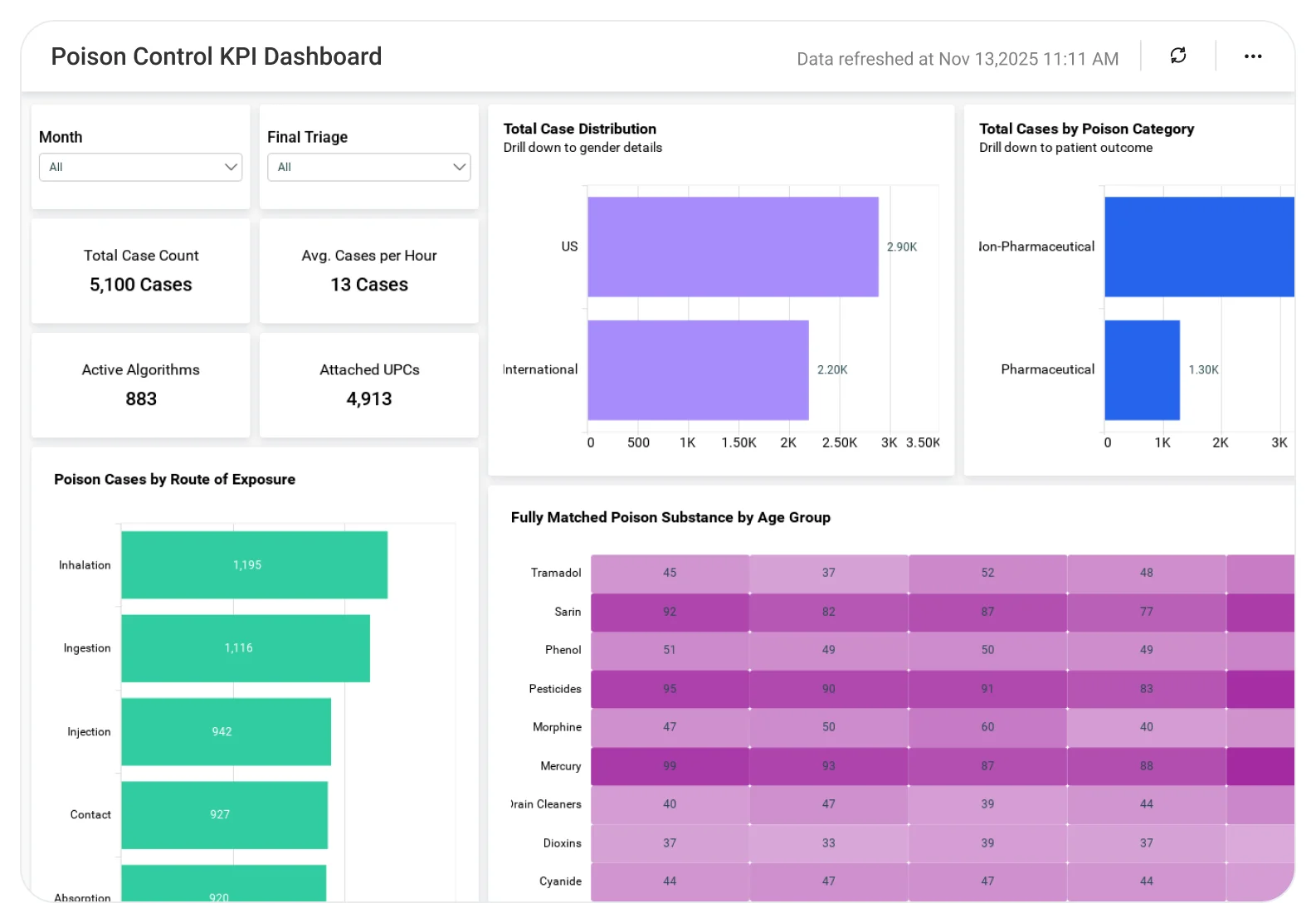
The Poison Control KPI Dashboard helps hospital networks and diagnostic organizations track poison exposure cases, response timelines, and clinical outcomes in one centralized view, supporting faster intervention and better capacity planning.
TL;DR
-
Track poison exposure case volume and trend patterns to anticipate surges and emerging risks.
-
Monitor call handling and response time KPIs to improve speed and coordination of care.
-
Analyze exposure distribution by substance, category, and severity to prioritize clinical attention.
-
Assess facility-and service-line workload impact to support staffing and capacity planning.
-
Strengthen clinical oversight and public health decisions with data-driven poison control insights.
What Is a Poison Control KPI Dashboard?
A Poison Control KPI Dashboard is an analytics solution that provides real‑time and historical visibility into poison exposure incidents, response efficiency, and clinical handling outcomes across healthcare systems.
With Bold BI, data from EHR/EMR platforms, poison control systems, lab diagnostics, and operational databases is securely unified, helping healthcare leaders move from fragmented incident tracking to coordinated poison response management.
Why Poison Control KPI Dashboard Matters
Poison exposure cases require rapid, well-coordinated clinical responses.
When poison control data is siloed:
-
Delays in poison response are hard to detect without real-time performance visibility.
-
Case volume surges strain staff unexpectedly.
-
Clinical and lab teams lack shared situational awareness.
-
Reporting for quality and compliance becomes manual.
A centralized KPI dashboard enables healthcare organizations to move from reactive case reviews to proactive poison response planning.
What You’ll Track
Using Bold BI dashboards, you will track important KPIs such as:
-
Poison exposure case volume: Number of reported cases over time to identify trends and spikes.
-
Response & handling time metrics: Time from case intake to clinical guidance or intervention.
-
Exposure severity distribution: Breakdown of mild, moderate, and severe cases for workload planning.
-
Facility & service-line impact: Case distribution by hospital, department, or care unit to support capacity management.
All dashboards are fully customizable, allowing you to add KPIs or metrics as needed.
How It Works
-
Connect poison control systems, EHR/EMR, lab, and operational data sources to Bold BI using REST APIs.
-
Apply the Poison Control KPI Dashboard sample.
-
Combine incident, response, and clinical data into a unified analytics model.
-
Analyze insights by facility, poison type, severity, or time period.
-
Share dashboards with clinical leadership, operations, and quality teams.
Why Bold BI Is the Right Fit for Poison Control KPI Analytics
-
Improves visibility into response performance under pressure: Highlights response time variations and bottlenecks during high-volume exposure periods.
-
Aligns poison control, clinical, and lab teams: Brings exposure data, response KPIs, and diagnostic context into one shared view.
-
Supports staffing and capacity planning: Helps leaders anticipate surge periods and allocate clinical resources accordingly.
-
Strengthens quality oversight and reporting: Provides consistent, drillable KPIs for internal reviews and external reporting needs.
-
Scales across large hospital and lab networks: Designed for multi-facility healthcare organizations handling high incident volumes.
Compare Options (at a glance)
| Feature | Bold BI | EHR / Poison Logs | Spreadsheets |
| Poison control KPI analytics | Yes | Limited | Manual |
| Response time & severity tracking | Yes | Partial | Manual |
| Facility & service-line drilldowns | Yes | Limited | Manual |
| Trend & surge detection | Yes | Limited | No |
| Custom KPIs & dashboards | Fully customizable | Fixed | Manual |