Axosoft Release Management Dashboard
Understand release progress and risks to deliver software updates with confidence.
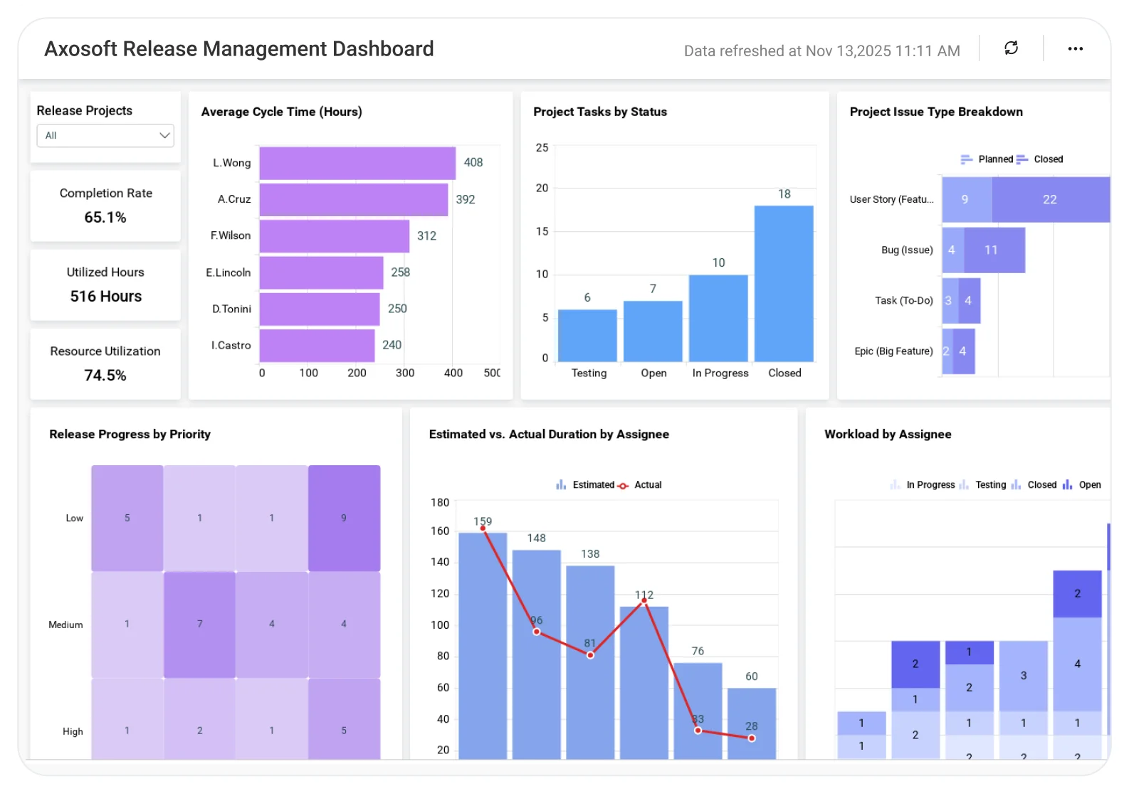
The Axosoft Release Management Dashboard helps teams analyze release status, scope readiness, defect trends, and delivery timelines, enabling better planning, reduced release risks, and more predictable software releases.
TL;DR
-
Real-Time Release Tracking: Start date, target release date, completion percentage, and item status breakdown.
-
Cycle Time Analysis: Identify how long work items stay in each workflow stage.
-
Workload Visibility: Monitor task distribution by user and track progress.
-
Estimation Accuracy: Compare estimated vs. actual hours to improve planning.
-
Scope Tracking: Keep an eye on daily scope and estimate changes to prevent release drift.
What Is an Axosoft Release Management Dashboard?
An Axosoft Release Management Dashboard gives IT and product managers a live, data-driven view of your release progress and team productivity.
In Bold BI, this means real-time charts, workload analysis, and KPIs powered directly by Axosoft Web API data so teams can identify delays early.
Why Axosoft Release Management Dashboard Matters
This Axosoft release management dashboard gives product and IT managers a clear view of the metrics that determine release success.
With this dashboard, we can answer the following questions:
-
What is our overall completion percentage?
-
How long is our cycle time?
-
How is the workload distributed across the team?
-
How do items break down by type, project, and priority?
What You’ll Track
Everything you need to manage release timelines, scope, and team capacity, without switching tools.
-
Release timeline accuracy: Track start and release dates, completion percentage, and utilized hours to monitor progress and capacity usage.
-
Cycle time and flow efficiency: Visualize how long work items stay in each workflow stage to surface delays and bottlenecks early.
-
Scope change and release drift: Monitor daily scope changes and status trends to understand estimate shifts and evolving priorities.
-
Team workload balance: Compare user-level estimated vs. actual effort to improve forecasting accuracy and prevent overload.
-
Work type and priority focus: Break down items by type, project, priority, and release status to identify blockers and effort distribution.
All dashboards are fully customizable so you can add KPIs like defect rate, rework percentage, or sprint velocity to strengthen your team’s performance visibility.
How It Works
-
Apply sample: Use the Axosoft Release Management Dashboard sample.
-
Blend: Combine Axosoft data with other tools for full release tracking.
-
Share securely: Role-based dashboards for managers, developers, and stakeholders.
-
Automate alerts: Set alerts for schedule slippage or high cycle time.
Why Bold BI Is the Right Fit for Axosoft Release Analytics
-
Track all your product release KPIs in one place with interactive and embeddable dashboards.
-
Visualize project workloads, cycle times, and priorities instantly.
-
Correlate engineering progress with business readiness.
-
Share dashboards securely with Row-Level Security, Single Sign-On and encryption across teams.
-
Flexible deployment into cloud or self-hosted environments.
Compare Options (at a glance)
| Feature | Bold BI | Axosoft Built-in Reports | Spreadsheets / Manual Reporting |
|---|---|---|---|
| Release status overview (on track/at risk/delayed) | Yes | Limited | Manual |
| Scope tracking (features added/removed, completion %) | Yes | Partial | Manual |
| Defects by release (open/closed, severity, aging) | Yes | Limited | Manual |
| Velocity & burndown trends by release/sprint | Yes | Limited | Manual |
| Custom KPIs & dashboards | Fully customizable | Fixed | Manual |
Frequently Asked Questions
More Articles About Axosoft Release Management Dashboard
-
Axosoft Data with the Power of Embedded Analytics
This blog explains how to fetch Axosoft data via REST API, connect it to Bold BI, and create embedded dashboards for release management. Covers API endpoints, access token generation, and embedding techniques.
-
Increase IT Department Performance with Embedded Analytics
This blog highlights how embedded analytics boosts IT department efficiency by integrating real-time dashboards into workflows. Discover how Bold BI enables IT teams to monitor KPIs, optimize resource allocation, and enhance project delivery.
-
Understanding Data Insights: Tips to Make Better Decisions
This blog explores how to turn raw data into meaningful insights for smarter decision-making. Learn best practices for analyzing trends, identifying patterns, and using Bold BI dashboards to improve accuracy and strategic planning.